Style combination · Contrasts
Arts × Techno-Futurist Graphics
Handmade, nature-derived craft is its anti-matter; a single hand-drawn element in a techno layout reads as a glitch of humanity.
01
What each style brings
Each part of the design comes from the style with the stronger say in it, and each style gives at least two.
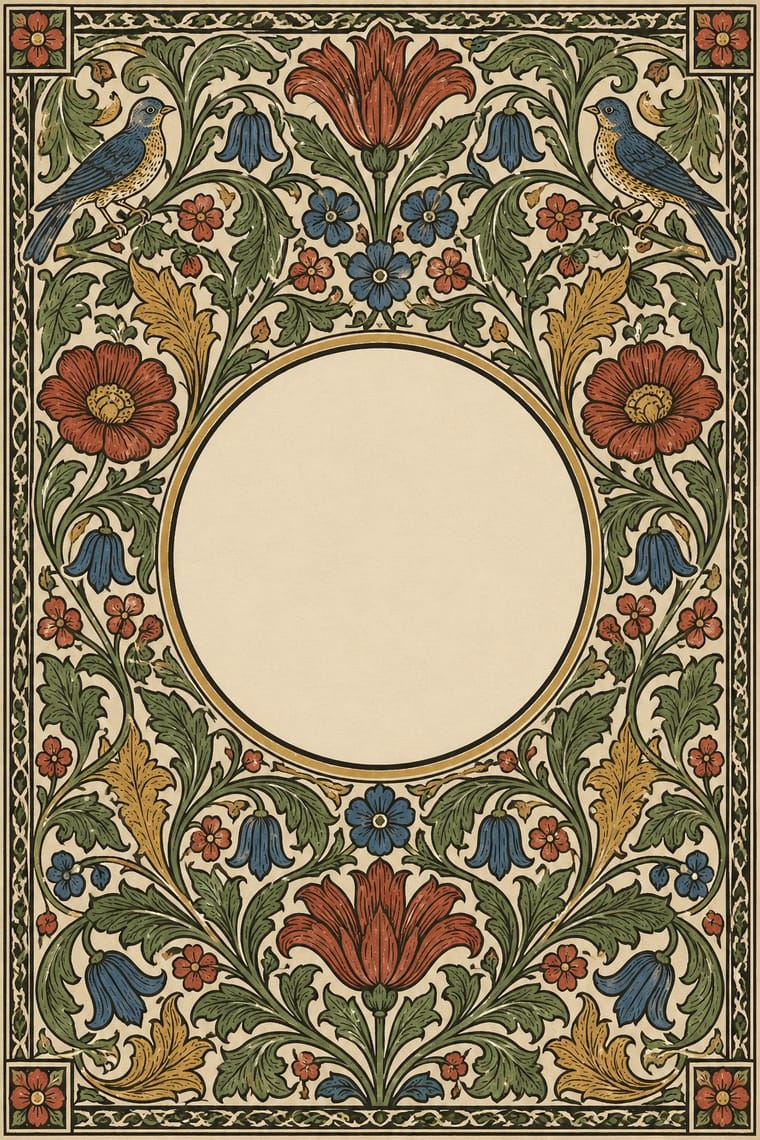
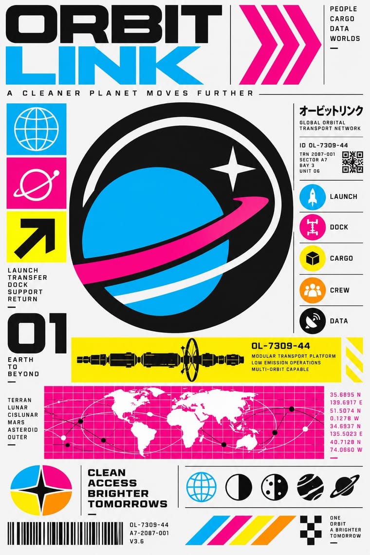
Arts & Crafts Movement Techno-Futurist Graphics
- Type from Arts
- Colour from Techno-Futurist Graphics
- Form from Techno-Futurist Graphics
- Composition from Arts
- Surface from Arts
-
Techno-Futurist Graphics avoids carved line: this is where the two pull against each other, which is the point of the contrast.
02
The type
Open fonts standing in for each style’s own type, which is often hand-drawn or commercial.
Text · Techno-Futurist Graphics
Electronic-music and video-game graphics of the late 1980s and 1990s that turned corporate modernism into a sci-fi consumer fantasy. Grids, Helvetica, pictograms, barcodes, warning labels and invented corporate logos were recombined with katakana, manga cuteness and early 3D, producing slick, flat, information-saturated surfaces that both celebrated and satirised technology and branding.
Inter; Techno-Futurist Graphics used Helvetica and Eurostile / Microgramma
03
The colours
The ground and leading colours come from Techno-Futurist Graphics, with a counter-accent from Arts. The ink reads on the ground at 4.5:1 or more.
Arts & Crafts Movement Techno-Futurist Graphics
-
#f5f5f5ground · 36% -
#111111ink · 14% -
#00aeefaccent · 18% -
#a33224accent · 14% -
#ec008caccent · 10% -
#c39a4aaccent · 8%
As CSS
:root {
  --ground: #f5f5f5;
  --ink: #111111;
  --accent-1: #00aeef;
  --accent-2: #a33224;
  --accent-3: #ec008c;
  --accent-4: #c39a4a;
  --font-display: "EB Garamond", serif;
  --font-text: "Inter", sans-serif;
}
04
The two styles
05
More combinations
With Arts
- Flat Design Contrasts · Borrow one engraved border or initial to give a flat interface a crafted, editorial moment against its vector minimalism.
- Scandinavian Functionalism Pairs well · Keep the craft ethic and natural palette but reduce Morris's foliage to a single repeating motif for warmth without clutter.
- Risograph & Indie Print Culture Pairs well · Frame a two-ink riso print with a Morris-style vine border to give indie publishing an heirloom, hand-made gravity.
- Die Neue Typographie Contrasts · Tschichold's asymmetric, unornamented page was built against this centred, bordered book; set them side by side to argue tradition versus machine age.
- Gothic Blackletter & Fraktur Tradition Pairs well · Morris's Kelmscott Press revived gothic type (Troy and Chaucer) inside dense woodcut borders; join the broken letter to foliate frames and handmade paper for a medieval, hand-made book.
- Renaissance Book Typography Pairs well · Morris's Kelmscott Press revived Jenson's roman; pair a Renaissance text block with dense Arts & Crafts borders for a private-press feel.
- Josef Frank and Svenskt Tenn Botanical Prints Pairs well · The parent tradition: both fill a repeat with plants on linen, but Morris is symmetrical, earthy and dense with dark grounds, Frank is looser, brighter and mostly light. Pair a Morris-style framed book page with Frank-style endpapers.
- Italian Futurism Contrasts · Arts & Crafts handwork is everything Futurism wanted to burn; juxtapose them to stage machine against hand.
With Techno-Futurist Graphics
- Y2K Futurism Pairs well · Add Y2K chrome and translucent plastics to techno-futurist pictograms for a late-1990s consumer-electronics look.
- Kawaii Design Pairs well · Drop a flat, cute mascot into a dense corporate-parody layout to soften its satire, as 1990s Tokyo studios did.
- Corporate Identity Modernism Contrasts · Use the sincere corporate identity manual as the straight version that techno-futurism parodies.
- Fantasy User Interface (FUI) & Sci-Fi HUD Pairs well · Techno-futurism's invented corporate logos, pictograms and warning labels make convincing in-world branding for FUI screens. Use them on boot screens and on the agencies and corporations whose software the characters run.
- Acid Graphics / New Ugly Pairs well · Borrow The Designers Republic's corporate-parody logos and tiny technical captions to give acid layouts a systematic backbone.
- Superflat Pairs well · groovisions, whose Chappie figure showed in the 2001 Superflat exhibition, links the two; set Superflat characters inside techno-futurist logos, grids and katakana captions for a slicker, more corporate parody.
- Afrofuturist Design Pairs well · Combine interface graphics and chrome with ancestral pattern so technology feels owned rather than imported.