Style combination · Contrasts
Corporate Identity Modernism × Techno-Futurist Graphics
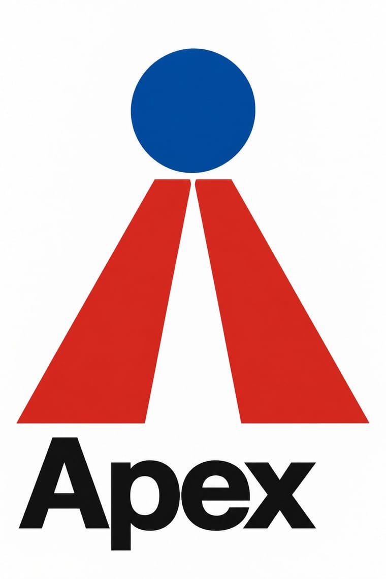
Use the sincere corporate identity manual as the straight version that techno-futurism parodies.
Mix them and make something Corporate Identity Modernism Techno-Futurist Graphics
01
What each style brings
Each part of the design comes from the style with the stronger say in it, and each style gives at least two.
Corporate Identity Modernism Techno-Futurist Graphics
- Type from Corporate Identity Modernism
- Colour from Corporate Identity Modernism
- Form from Techno-Futurist Graphics
- Composition from Corporate Identity Modernism
- Surface from Techno-Futurist Graphics
02
The type
Open fonts standing in for each style’s own type, which is often hand-drawn or commercial.
Text · Techno-Futurist Graphics
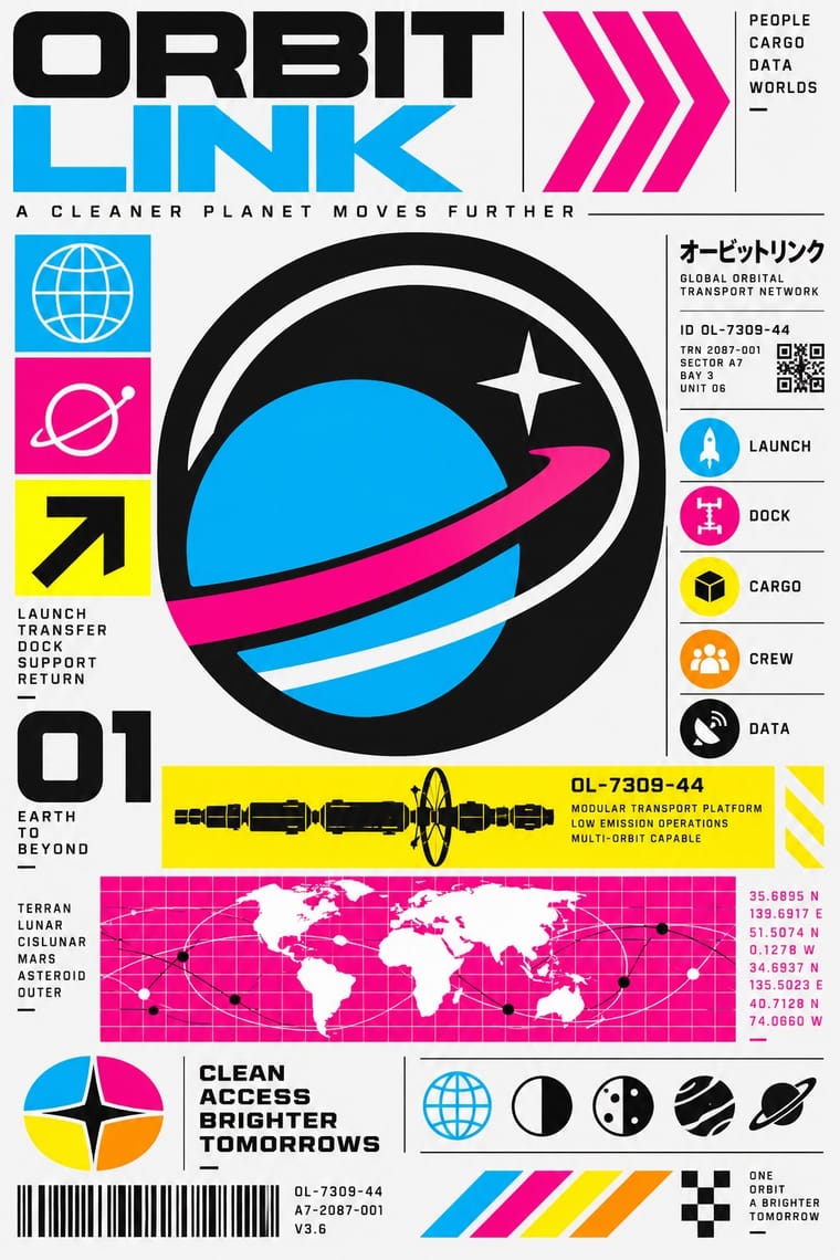
Electronic-music and video-game graphics of the late 1980s and 1990s that turned corporate modernism into a sci-fi consumer fantasy. Grids, Helvetica, pictograms, barcodes, warning labels and invented corporate logos were recombined with katakana, manga cuteness and early 3D, producing slick, flat, information-saturated surfaces that both celebrated and satirised technology and branding.
Inter; Techno-Futurist Graphics used Helvetica and Eurostile / Microgramma
03
The colours
The ground and leading colours come from Corporate Identity Modernism, with a counter-accent from Techno-Futurist Graphics. The ink reads on the ground at 4.5:1 or more.
Corporate Identity Modernism Techno-Futurist Graphics
-
#ffffffground · 36% -
#111111ink · 14% -
#d7261eaccent · 18% -
#00aeefaccent · 14% -
#0a4fa0accent · 10% -
#ec008caccent · 8%
As CSS
:root {
  --ground: #ffffff;
  --ink: #111111;
  --accent-1: #d7261e;
  --accent-2: #00aeef;
  --accent-3: #0a4fa0;
  --accent-4: #ec008c;
  --font-display: "Inter Tight", sans-serif;
  --font-text: "Inter", sans-serif;
}
04
The two styles
05
More combinations
With Corporate Identity Modernism
- Corporate Memphis Contrasts · Its successor trades abstract authority for rubbery friendliness; compare the two to decide how institutional or human a brand should feel.
- Generative & Dynamic Identities Pairs well · Keep the manual's mark, colour and grid as constants and let generative rules vary one parameter, so the system still reads as one company.
- Flat Design Pairs well · Flat UI inherits these reductive marks; reuse their clear-space and colour-code discipline when scaling icons across screens.
- Punk & DIY Zine Contrasts · Punk's ransom-note lettering is the anti-manual; one torn, xeroxed element against a corporate grid reads instantly as critique.
- Plakatstil / Sachplakat Pairs well · Its brand-name-plus-object formula prefigures logo-led identity; pair it with a modernist grid for confident product campaigns.
- Risograph & Indie Print Culture Contrasts · Exact Pantone-matched corporate colour is the opposite of riso's drifting inks; use the contrast to signal independence.
- Contemporary Arabic & Dual-Script Type Design Pairs well · Roll a matched Arabic–Latin family through a standards manual so both scripts carry the identity with equal authority.
- Milanese Industrial Modernism (Olivetti, Pirelli, Studio Boggeri) Contrasts · American corporate identity policed one mark through a manual, while Milan let artists vary the language; compare the two when deciding how strict a brand system should be.
With Techno-Futurist Graphics
- Y2K Futurism Pairs well · Add Y2K chrome and translucent plastics to techno-futurist pictograms for a late-1990s consumer-electronics look.
- Kawaii Design Pairs well · Drop a flat, cute mascot into a dense corporate-parody layout to soften its satire, as 1990s Tokyo studios did.
- Arts & Crafts Movement Contrasts · Handmade, nature-derived craft is its anti-matter; a single hand-drawn element in a techno layout reads as a glitch of humanity.
- Fantasy User Interface (FUI) & Sci-Fi HUD Pairs well · Techno-futurism's invented corporate logos, pictograms and warning labels make convincing in-world branding for FUI screens. Use them on boot screens and on the agencies and corporations whose software the characters run.
- Acid Graphics / New Ugly Pairs well · Borrow The Designers Republic's corporate-parody logos and tiny technical captions to give acid layouts a systematic backbone.
- Superflat Pairs well · groovisions, whose Chappie figure showed in the 2001 Superflat exhibition, links the two; set Superflat characters inside techno-futurist logos, grids and katakana captions for a slicker, more corporate parody.
- Afrofuturist Design Pairs well · Combine interface graphics and chrome with ancestral pattern so technology feels owned rather than imported.