Style combination · Contrasts
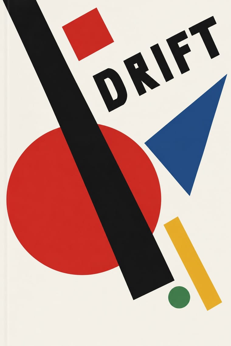
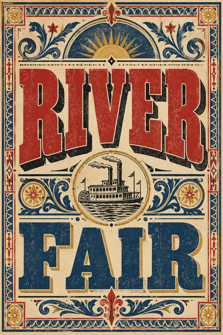
Suprematism × Victorian Letterpress
Crowded, ornamented Victorian bills make Suprematist emptiness feel even more radical; use the clash for editorial openers.
Mix them and make something Suprematism Victorian Letterpress
01
What each style brings
Each part of the design comes from the style with the stronger say in it, and each style gives at least two.
Suprematism Victorian Letterpress & Wood Type
- Type from Victorian Letterpress
- Colour from Suprematism
- Form from Suprematism
- Composition from Suprematism
-
Victorian Letterpress avoids generous white space: this is where the two pull against each other, which is the point of the contrast.
- Surface from Victorian Letterpress
02
The type
Open fonts standing in for each style’s own type, which is often hand-drawn or commercial.
Display · Victorian Letterpress
Rise
Abril Fatface, standing in for Fat face romans (Thorne, Figgins)
Text · Suprematism
Kazimir Malevich's non-objective art, unveiled with the Black Square at the 0.10 exhibition in Petrograd in 1915, reduced painting to pure geometric planes floating in white, infinite space. Through the UNOVIS collective in Vitebsk and El Lissitzky's books it became a graphic language of squares, bars and circles tilted on dynamic diagonals, the seedbed of Constructivist layout.
Hanken Grotesk; Suprematism used Russian grotesques (rubleny shrift) as set by Lissitzky and Hand-drawn lithographic lettering of UNOVIS publications
03
The colours
The ground and leading colours come from Suprematism, with a counter-accent from Victorian Letterpress. The ink reads on the ground at 4.5:1 or more.
Suprematism Victorian Letterpress & Wood Type
-
#f4f1e8ground · 36% -
#121212ink · 14% -
#e9b824accent · 18% -
#b3322baccent · 14% -
#d9b45aaccent · 10% -
#2a4d8faccent · 8%
As CSS
:root {
  --ground: #f4f1e8;
  --ink: #121212;
  --accent-1: #e9b824;
  --accent-2: #b3322b;
  --accent-3: #d9b45a;
  --accent-4: #2a4d8f;
  --font-display: "Abril Fatface", serif;
  --font-text: "Hanken Grotesk", sans-serif;
}
04
The two styles
05
More combinations
With Suprematism
- Russian Constructivism Pairs well · Add photomontage and heavy grotesque slogans to Suprematist floating planes to turn pure form into a message.
- Socialist Realist Propaganda Poster Contrasts · The doctrine that outlawed non-objective art; set a pure red wedge against heroic figuration to show the 1930s rupture.
- Minimalist Graphic Design Pairs well · Both trust a few shapes on an empty field; borrow the Suprematist diagonal to animate a static minimal layout.
- Russian Futurist Book Contrasts · Malevich went from drawing crude figures in these books to pure geometry on white; pick Suprematism for cosmic order and the Futurist book for crowded, earthy handwork.
- NSK Retro-Avant-Garde Pairs well · NSK turned Malevich's black cross into a heraldic badge; set one Suprematist primitive dead centre, framed by a cog or wreath, to turn pure form into insignia.
- Kultur-Lige & Yiddish Avant-Garde Book Design Pairs well · Lissitzky moved from one to the other in 1919, giving Had Gadya a Suprematist inner jacket; set a folk figure and a drawn verse against a few floating planes to keep a story inside an abstract page.
- Mechano-Faktura & Polish Constructivist Advertising Pairs well · Borrow its flat geometric primitives, then fill them with Berlewi's mechanical line rhythm.
With Victorian Letterpress
- Hand-Painted Signage & Vernacular Lettering Pairs well · Sign writers and type founders traded letterforms; add brushed shading and drop shadows to wood-type headlines for a street-made feel.
- Push Pin Style Pairs well · Push Pin revived Victorian display faces with irony; mix one wood-type headline with modern illustration for the same knowing nostalgia.
- International Typographic Style Contrasts · One face, flush left and white space against a centred clamour of faces: use the contrast to test whether hierarchy needs variety at all.
- Arts & Crafts Movement Contrasts · Morris reacted against exactly this commercial clutter; set the two side by side to show craft restraint versus jobbing exuberance.
- HfG Ulm Systematic Design Contrasts · A Victorian mixed-face handbill is the clutter Ulm's one-family rule was meant to cure; use it as a before-and-after foil.
- Victorian Colour Toy Books (Evans, Crane, Caldecott and Greenaway) Contrasts · Its black-letter-dense, type-and-ornament jobbing page is the opposite of a picture-led page; combine them by hanging a wood-type title over a flat colour picture.
- Dada Pairs well · Raid Victorian wood type and stock ornaments as the Dadaists did, but scatter them instead of centring them.
- American Four-Colour Comic Book (Golden to Bronze Age) Pairs well · Both are cheap letterpress print that shouts to passers-by; borrow the playbill's stacked display capitals, banners and rules for a comic cover's blurbs and price box, while keeping the comic's hand-drawn letters and keyline art.