Style combination · Contrasts
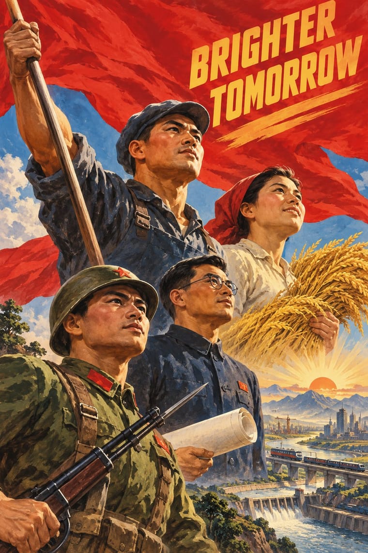
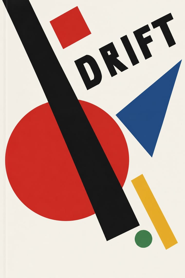
Socialist Realist Propaganda Poster × Suprematism
The doctrine that outlawed non-objective art; set a pure red wedge against heroic figuration to show the 1930s rupture.
Mix them and make something Socialist Realist Propaganda Poster Suprematism
01
What each style brings
Each part of the design comes from the style with the stronger say in it, and each style gives at least two.
Socialist Realist Propaganda Poster Suprematism
- Type from Socialist Realist Propaganda Poster
- Colour from Suprematism
- Form from Suprematism
-
Socialist Realist Propaganda Poster avoids non-representational: this is where the two pull against each other, which is the point of the contrast.
- Composition from Suprematism
- Surface from Socialist Realist Propaganda Poster
02
The type
Open fonts standing in for each style’s own type, which is often hand-drawn or commercial.
Display · Socialist Realist Propaganda Poster
Rise
Big Shoulders, standing in for Hand-drawn Cyrillic poster capitals in condensed grotesque and slab forms
Text · Suprematism
Kazimir Malevich's non-objective art, unveiled with the Black Square at the 0.10 exhibition in Petrograd in 1915, reduced painting to pure geometric planes floating in white, infinite space. Through the UNOVIS collective in Vitebsk and El Lissitzky's books it became a graphic language of squares, bars and circles tilted on dynamic diagonals, the seedbed of Constructivist layout.
Hanken Grotesk; Suprematism used Russian grotesques (rubleny shrift) as set by Lissitzky and Hand-drawn lithographic lettering of UNOVIS publications
03
The colours
The ground and leading colours come from Suprematism, with a counter-accent from Socialist Realist Propaganda Poster. The ink reads on the ground at 4.5:1 or more.
Socialist Realist Propaganda Poster Suprematism
-
#f4f1e8ground · 36% -
#121212ink · 14% -
#e9b824accent · 18% -
#cf2a27accent · 14% -
#2a4d8faccent · 10% -
#3f7d4eaccent · 8%
As CSS
:root {
  --ground: #f4f1e8;
  --ink: #121212;
  --accent-1: #e9b824;
  --accent-2: #cf2a27;
  --accent-3: #2a4d8f;
  --accent-4: #3f7d4e;
  --font-display: "Big Shoulders", sans-serif;
  --font-text: "Hanken Grotesk", sans-serif;
}
04
The two styles
05
More combinations
With Socialist Realist Propaganda Poster
- Cuban Revolutionary Poster (OSPAAAL & ICAIC) Contrasts · Cuban designers rejected Soviet realism for pop and op graphics; compare them to decide whether a cause needs heroes or wit.
- Taller de Gráfica Popular Pairs well · TGP shared the social commitment with a carved linocut line; borrow its grit to make heroic imagery feel grassroots.
- WPA Silkscreen Posters Pairs well · Both mobilised a 1930s public; combine WPA flat silkscreen colour with heroic low-angle diagonals for civic campaigns.
- Russian Constructivism Contrasts · Same revolution, opposite means: set Constructivist abstraction beside heroic realism to show the 1932 turn from experiment to doctrine.
- Shanghai Modern & Yuefenpai Contrasts · After 1949 the same painters and rubbed-watercolour technique served propaganda; compare how one rendering style sells glamour versus ideology.
- Chinese National-Style Animation (Shanghai Animation Film Studio) Contrasts · Made in the same state and decades, and like it an official art: the national style was pursued with state backing and its fables carried lessons. But where socialist realism pictured idealised heroes in legible, illusionistic realism, the studio found its forms in ink painting, cut paper, opera and murals; set one against the other to separate a painted, traditional idiom from heroic realism.
- ROSTA Windows Contrasts · The heroic, naturalistic painting that displaced it in the 1930s is the exact opposite of its crude, satirical shorthand.
- Minjung Woodcut Graphics (Korean People's Art) Contrasts · State posters paint polished heroes from above; Minjung prints cut rough, grieving and dancing people from below.
All 32 combinations with Socialist Realist Propaganda Poster
With Suprematism
- Russian Constructivism Pairs well · Add photomontage and heavy grotesque slogans to Suprematist floating planes to turn pure form into a message.
- Victorian Letterpress & Wood Type Contrasts · Crowded, ornamented Victorian bills make Suprematist emptiness feel even more radical; use the clash for editorial openers.
- Minimalist Graphic Design Pairs well · Both trust a few shapes on an empty field; borrow the Suprematist diagonal to animate a static minimal layout.
- Russian Futurist Book Contrasts · Malevich went from drawing crude figures in these books to pure geometry on white; pick Suprematism for cosmic order and the Futurist book for crowded, earthy handwork.
- NSK Retro-Avant-Garde Pairs well · NSK turned Malevich's black cross into a heraldic badge; set one Suprematist primitive dead centre, framed by a cog or wreath, to turn pure form into insignia.
- Kultur-Lige & Yiddish Avant-Garde Book Design Pairs well · Lissitzky moved from one to the other in 1919, giving Had Gadya a Suprematist inner jacket; set a folk figure and a drawn verse against a few floating planes to keep a story inside an abstract page.
- Mechano-Faktura & Polish Constructivist Advertising Pairs well · Borrow its flat geometric primitives, then fill them with Berlewi's mechanical line rhythm.