Style combination · Contrasts
Arts × Victorian Letterpress
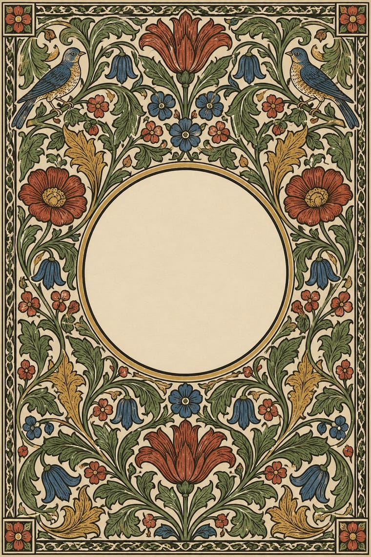
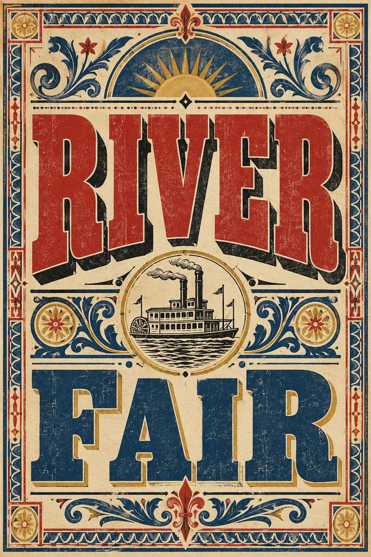
Morris reacted against exactly this commercial clutter; set the two side by side to show craft restraint versus jobbing exuberance.
01
What each style brings
Each part of the design comes from the style with the stronger say in it, and each style gives at least two.
Arts & Crafts Movement Victorian Letterpress & Wood Type
- Type from Victorian Letterpress
-
Arts avoids eclectic mixing: this is where the two pull against each other, which is the point of the contrast.
- Colour from Victorian Letterpress
- Form from Arts
- Composition from Arts
- Surface from Arts
02
The type
Open fonts standing in for each style’s own type, which is often hand-drawn or commercial.
Display · Victorian Letterpress
Amour
Abril Fatface, standing in for Fat face romans (Thorne, Figgins)
Text · Arts
A British-led reform movement that answered industrial shoddiness with honest handcraft, medieval models and the ideal of joy in labour. In graphic design it is embodied by William Morris's Kelmscott Press: dark Jenson-derived and gothic types, handmade paper, and wood-engraved borders and initials dense with stylised foliage, treating the book as one integrated, hand-made object.
EB Garamond; Arts used Golden Type and Troy and Chaucer
03
The colours
The ground and leading colours come from Victorian Letterpress, with a counter-accent from Arts. The ink reads on the ground at 4.5:1 or more.
Arts & Crafts Movement Victorian Letterpress & Wood Type
-
#efe4c9ground · 36% -
#1b1a17ink · 14% -
#b3322baccent · 18% -
#d9b45aaccent · 14% -
#24477daccent · 10% -
#5f7140accent · 8%
As CSS
:root {
  --ground: #efe4c9;
  --ink: #1b1a17;
  --accent-1: #b3322b;
  --accent-2: #d9b45a;
  --accent-3: #24477d;
  --accent-4: #5f7140;
  --font-display: "Abril Fatface", serif;
  --font-text: "EB Garamond", serif;
}
04
The two styles
05
More combinations
With Arts
- Flat Design Contrasts · Borrow one engraved border or initial to give a flat interface a crafted, editorial moment against its vector minimalism.
- Scandinavian Functionalism Pairs well · Keep the craft ethic and natural palette but reduce Morris's foliage to a single repeating motif for warmth without clutter.
- Risograph & Indie Print Culture Pairs well · Frame a two-ink riso print with a Morris-style vine border to give indie publishing an heirloom, hand-made gravity.
- Die Neue Typographie Contrasts · Tschichold's asymmetric, unornamented page was built against this centred, bordered book; set them side by side to argue tradition versus machine age.
- Gothic Blackletter & Fraktur Tradition Pairs well · Morris's Kelmscott Press revived gothic type (Troy and Chaucer) inside dense woodcut borders; join the broken letter to foliate frames and handmade paper for a medieval, hand-made book.
- Renaissance Book Typography Pairs well · Morris's Kelmscott Press revived Jenson's roman; pair a Renaissance text block with dense Arts & Crafts borders for a private-press feel.
- Josef Frank and Svenskt Tenn Botanical Prints Pairs well · The parent tradition: both fill a repeat with plants on linen, but Morris is symmetrical, earthy and dense with dark grounds, Frank is looser, brighter and mostly light. Pair a Morris-style framed book page with Frank-style endpapers.
- Italian Futurism Contrasts · Arts & Crafts handwork is everything Futurism wanted to burn; juxtapose them to stage machine against hand.
With Victorian Letterpress
- Hand-Painted Signage & Vernacular Lettering Pairs well · Sign writers and type founders traded letterforms; add brushed shading and drop shadows to wood-type headlines for a street-made feel.
- Push Pin Style Pairs well · Push Pin revived Victorian display faces with irony; mix one wood-type headline with modern illustration for the same knowing nostalgia.
- International Typographic Style Contrasts · One face, flush left and white space against a centred clamour of faces: use the contrast to test whether hierarchy needs variety at all.
- HfG Ulm Systematic Design Contrasts · A Victorian mixed-face handbill is the clutter Ulm's one-family rule was meant to cure; use it as a before-and-after foil.
- Victorian Colour Toy Books (Evans, Crane, Caldecott and Greenaway) Contrasts · Its black-letter-dense, type-and-ornament jobbing page is the opposite of a picture-led page; combine them by hanging a wood-type title over a flat colour picture.
- Dada Pairs well · Raid Victorian wood type and stock ornaments as the Dadaists did, but scatter them instead of centring them.
- American Four-Colour Comic Book (Golden to Bronze Age) Pairs well · Both are cheap letterpress print that shouts to passers-by; borrow the playbill's stacked display capitals, banners and rules for a comic cover's blurbs and price box, while keeping the comic's hand-drawn letters and keyline art.
- Urdu Katib Lithography Contrasts · Movable-type jobbing print is the technology Urdu turned down; set its centred, mixed metal faces against a flowing, hand-ruled lithographic page.