Style combination · Contrasts
Victorian Letterpress × Victorian Colour Toy Books
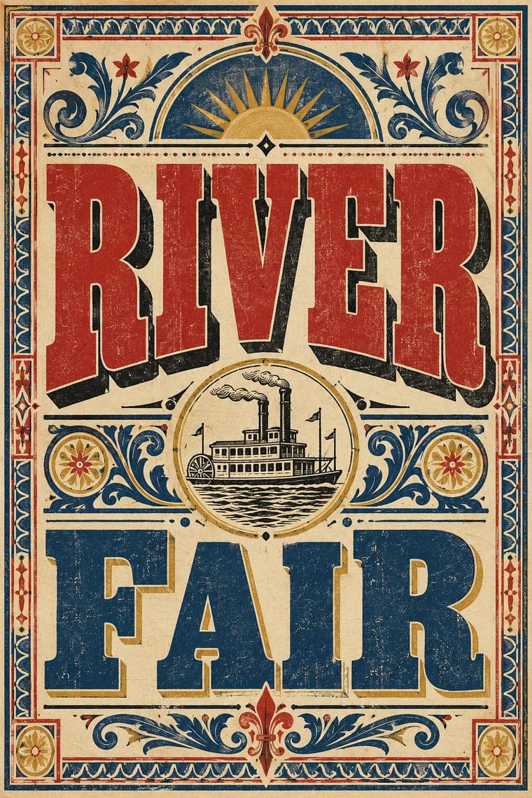
Its black-letter-dense, type-and-ornament jobbing page is the opposite of a picture-led page; combine them by hanging a wood-type title over a flat colour picture.
Mix them and make something Victorian Letterpress Victorian Colour Toy Books
01
What each style brings
Each part of the design comes from the style with the stronger say in it, and each style gives at least two.
Victorian Letterpress & Wood Type Victorian Colour Toy Books (Evans, Crane, Caldecott and Greenaway)
- Type from Victorian Letterpress
- Colour from Victorian Colour Toy Books
- Form from Victorian Colour Toy Books
- Composition from Victorian Letterpress
- Surface from Victorian Letterpress
02
The type
Open fonts standing in for each style’s own type, which is often hand-drawn or commercial.
Display · Victorian Letterpress
Yay!
Abril Fatface, standing in for Fat face romans (Thorne, Figgins)
Text · Victorian Colour Toy Books
Mass-printed children's picture books in which a black key block and flat colour blocks (generally up to a dozen, as few as four), printed by Edmund Evans from wood, carried pictures that dominated short texts. The illustrators Walter Crane (flat tints and sharp outlines, influenced by Japanese colour prints), Randolph Caldecott (loose, comic movement) and Kate Greenaway (dainty colours and invented late-18th-century and Regency costume) gave the format three distinct hands under one genome; image.comic belongs to Caldecott only.
EB Garamond; Victorian Colour Toy Books used Hand-lettered titles and verses and Wood-engraved display lettering
03
The colours
The ground and leading colours come from Victorian Colour Toy Books, with a counter-accent from Victorian Letterpress. The ink reads on the ground at 4.5:1 or more.
Victorian Letterpress & Wood Type Victorian Colour Toy Books (Evans, Crane, Caldecott and Greenaway)
-
#f1e6ccground · 36% -
#2b2622ink · 14% -
#e0a93baccent · 18% -
#b3322baccent · 14% -
#4f7ea6accent · 10% -
#8fae8baccent · 8%
As CSS
:root {
  --ground: #f1e6cc;
  --ink: #2b2622;
  --accent-1: #e0a93b;
  --accent-2: #b3322b;
  --accent-3: #4f7ea6;
  --accent-4: #8fae8b;
  --font-display: "Abril Fatface", serif;
  --font-text: "EB Garamond", serif;
}
04
The two styles
05
More combinations
With Victorian Letterpress
- Hand-Painted Signage & Vernacular Lettering Pairs well · Sign writers and type founders traded letterforms; add brushed shading and drop shadows to wood-type headlines for a street-made feel.
- Push Pin Style Pairs well · Push Pin revived Victorian display faces with irony; mix one wood-type headline with modern illustration for the same knowing nostalgia.
- International Typographic Style Contrasts · One face, flush left and white space against a centred clamour of faces: use the contrast to test whether hierarchy needs variety at all.
- Arts & Crafts Movement Contrasts · Morris reacted against exactly this commercial clutter; set the two side by side to show craft restraint versus jobbing exuberance.
- HfG Ulm Systematic Design Contrasts · A Victorian mixed-face handbill is the clutter Ulm's one-family rule was meant to cure; use it as a before-and-after foil.
- Dada Pairs well · Raid Victorian wood type and stock ornaments as the Dadaists did, but scatter them instead of centring them.
- American Four-Colour Comic Book (Golden to Bronze Age) Pairs well · Both are cheap letterpress print that shouts to passers-by; borrow the playbill's stacked display capitals, banners and rules for a comic cover's blurbs and price box, while keeping the comic's hand-drawn letters and keyline art.
- Urdu Katib Lithography Contrasts · Movable-type jobbing print is the technology Urdu turned down; set its centred, mixed metal faces against a flowing, hand-ruled lithographic page.
With Victorian Colour Toy Books
- Polish Information Picture Book (Dwie Siostry) Pairs well · Both put flat printed colour and picture-led narrative first; carry the toy-book key-block approach into a modern picture book.
- Japonisme Pairs well · Crane's flattened planes and outlines owe much to Japanese prints; push the flatness further for a more graphic page.
- Arts & Crafts Movement Pairs well · Share borders and craft ideals; add Morris-style foliage frames to toy-book colour blocks for a gentler, heirloom storybook.
- Nordic Fairy-Tale and Troll Illustration (Werenskiold, Kittelsen, Bauer) Contrasts · Both are children's picture books of the same era, but the toy book's bright flat key-block colour and nursery cheer stand against this dusky, modelled and uncanny northern mood.