Style combination · Pairs well
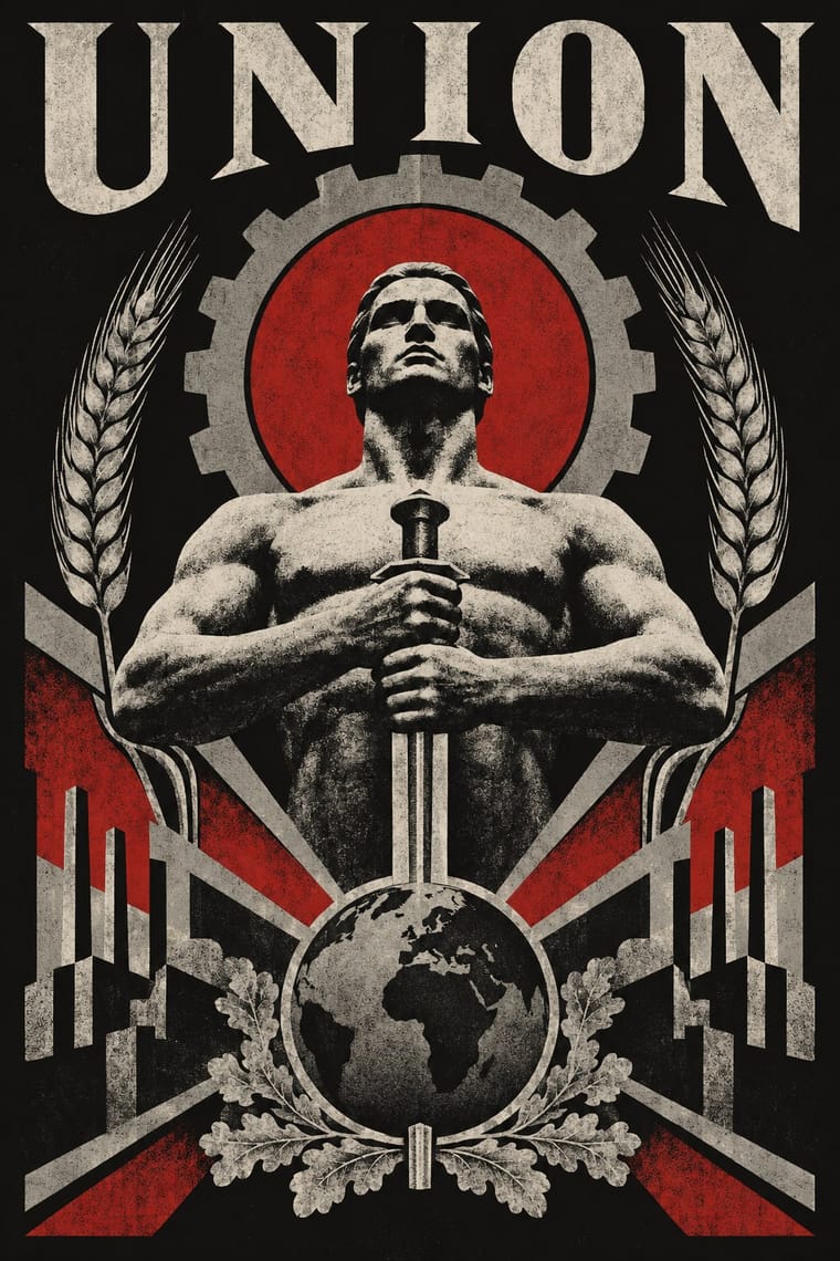
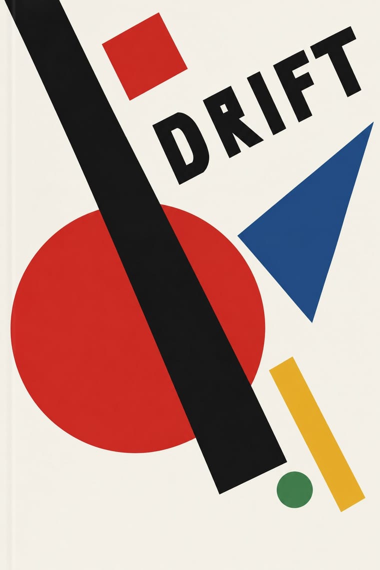
NSK Retro-Avant-Garde × Suprematism
NSK turned Malevich's black cross into a heraldic badge; set one Suprematist primitive dead centre, framed by a cog or wreath, to turn pure form into insignia.
Mix them and make something NSK Retro-Avant-Garde Suprematism
01
What each style brings
Each part of the design comes from the style with the stronger say in it, and each style gives at least two.
NSK Retro-Avant-Garde Suprematism
- Type from NSK Retro-Avant-Garde
- Colour from Suprematism
- Form from Suprematism
- Composition from NSK Retro-Avant-Garde
- Surface from NSK Retro-Avant-Garde
02
The type
Open fonts standing in for each style’s own type, which is often hand-drawn or commercial.
Display · NSK Retro-Avant-Garde
Vow
Special Gothic Expanded One; NSK Retro-Avant-Garde used Heavy block sans capitals for the name LAIBACH on the 1980 Thrower posters and Constructed mixed-case display capitals of the 'NEUE SLOWENISCHE KUNST' wordmark under the NSK coat of arms
Text · Suprematism
Kazimir Malevich's non-objective art, unveiled with the Black Square at the 0.10 exhibition in Petrograd in 1915, reduced painting to pure geometric planes floating in white, infinite space. Through the UNOVIS collective in Vitebsk and El Lissitzky's books it became a graphic language of squares, bars and circles tilted on dynamic diagonals, the seedbed of Constructivist layout.
Hanken Grotesk; Suprematism used Russian grotesques (rubleny shrift) as set by Lissitzky and Hand-drawn lithographic lettering of UNOVIS publications
03
The colours
The ground and leading colours come from Suprematism, with a counter-accent from NSK Retro-Avant-Garde. The ink reads on the ground at 4.5:1 or more.
NSK Retro-Avant-Garde Suprematism
-
#f4f1e8ground · 36% -
#121212ink · 14% -
#e9b824accent · 18% -
#b31b1baccent · 14% -
#8c8c88accent · 10% -
#2a4d8faccent · 8%
As CSS
:root {
  --ground: #f4f1e8;
  --ink: #121212;
  --accent-1: #e9b824;
  --accent-2: #b31b1b;
  --accent-3: #8c8c88;
  --accent-4: #2a4d8f;
  --font-display: "Special Gothic Expanded One", sans-serif;
  --font-text: "Hanken Grotesk", sans-serif;
}
Use it with care
NSK Retro-Avant-Garde: NSK's sources include Nazi propaganda, and its emblem incorporates John Heartfield's swastika of axes: taken out of its context such imagery reads as endorsement rather than critique, and showing Nazi symbols is restricted by law in Germany and several other countries. The black cross, the NSK coat of arms and the NSK passport belong to living artists who still use them, so do not copy them. Make a new quotation from public-domain state imagery, and only for a setting that can carry the provocation and make its critical frame clear. The NSK passport, an art project that is not valid for travel, has been taken for a real document: there are stories of holders crossing a border on one when their Bosnian passport failed in the 1990s, and by 2007 a growing number of applicants from one town in Nigeria treated it, in IRWIN's words, as 'a viable document'. Never make a mock passport, ID card, stamp or banknote that could be mistaken for, or used as, a real state document.
04
The two styles
05
More combinations
With NSK Retro-Avant-Garde
- Socialist Realist Propaganda Poster Contrasts · The same workers, torches and flags, but socialist realism believes them and NSK joins them to their enemies; choose between them by asking whether the viewer should be moved or made uneasy.
- Post-Punk Record Sleeve (Stiff, Factory, 4AD) Pairs well · Both quote an earlier image whole on a quiet or dark field and let a coded title do the rest; borrow Saville's restraint to make an NSK-style quotation read as a designed object rather than a provocation.
- Punk & DIY Zine Contrasts · Both answered power in the early 1980s, but punk is crude, cut-up and loud while NSK is polished, centred and solemn; use the pair to choose between shouting at power and impersonating it.
- AIZ Political Photomontage (Heartfield) Contrasts · NSK lifts Nazi and socialist emblems whole into solemn, centred heraldry and over-identifies with power, leaving the verdict open; AIZ builds the same kind of centred emblem, like the axe swastika, but always adds a caption that convicts. Choose by whether the viewer should be left uneasy or told what to think.
- Solidarność & Polish Underground Graphics Contrasts · Both answered a socialist state in the 1980s, but NSK impersonates power in solemn, centred heraldry, while the Polish underground mocked it with jokes, and the Orange Alternative with dwarfs, and Solidarity kept its reverence for church and nation; choose between over-identifying and laughing.
- Zagreb Modernist Graphics (EXAT 51 to Teatar &TD) Contrasts · A later Yugoslav answer to power: Ljubljana's retro-avant-garde of the 1980s lifts socialist, Nazi and religious emblems whole and joins them in solemn heraldry, while Zagreb's designers of the 1950s–70s kept such emblems out and built their posters from abstract units and letters; choose between impersonating power through its symbols and a sign system with none.
With Suprematism
- Russian Constructivism Pairs well · Add photomontage and heavy grotesque slogans to Suprematist floating planes to turn pure form into a message.
- Socialist Realist Propaganda Poster Contrasts · The doctrine that outlawed non-objective art; set a pure red wedge against heroic figuration to show the 1930s rupture.
- Victorian Letterpress & Wood Type Contrasts · Crowded, ornamented Victorian bills make Suprematist emptiness feel even more radical; use the clash for editorial openers.
- Minimalist Graphic Design Pairs well · Both trust a few shapes on an empty field; borrow the Suprematist diagonal to animate a static minimal layout.
- Russian Futurist Book Contrasts · Malevich went from drawing crude figures in these books to pure geometry on white; pick Suprematism for cosmic order and the Futurist book for crowded, earthy handwork.
- Kultur-Lige & Yiddish Avant-Garde Book Design Pairs well · Lissitzky moved from one to the other in 1919, giving Had Gadya a Suprematist inner jacket; set a folk figure and a drawn verse against a few floating planes to keep a story inside an abstract page.
- Mechano-Faktura & Polish Constructivist Advertising Pairs well · Borrow its flat geometric primitives, then fill them with Berlewi's mechanical line rhythm.