Style combination · Pairs well
Kultur-Lige × Suprematism
Lissitzky moved from one to the other in 1919, giving Had Gadya a Suprematist inner jacket; set a folk figure and a drawn verse against a few floating planes to keep a story inside an abstract page.
01
What each style brings
Each part of the design comes from the style with the stronger say in it, and each style gives at least two.
Kultur-Lige & Yiddish Avant-Garde Book Design Suprematism
- Type from Kultur-Lige
- Colour from Suprematism
- Form from Kultur-Lige
-
Suprematism avoids stylised figuration: this is where the two pull against each other.
- Composition from Suprematism
- Surface from Kultur-Lige
02
The type
Open fonts standing in for each style’s own type, which is often hand-drawn or commercial.
Display · Kultur-Lige
Rise
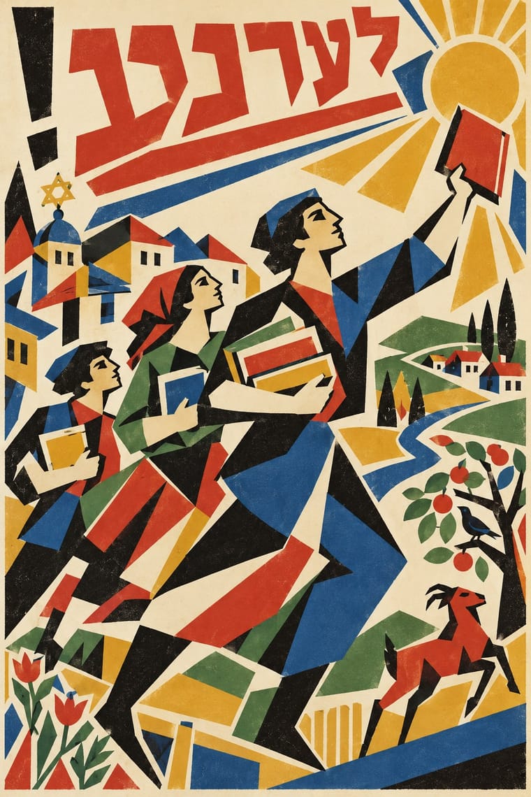
Archivo Black; Kultur-Lige used The scribe's square Hebrew script (ktav ashuri), written by a sofer for Sikhes khulin (1917), whose 'wonderful' style Lissitzky set out to match in his illustrations and Lissitzky's hand-drawn Yiddish verses lithographed into each picture of Had Gadya (1919), the refrain running along the margins and closing in a circle at the foot
Text · Suprematism
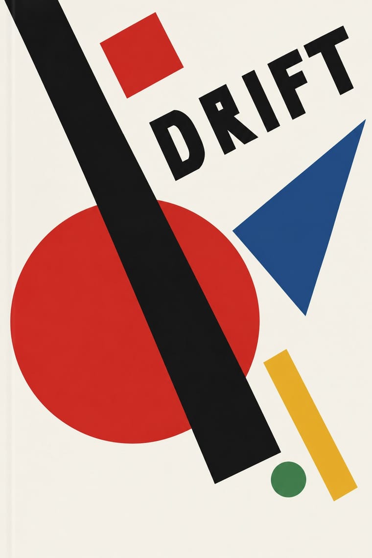
Kazimir Malevich's non-objective art, unveiled with the Black Square at the 0.10 exhibition in Petrograd in 1915, reduced painting to pure geometric planes floating in white, infinite space. Through the UNOVIS collective in Vitebsk and El Lissitzky's books it became a graphic language of squares, bars and circles tilted on dynamic diagonals, the seedbed of Constructivist layout.
Hanken Grotesk; Suprematism used Russian grotesques (rubleny shrift) as set by Lissitzky and Hand-drawn lithographic lettering of UNOVIS publications
03
The colours
The ground and leading colours come from Suprematism, with a counter-accent from Kultur-Lige. The ink reads on the ground at 4.5:1 or more.
Kultur-Lige & Yiddish Avant-Garde Book Design Suprematism
-
#f4f1e8ground · 36% -
#121212ink · 14% -
#e9b824accent · 18% -
#cf2a27accent · 14% -
#2a4d8faccent · 10% -
#3f7d4eaccent · 8%
As CSS
:root {
  --ground: #f4f1e8;
  --ink: #121212;
  --accent-1: #e9b824;
  --accent-2: #cf2a27;
  --accent-3: #2a4d8f;
  --accent-4: #3f7d4e;
  --font-display: "Archivo Black", sans-serif;
  --font-text: "Hanken Grotesk", sans-serif;
}
Use it with care
Kultur-Lige & Yiddish Avant-Garde Book Design: These books quote sacred forms: Hebrew letters, the divine name (written in Had Gadya), scroll formats and scribal square script, synagogue art and tombstone inscriptions. Do not use the letters as decorative glyphs or mirror them; have any Yiddish or Hebrew written and checked by a fluent reader, and keep divine names and scroll and tombstone forms off throwaway or commercial items. The movement was secular and Yiddishist, a modern Jewish culture in Yiddish backed by Jewish socialist parties, Folkists and left-wing Zionists, not the Hebrew, Zionist art of Bezalel and not religious art, so do not present it as a generic 'Jewish look', and do not reduce its folk figures to stereotyped shtetl types. Many of its people were persecuted: Ryback's father was killed in the pogroms, and Hofshteyn, Markish, Bergelson and Kvitko were executed in Moscow on 12 August 1952. Chagall (d. 1985) and Chaikov (d. 1979) are still in copyright: draw your own letters and figures rather than reproducing their pages.
04
The two styles
05
More combinations
With Kultur-Lige
- Bezalel School Contrasts · Two Jewish national arts of the same years with hand-drawn Hebrew letters: Bezalel's Zionist, biblical pictures in gilded symmetrical frames in Jerusalem, and the Kultur-Lige's secular Yiddish children's books in faceted avant-garde planes in Kyiv; never merge them into one 'Jewish style'.
- Russian Futurist Book Contrasts · Its parent in method: artists drawing the whole page and printing it by lithography in small runs. The Futurist book is Cyrillic, mostly black and deliberately crude; the Kultur-Lige book is in Yiddish, earnest, and at its most ambitious in colour, and builds its pages from the Hebrew letter and synagogue ornament.
- Leningrad Avant-Garde Picture Book Contrasts · The Leningrad picture book that followed is in Russian, uses flat cut-paper figures floating on white and drops folk ornament; choose the Kultur-Lige page when letters and ornament must carry a culture's memory.
- Russian Constructivism Contrasts · Lissitzky's next step: grotesque type, rules and photomontage replaced the drawn letter and folk motif; compare them to decide between a handmade, culturally rooted page and a machine-age one.
With Suprematism
- Russian Constructivism Pairs well · Add photomontage and heavy grotesque slogans to Suprematist floating planes to turn pure form into a message.
- Socialist Realist Propaganda Poster Contrasts · The doctrine that outlawed non-objective art; set a pure red wedge against heroic figuration to show the 1930s rupture.
- Victorian Letterpress & Wood Type Contrasts · Crowded, ornamented Victorian bills make Suprematist emptiness feel even more radical; use the clash for editorial openers.
- Minimalist Graphic Design Pairs well · Both trust a few shapes on an empty field; borrow the Suprematist diagonal to animate a static minimal layout.
- Russian Futurist Book Contrasts · Malevich went from drawing crude figures in these books to pure geometry on white; pick Suprematism for cosmic order and the Futurist book for crowded, earthy handwork.
- NSK Retro-Avant-Garde Pairs well · NSK turned Malevich's black cross into a heraldic badge; set one Suprematist primitive dead centre, framed by a cog or wreath, to turn pure form into insignia.
- Mechano-Faktura & Polish Constructivist Advertising Pairs well · Borrow its flat geometric primitives, then fill them with Berlewi's mechanical line rhythm.