Style combination · Pairs well
Mechano-Faktura × Suprematism
Borrow its flat geometric primitives, then fill them with Berlewi's mechanical line rhythm.
01
What each style brings
Each part of the design comes from the style with the stronger say in it, and each style gives at least two.
Mechano-Faktura & Polish Constructivist Advertising Suprematism
- Type from Suprematism
- Colour from Mechano-Faktura
- Form from Mechano-Faktura
- Composition from Suprematism
- Surface from Suprematism
02
The type
Open fonts standing in for each style’s own type, which is often hand-drawn or commercial.
Display · Suprematism
Circuit
Six Caps, standing in for Russian grotesques (rubleny shrift) as set by Lissitzky
Text · Mechano-Faktura
Henryk Berlewi's system of two-dimensional pictures built mechanically from rhythmic parallel lines, circles and squares in black, white and red. It rejected the illusion of space and was promptly applied to commercial advertising, brochures and packaging by the agency Reklama-Mechano. Unlike Russian Constructivism, it was a theory of mechanical surface texture sold to business, with no photomontage, diagonals or agitprop. Berlewi quit the research in 1926 and returned to figurative art.
Jost; Mechano-Faktura used Lettering not verified; no typeface attribution confirmed and Geometric sans-serif display lettering is an unconfirmed assumption
03
The colours
The ground and leading colours come from Mechano-Faktura, with a counter-accent from Suprematism. The ink reads on the ground at 4.5:1 or more.
Mechano-Faktura & Polish Constructivist Advertising Suprematism
-
#ffffffground · 36% -
#111111ink · 14% -
#d62718accent · 18% -
#e9b824accent · 14% -
#2a4d8faccent · 10% -
#3f7d4eaccent · 8%
As CSS
:root {
  --ground: #ffffff;
  --ink: #111111;
  --accent-1: #d62718;
  --accent-2: #e9b824;
  --accent-3: #2a4d8f;
  --accent-4: #3f7d4e;
  --font-display: "Six Caps", sans-serif;
  --font-text: "Jost", sans-serif;
}
04
The two styles
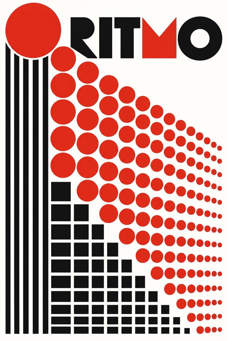
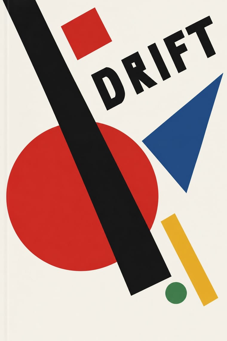
05
More combinations
With Mechano-Faktura
- Die Neue Typographie Pairs well · Pair the line-field image with asymmetric sans setting for an advertising layout.
- De Stijl Pairs well · Shared flat colour and orthogonal discipline; swap the Dutch primaries for red-black-white.
- Art Nouveau Contrasts · Whiplash curves and ornament against strict mechanical lines.
With Suprematism
- Russian Constructivism Pairs well · Add photomontage and heavy grotesque slogans to Suprematist floating planes to turn pure form into a message.
- Socialist Realist Propaganda Poster Contrasts · The doctrine that outlawed non-objective art; set a pure red wedge against heroic figuration to show the 1930s rupture.
- Victorian Letterpress & Wood Type Contrasts · Crowded, ornamented Victorian bills make Suprematist emptiness feel even more radical; use the clash for editorial openers.
- Minimalist Graphic Design Pairs well · Both trust a few shapes on an empty field; borrow the Suprematist diagonal to animate a static minimal layout.
- Russian Futurist Book Contrasts · Malevich went from drawing crude figures in these books to pure geometry on white; pick Suprematism for cosmic order and the Futurist book for crowded, earthy handwork.
- NSK Retro-Avant-Garde Pairs well · NSK turned Malevich's black cross into a heraldic badge; set one Suprematist primitive dead centre, framed by a cog or wreath, to turn pure form into insignia.
- Kultur-Lige & Yiddish Avant-Garde Book Design Pairs well · Lissitzky moved from one to the other in 1919, giving Had Gadya a Suprematist inner jacket; set a folk figure and a drawn verse against a few floating planes to keep a story inside an abstract page.