Style combination · Contrasts
Sovietwave × Synthwave
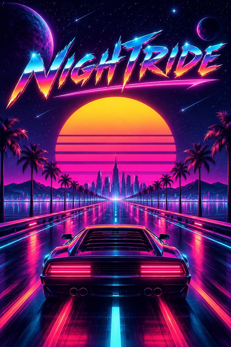
Choose synthwave for American chrome, neon and palm-tree sunsets; choose sovietwave for muted print colours, Cyrillic and Space Age housing blocks.
01
What each style brings
Each part of the design comes from the style with the stronger say in it, and each style gives at least two.
Sovietwave Synthwave / Outrun
- Type from Sovietwave
- Colour from Synthwave
-
Sovietwave avoids fluorescent & neon: this is where the two pull against each other, which is the point of the contrast.
- Form from Synthwave
- Composition from Synthwave
-
Sovietwave avoids central symmetry: this is where the two pull against each other, which is the point of the contrast.
- Surface from Sovietwave
02
The type
Open fonts standing in for each style’s own type, which is often hand-drawn or commercial.
Display · Sovietwave
Daydream
VT323, standing in for VHS and CRT on-screen lettering and teletext-like pixel type
Text · Sovietwave
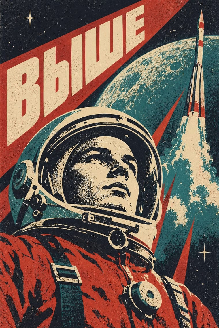
A post-Soviet internet aesthetic pairing synthwave's music and VHS glow with Space Age Soviet imagery and Cyrillic captions: nostalgia for the past future (Natalija Majsova), a lost technological optimism. Visually it diverges from synthwave, with muted print colours and little neon. It is not endorsement of the Soviet state; critics call it a romanticised myth (Shevchenko) or one that ignores harsh realities (Molchat Doma), and Ukrainian artists may reject the label. Use state symbols with care.
VT323; Sovietwave used Plain Soviet-era sans lettering, such as the period Zhurnalnaya rublenaya (Polygraphmash, 1947), which the look draws on; no source ties it to specific sovietwave works and Hand-drawn Soviet poster and film-title lettering in Cyrillic
03
The colours
The ground and leading colours come from Synthwave, with a counter-accent from Sovietwave. The ink reads on the ground at 4.5:1 or more.
Sovietwave Synthwave / Outrun
-
#0d0221ground · 36% -
#ffd319ink · 14% -
#05d9e8accent · 18% -
#43d5e0accent · 14% -
#ff9f1caccent · 10% -
#d9a441accent · 8%
As CSS
:root {
  --ground: #0d0221;
  --ink: #ffd319;
  --accent-1: #05d9e8;
  --accent-2: #43d5e0;
  --accent-3: #ff9f1c;
  --accent-4: #d9a441;
  --font-display: "VT323", monospace;
  --font-text: "VT323", monospace;
}
Use it with care
Synthwave / Outrun: Since about 2015 far-right 'fashwave' has appropriated synthwave, setting fascist symbols, classical statues and slogans on neon grids and swapping the classic neon sun for the Nazi Black Sun; keep the sun a plain banded disc, avoid sunwheel, eagle and bust-plus-slogan layouts, and check where borrowed fan art and music come from.
04
The two styles
05
More combinations
With Sovietwave
- Socialist Realist Propaganda Poster Contrasts · Heroic state painting and slogans are the official register; sovietwave keeps poster compositions but is a private, melancholy longing rather than a command.
- Vaporwave Pairs well · Its Western counterpart: share the degraded found footage and wistfulness, but replace the mall and pastel irony with Soviet space imagery.
- Thaw Modernism (Soviet and Czechoslovak) Pairs well · The real period style sovietwave quotes: take its flat optimistic cosmonaut figures and flat optimistic fields, then add grain and scanlines for the memory-of-a-memory look.
With Synthwave
- Hong Kong Neon & Beiwei Shop-Sign Lettering Pairs well · Real neon-tube shop lettering gives synthwave's painted glow a street-level counterpart for night-market, bar or club identities; use real Beiwei forms and credit the sign-makers rather than dressing the scene in random Chinese characters.
- Dark Tech Minimalism Contrasts · Both live on dark grounds, but dark tech minimalism keeps gradients faint and drops nostalgia and ornament; switch to it when the neon sunset would shout over the content.
- Bitmap & Pixel Graphics Pairs well · Pixel sprites and bitmap type are synthwave's arcade inheritance, as Hotline Miami shows; set them over the neon grid for game key art and title screens.
- Rave & Acid House Graphics Pairs well · Both put chrome logotypes and airbrushed fantasy horizons in neon on black; borrow the flyer's crammed line-up reverse to turn a synthwave key visual into a working event poster.
- Vaporwave Contrasts · Vaporwave takes the same grids and neon into pastel, ironic collage of malls, desktops and stock imagery; choose synthwave for a heartfelt or affectionately parodic night drive and vaporwave when the nostalgia itself should be questioned.
- Analog Horror Graphics Contrasts · Both finish 1980s screens with VHS tracking noise, scanlines and grain, but synthwave treats the decade with affection, in neon grids, chrome type and sunsets, while analog horror makes it a flat, official screen that is failing. Keep neon and chrome out, and let the noise mean something is wrong.
- Polish Cold War Neon (PRL Neonisation) Contrasts · Synthwave remembers neon as a glowing grid, chrome and sunset gradients on a screen; the Polish signs were real tubes in one or two colours with no gradients. Use the contrast to keep a neon revival honest to the single line.
- Cassette Futurism Contrasts · Neon grids and chrome sunsets show a glamorous 1980s; cassette futurism shows its workaday machinery.