Style combination · Contrasts
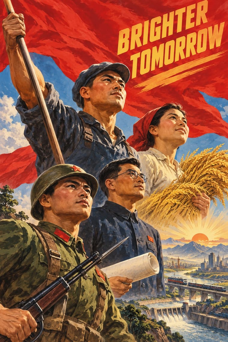
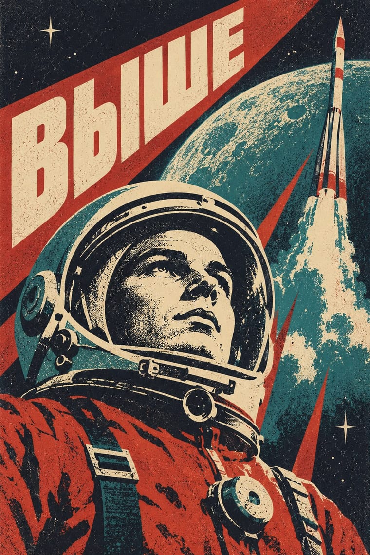
Socialist Realist Propaganda Poster × Sovietwave
Heroic state painting and slogans are the official register; sovietwave keeps poster compositions but is a private, melancholy longing rather than a command.
Mix them and make something Socialist Realist Propaganda Poster Sovietwave
01
What each style brings
Each part of the design comes from the style with the stronger say in it, and each style gives at least two.
Socialist Realist Propaganda Poster Sovietwave
- Type from Socialist Realist Propaganda Poster
- Colour from Sovietwave
- Form from Socialist Realist Propaganda Poster
- Composition from Socialist Realist Propaganda Poster
- Surface from Sovietwave
02
The type
Open fonts standing in for each style’s own type, which is often hand-drawn or commercial.
Display · Socialist Realist Propaganda Poster
New
Big Shoulders, standing in for Hand-drawn Cyrillic poster capitals in condensed grotesque and slab forms
Text · Sovietwave
A post-Soviet internet aesthetic pairing synthwave's music and VHS glow with Space Age Soviet imagery and Cyrillic captions: nostalgia for the past future (Natalija Majsova), a lost technological optimism. Visually it diverges from synthwave, with muted print colours and little neon. It is not endorsement of the Soviet state; critics call it a romanticised myth (Shevchenko) or one that ignores harsh realities (Molchat Doma), and Ukrainian artists may reject the label. Use state symbols with care.
VT323; Sovietwave used Plain Soviet-era sans lettering, such as the period Zhurnalnaya rublenaya (Polygraphmash, 1947), which the look draws on; no source ties it to specific sovietwave works and Hand-drawn Soviet poster and film-title lettering in Cyrillic
03
The colours
The ground and leading colours come from Sovietwave, with a counter-accent from Socialist Realist Propaganda Poster. The ink reads on the ground at 4.5:1 or more.
Socialist Realist Propaganda Poster Sovietwave
-
#1c1f2eground · 36% -
#e8dcc0ink · 14% -
#43d5e0accent · 18% -
#f2c230accent · 14% -
#c8102eaccent · 10% -
#2f6f73accent · 8%
As CSS
:root {
  --ground: #1c1f2e;
  --ink: #e8dcc0;
  --accent-1: #43d5e0;
  --accent-2: #f2c230;
  --accent-3: #c8102e;
  --accent-4: #2f6f73;
  --font-display: "Big Shoulders", sans-serif;
  --font-text: "VT323", monospace;
}
04
The two styles
05
More combinations
With Socialist Realist Propaganda Poster
- Cuban Revolutionary Poster (OSPAAAL & ICAIC) Contrasts · Cuban designers rejected Soviet realism for pop and op graphics; compare them to decide whether a cause needs heroes or wit.
- Taller de Gráfica Popular Pairs well · TGP shared the social commitment with a carved linocut line; borrow its grit to make heroic imagery feel grassroots.
- WPA Silkscreen Posters Pairs well · Both mobilised a 1930s public; combine WPA flat silkscreen colour with heroic low-angle diagonals for civic campaigns.
- Russian Constructivism Contrasts · Same revolution, opposite means: set Constructivist abstraction beside heroic realism to show the 1932 turn from experiment to doctrine.
- Shanghai Modern & Yuefenpai Contrasts · After 1949 the same painters and rubbed-watercolour technique served propaganda; compare how one rendering style sells glamour versus ideology.
- Chinese National-Style Animation (Shanghai Animation Film Studio) Contrasts · Made in the same state and decades, and like it an official art: the national style was pursued with state backing and its fables carried lessons. But where socialist realism pictured idealised heroes in legible, illusionistic realism, the studio found its forms in ink painting, cut paper, opera and murals; set one against the other to separate a painted, traditional idiom from heroic realism.
- ROSTA Windows Contrasts · The heroic, naturalistic painting that displaced it in the 1930s is the exact opposite of its crude, satirical shorthand.
- Minjung Woodcut Graphics (Korean People's Art) Contrasts · State posters paint polished heroes from above; Minjung prints cut rough, grieving and dancing people from below.
All 32 combinations with Socialist Realist Propaganda Poster
With Sovietwave
- Synthwave / Outrun Contrasts · Choose synthwave for American chrome, neon and palm-tree sunsets; choose sovietwave for muted print colours, Cyrillic and Space Age housing blocks.
- Vaporwave Pairs well · Its Western counterpart: share the degraded found footage and wistfulness, but replace the mall and pastel irony with Soviet space imagery.
- Thaw Modernism (Soviet and Czechoslovak) Pairs well · The real period style sovietwave quotes: take its flat optimistic cosmonaut figures and flat optimistic fields, then add grain and scanlines for the memory-of-a-memory look.