Style combination · Pairs well
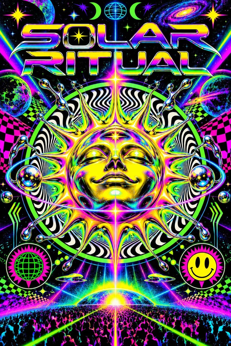
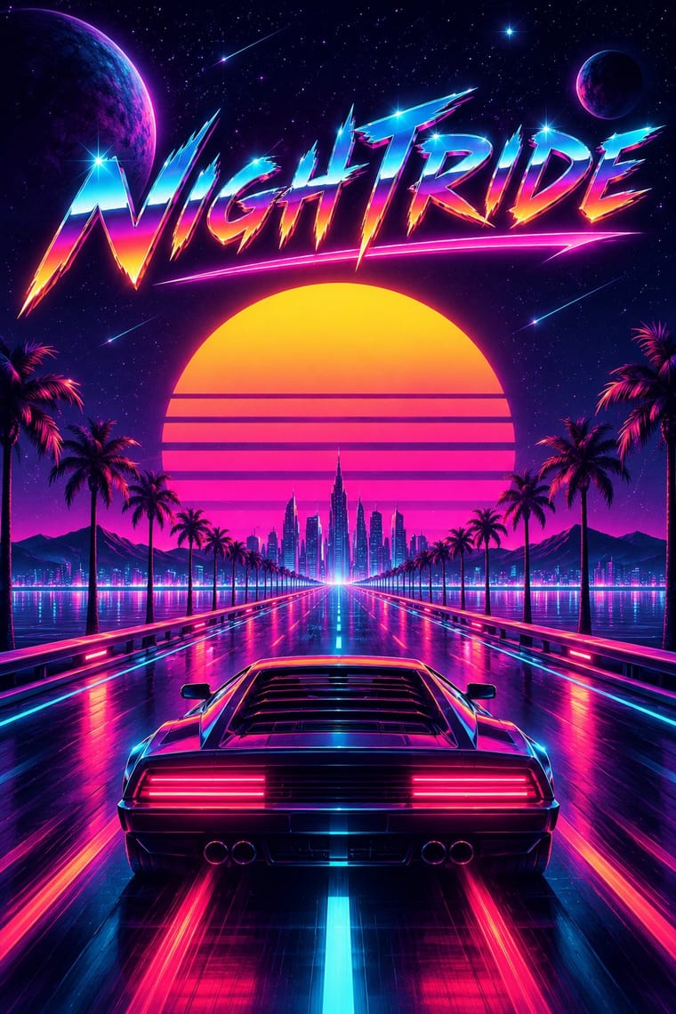
Rave × Synthwave
Both put chrome logotypes and airbrushed fantasy horizons in neon on black; borrow the flyer's crammed line-up reverse to turn a synthwave key visual into a working event poster.
01
What each style brings
Each part of the design comes from the style with the stronger say in it, and each style gives at least two.
Rave & Acid House Graphics Synthwave / Outrun
- Type from Rave
- Colour from Rave
- Form from Rave
- Composition from Synthwave
- Surface from Synthwave
02
The type
Open fonts standing in for each style’s own type, which is often hand-drawn or commercial.
Text · Synthwave
The retro-futurist look of synthwave music: a 1980s revival that grew from mid-2000s French electro and online synth scenes, took its other name from Sega's arcade racer Out Run (1986) and reached the mainstream with Drive (2011). Its register runs from the brooding night drives of Kavinsky and Hotline Miami to the affectionate parody of Far Cry 3: Blood Dragon and Kung Fury. The visuals, settled around 2010–2013, recall the era's film posters, arcades and VHS: a neon grid running to a banded setting sun, chrome logotypes and hot-pink script, palms and sports cars at night, tape noise.
VT323; Synthwave used Mistral (Roger Excoffon, Fonderie Olive, 1953), the brush script set in hot pink for the Drive poster title and Custom chrome-bevelled, airbrushed logotypes with star glints, after 1980s film-poster and arcade titles
03
The colours
The ground and leading colours come from Rave, with a counter-accent from Synthwave. The ink reads on the ground at 4.5:1 or more.
Rave & Acid House Graphics Synthwave / Outrun
-
#0a0a0aground · 36% -
#ffe600ink · 14% -
#ff00b4accent · 18% -
#05d9e8accent · 14% -
#ff9f1caccent · 10% -
#6a00ffaccent · 8%
As CSS
:root {
  --ground: #0a0a0a;
  --ink: #ffe600;
  --accent-1: #ff00b4;
  --accent-2: #05d9e8;
  --accent-3: #ff9f1c;
  --accent-4: #6a00ff;
  --font-display: "Michroma", sans-serif;
  --font-text: "VT323", monospace;
}
Use it with care
Synthwave / Outrun: Since about 2015 far-right 'fashwave' has appropriated synthwave, setting fascist symbols, classical statues and slogans on neon grids and swapping the classic neon sun for the Nazi Black Sun; keep the sun a plain banded disc, avoid sunwheel, eagle and bust-plus-slogan layouts, and check where borrowed fan art and music come from.
04
The two styles
05
More combinations
With Rave
- Acid Graphics / New Ugly Pairs well · Acid graphics is rave's digital heir; reuse the chrome logotype and fluorescent-on-black palette with contemporary 3D tools.
- Corporate Identity Modernism Contrasts · Rave flyers parodied corporate logos; set a sober corporate mark beside its flyer pastiche to make the détournement legible.
- Y2K Futurism Pairs well · Share chrome, gradients and techno optimism; combine them for a late-1990s club-to-millennium look.
- Dark Tech Minimalism Contrasts · Both live on black, but one whispers and one shouts; borrow a single neon gradient to wake up a restrained dark interface.
- Brazilian Baile Funk Digital Flyer Contrasts · Both advertise a club night, but the rave flyer uses a central emblem and dense printed text, while this idiom puts a portrait group in front of one giant title.
- Demoscene Graphics (Cracktros, Demos & Text-Mode Art) Pairs well · Rave flyers and scene logos share chrome lettering on black and the same 1990s tracker-and-techno culture; animate a flyer's line-up as a demo-style scroller for party visuals.
- Psychedelic Poster Pairs well · Carry the vibrating fluorescent palette into rave-style chrome and airbrush to signal the 1960s-to-1990s lineage on purpose.
- Gabber and Hardcore Graphics (Rotterdam and Thunderdome) Pairs well · Shares the flyer's info-heavy format and logotype culture, but hardens psychedelia into horror and menace and avoids the gradient and iridescence.
With Synthwave
- Hong Kong Neon & Beiwei Shop-Sign Lettering Pairs well · Real neon-tube shop lettering gives synthwave's painted glow a street-level counterpart for night-market, bar or club identities; use real Beiwei forms and credit the sign-makers rather than dressing the scene in random Chinese characters.
- Dark Tech Minimalism Contrasts · Both live on dark grounds, but dark tech minimalism keeps gradients faint and drops nostalgia and ornament; switch to it when the neon sunset would shout over the content.
- Bitmap & Pixel Graphics Pairs well · Pixel sprites and bitmap type are synthwave's arcade inheritance, as Hotline Miami shows; set them over the neon grid for game key art and title screens.
- Vaporwave Contrasts · Vaporwave takes the same grids and neon into pastel, ironic collage of malls, desktops and stock imagery; choose synthwave for a heartfelt or affectionately parodic night drive and vaporwave when the nostalgia itself should be questioned.
- Analog Horror Graphics Contrasts · Both finish 1980s screens with VHS tracking noise, scanlines and grain, but synthwave treats the decade with affection, in neon grids, chrome type and sunsets, while analog horror makes it a flat, official screen that is failing. Keep neon and chrome out, and let the noise mean something is wrong.
- Polish Cold War Neon (PRL Neonisation) Contrasts · Synthwave remembers neon as a glowing grid, chrome and sunset gradients on a screen; the Polish signs were real tubes in one or two colours with no gradients. Use the contrast to keep a neon revival honest to the single line.
- Cassette Futurism Contrasts · Neon grids and chrome sunsets show a glamorous 1980s; cassette futurism shows its workaday machinery.
- Fantasy User Interface (FUI) & Sci-Fi HUD Contrasts · Both glow in neon on black, but synthwave paints a nostalgic horizon with chrome and a sunset, while FUI shows a present-tense instrument. Choose synthwave for a mood and FUI when the picture has to look like it is working.