Style combination · Pairs well
Sovietwave × Thaw Modernism
The real period style sovietwave quotes: take its flat optimistic cosmonaut figures and flat optimistic fields, then add grain and scanlines for the memory-of-a-memory look.
01
What each style brings
Each part of the design comes from the style with the stronger say in it, and each style gives at least two.
Sovietwave Thaw Modernism (Soviet and Czechoslovak)
- Type from Sovietwave
- Colour from Thaw Modernism
- Form from Thaw Modernism
- Composition from Thaw Modernism
- Surface from Sovietwave
02
The type
Open fonts standing in for each style’s own type, which is often hand-drawn or commercial.
Display · Sovietwave
Tomorrow
VT323, standing in for VHS and CRT on-screen lettering and teletext-like pixel type
Text · Thaw Modernism
The light, stylised modernism that replaced Socialist Realist illusionism and Stalinist pomp in Soviet and Czechoslovak graphic and applied design, from the 1956 Secret Speech, the 1957 Moscow youth festival and Expo 58 to the crushing of the Prague Spring in 1968 (a political cut-off; the manner ran on into the 1970s). Laconic flat figures, a few flat inks and clear pastels, airy asymmetric pages and the parabolas, trapezoids and spirals of the new architecture carried civic, scientific optimism into animation, children's books, magazines, tourism posters and Sputnik-age orbits and rockets.
Jost; Thaw Modernism used Zhurnalnaya rublenaya (Polygraphmash type bureau under Anatoly Shchukin, released 1947, Latin added 1962), the Soviet geometric sans after Erbar and Metro and Tyfa (Josef Týfa, 1959, cast by Grafotechna from 1960), a Czech book roman its designer said was inspired by modern architecture
03
The colours
The ground and leading colours come from Thaw Modernism, with a counter-accent from Sovietwave. The ink reads on the ground at 4.5:1 or more.
Sovietwave Thaw Modernism (Soviet and Czechoslovak)
-
#f2ead8ground · 36% -
#2b2b2bink · 14% -
#d8452faccent · 18% -
#43d5e0accent · 14% -
#f1c95eaccent · 10% -
#d9a441accent · 8%
As CSS
:root {
  --ground: #f2ead8;
  --ink: #2b2b2b;
  --accent-1: #d8452f;
  --accent-2: #43d5e0;
  --accent-3: #f1c95e;
  --accent-4: #d9a441;
  --font-display: "VT323", monospace;
  --font-text: "Jost", sans-serif;
}
Use it with care
Thaw Modernism (Soviet and Czechoslovak): This was the official design culture of one-party states, and its years ended with the Warsaw Pact invasion of Czechoslovakia in 1968: use its optimism knowingly rather than as innocent retro, and draw new figures and emblems instead of copying Soyuzmultfilm characters or state insignia; Soviet and communist symbols are restricted by law in Lithuania, Latvia and Ukraine, and the Czech Republic has criminalised promoting communist ideology since 2026; films such as Khitruk's (he died in 2012) remain in copyright.
04
The two styles
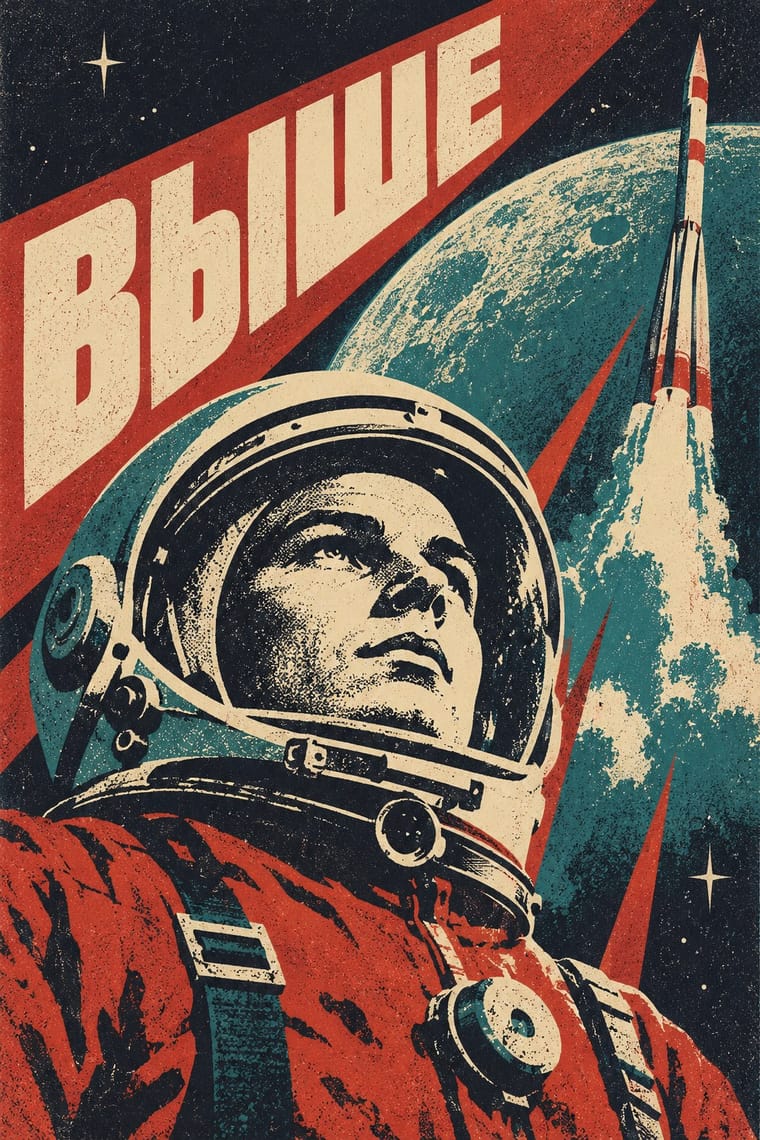
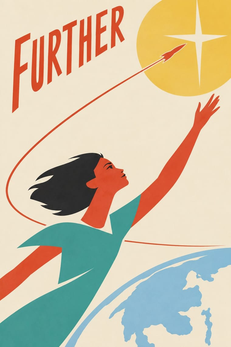
05
More combinations
With Sovietwave
- Socialist Realist Propaganda Poster Contrasts · Heroic state painting and slogans are the official register; sovietwave keeps poster compositions but is a private, melancholy longing rather than a command.
- Synthwave / Outrun Contrasts · Choose synthwave for American chrome, neon and palm-tree sunsets; choose sovietwave for muted print colours, Cyrillic and Space Age housing blocks.
- Vaporwave Pairs well · Its Western counterpart: share the degraded found footage and wistfulness, but replace the mall and pastel irony with Soviet space imagery.
With Thaw Modernism
- Polish Poster School Pairs well · Add the Polish poster's single painted metaphor and hand lettering to push Thaw illustration towards darker, more personal wit.
- Scandinavian Functionalism Pairs well · Nordic calm and natural colours make the Thaw's pastel optimism quieter and more domestic.
- Googie & Atomic Age Pairs well · Its capitalist cousin shares the parabolas, boomerangs and sputniks; borrow its starbursts for a louder space-age mood, but drop the neon and roadside salesmanship to keep the civic tone.
- Socialist Realist Propaganda Poster Contrasts · The idiom the Thaw replaced: set a flat, witty Thaw figure against heroic, illusionist realism to make the break visible.
- Polish Cold War Neon (PRL Neonisation) Pairs well · The thaw's laconic figures, few flat colours and civic optimism are the daytime print counterpart of these signs; pair them for a cinema, café or festival identity that has to work on paper and on a facade.
- Soviet Central Asian Ornamental Modernism Pairs well · Borrow its laconic flat figures, orbits and rockets for posters and booklets that sit beside a mosaic wall about science and space.
- Festival of Britain 'Contemporary' Pattern (Lucienne Day and the Festival Pattern Group) Pairs well · Thaw graphics share the light utopian line and flat pastel shapes; its stylised figures and stars give the repeat a narrative accent.
- UPA & Cartoon Modern Contrasts · The nearest genome in the atlas, and close kin in animation: critics found that Khitruk's Story of a Crime (1962) looked more like UPA than Disney, and called it a rare example of Soviet cartoon modern design. It shares the limited movement and the set cut down to its props. But Thaw modernism prints a few clear pastel inks on a light ground and aims at civic, Sputnik-age optimism, while UPA sets one or two caricatures on a single, often saturated, flat field, often lets the colour slip off the line and pokes fun at American folkways.