Style combination · Contrasts
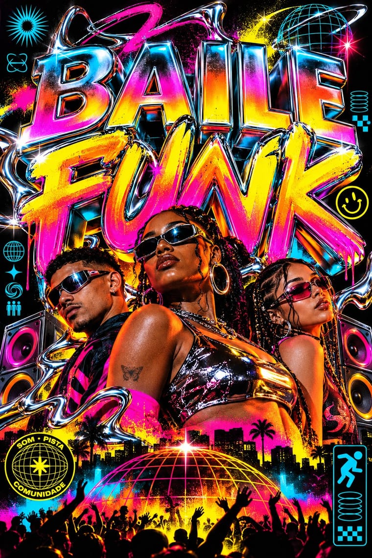
Brazilian Baile Funk Digital Flyer × Rave
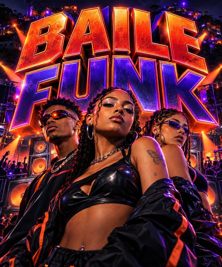
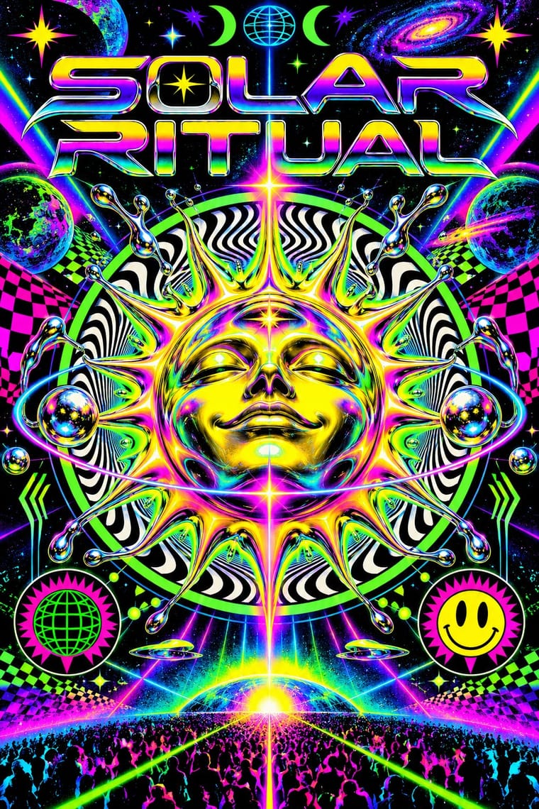
Both advertise a club night, but the rave flyer uses a central emblem and dense printed text, while this idiom puts a portrait group in front of one giant title.
Mix them and make something Brazilian Baile Funk Digital Flyer Rave
01
What each style brings
Each part of the design comes from the style with the stronger say in it, and each style gives at least two.
Brazilian Baile Funk Digital Flyer Rave & Acid House Graphics
- Type from Brazilian Baile Funk Digital Flyer
- Colour from Rave
- Form from Rave
- Composition from Brazilian Baile Funk Digital Flyer
- Surface from Rave
02
The type
Open fonts standing in for each style’s own type, which is often hand-drawn or commercial.
Display · Brazilian Baile Funk Digital Flyer
Fiesta
Bangers; Brazilian Baile Funk Digital Flyer used Heavy extruded 3D capitals for the title and Compact bold sans-serif in capitals for names, venue and date in the lower band
Text · Rave
The pocket-sized promotional art of acid house, rave and early techno, handed out in record shops and car parks to advertise all-night parties. Fronts revived psychedelia through smileys, trippy eyes, fractals and airbrushed fantasy landscapes; backs crammed DJ line-ups, sound-system credits and info-line numbers. Early desktop software, chrome 3D logotypes and fluorescent or metallic inks gave it a synthetic, hedonistic glow.
IBM Plex Mono; Rave used Eurostile Extended and OCR-A
03
The colours
The ground and leading colours come from Rave, with a counter-accent from Brazilian Baile Funk Digital Flyer. The ink reads on the ground at 4.5:1 or more.
Brazilian Baile Funk Digital Flyer Rave & Acid House Graphics
-
#0a0a0aground · 36% -
#ffe600ink · 14% -
#ff00b4accent · 18% -
#ff6a1aaccent · 14% -
#00e5ffaccent · 10% -
#d81f26accent · 8%
As CSS
:root {
  --ground: #0a0a0a;
  --ink: #ffe600;
  --accent-1: #ff00b4;
  --accent-2: #ff6a1a;
  --accent-3: #00e5ff;
  --accent-4: #d81f26;
  --font-display: "Bangers", sans-serif;
  --font-text: "IBM Plex Mono", monospace;
}
Use it with care
Brazilian Baile Funk Digital Flyer: Baile funk is a living Afro-Brazilian favela culture with a long history of stigma and police repression, so do not use these flyers to caricature favelas, weapons or crime. Do not show real people, MCs or DJs without their consent, and do not imply that placeholder figures in templates are real artists. The evidence here is commercial templates from one publisher, so treat this as a provisional idiom and check it against flyers made by funk producers and promoters before leaning on it. Respect the template licences, which do not allow redistribution. The template figures may be stock or AI-generated, and promoters' own funk flyer culture (hand-made, shared on WhatsApp and Instagram, led by MC names) is not represented here, so this entry may misrepresent the tradition's actual visual culture.
04
The two styles
05
More combinations
With Brazilian Baile Funk Digital Flyer
- YouTube Thumbnail Style (the 'YouTube Face') Pairs well · Loosely similar: both put cut-out people in front of big type for the feed, but the purpose differs (event promotion versus video click-through); limited affinity.
- Graffiti & Hip-Hop Graphics Pairs well · A speculative pairing, not shown in the sources: borrow wildstyle outlines for the title to take the extruded lettering toward street culture.
With Rave
- Acid Graphics / New Ugly Pairs well · Acid graphics is rave's digital heir; reuse the chrome logotype and fluorescent-on-black palette with contemporary 3D tools.
- Corporate Identity Modernism Contrasts · Rave flyers parodied corporate logos; set a sober corporate mark beside its flyer pastiche to make the détournement legible.
- Y2K Futurism Pairs well · Share chrome, gradients and techno optimism; combine them for a late-1990s club-to-millennium look.
- Dark Tech Minimalism Contrasts · Both live on black, but one whispers and one shouts; borrow a single neon gradient to wake up a restrained dark interface.
- Demoscene Graphics (Cracktros, Demos & Text-Mode Art) Pairs well · Rave flyers and scene logos share chrome lettering on black and the same 1990s tracker-and-techno culture; animate a flyer's line-up as a demo-style scroller for party visuals.
- Psychedelic Poster Pairs well · Carry the vibrating fluorescent palette into rave-style chrome and airbrush to signal the 1960s-to-1990s lineage on purpose.
- Synthwave / Outrun Pairs well · Both put chrome logotypes and airbrushed fantasy horizons in neon on black; borrow the flyer's crammed line-up reverse to turn a synthwave key visual into a working event poster.
- Gabber and Hardcore Graphics (Rotterdam and Thunderdome) Pairs well · Shares the flyer's info-heavy format and logotype culture, but hardens psychedelia into horror and menace and avoids the gradient and iridescence.