Style combination · Contrasts
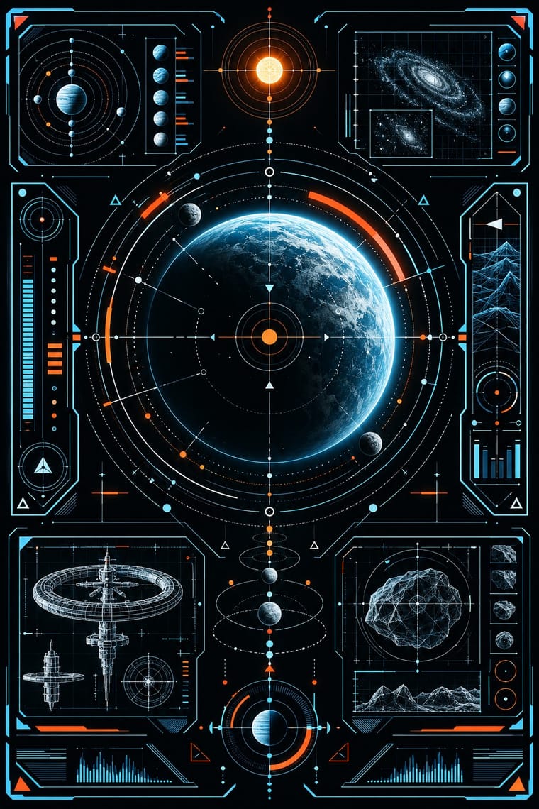
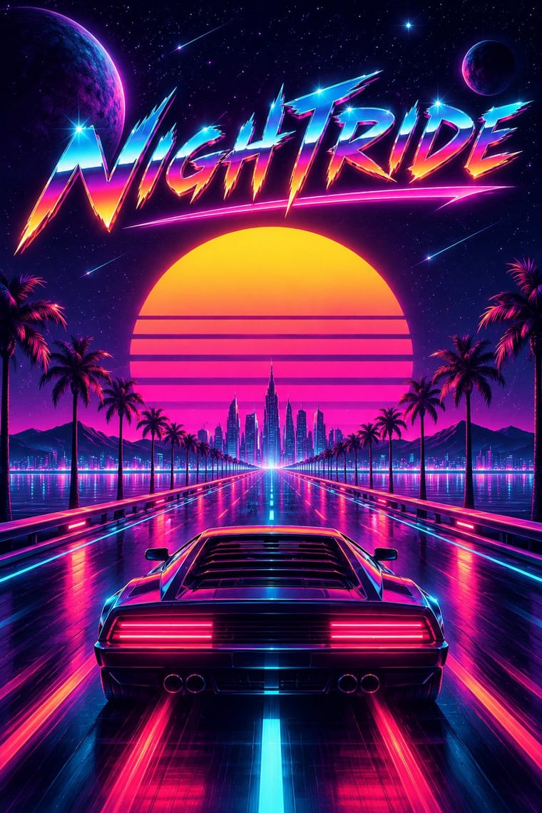
Fantasy User Interface × Synthwave
Both glow in neon on black, but synthwave paints a nostalgic horizon with chrome and a sunset, while FUI shows a present-tense instrument. Choose synthwave for a mood and FUI when the picture has to look like it is working.
Mix them and make something Fantasy User Interface Synthwave
01
What each style brings
Each part of the design comes from the style with the stronger say in it, and each style gives at least two.
Fantasy User Interface (FUI) & Sci-Fi HUD Synthwave / Outrun
- Colour from Synthwave
- Form from Fantasy User Interface
- Composition from Fantasy User Interface
- Surface from Synthwave
02
The type
Open fonts standing in for each style’s own type, which is often hand-drawn or commercial.
Display · Fantasy User Interface
Signal
Michroma, standing in for Squared, extended sans in the line of Microgramma (Aldo Novarese & Alessandro Butti, 1952) and Eurostile (Novarese, Nebiolo, 1962), science fiction's screen face since the Eurostile Bold Extended displays of 2001: A Space Odyssey (1968)
Text · Synthwave
The retro-futurist look of synthwave music: a 1980s revival that grew from mid-2000s French electro and online synth scenes, took its other name from Sega's arcade racer Out Run (1986) and reached the mainstream with Drive (2011). Its register runs from the brooding night drives of Kavinsky and Hotline Miami to the affectionate parody of Far Cry 3: Blood Dragon and Kung Fury. The visuals, settled around 2010–2013, recall the era's film posters, arcades and VHS: a neon grid running to a banded setting sun, chrome logotypes and hot-pink script, palms and sports cars at night, tape noise.
VT323; Synthwave used Mistral (Roger Excoffon, Fonderie Olive, 1953), the brush script set in hot pink for the Drive poster title and Custom chrome-bevelled, airbrushed logotypes with star glints, after 1980s film-poster and arcade titles
03
The colours
The ground and leading colours come from Synthwave, with a counter-accent from Fantasy User Interface. The ink reads on the ground at 4.5:1 or more.
Fantasy User Interface (FUI) & Sci-Fi HUD Synthwave / Outrun
-
#0d0221ground · 36% -
#ffd319ink · 14% -
#05d9e8accent · 18% -
#ff9d2eaccent · 14% -
#ff3b30accent · 10% -
#ff2a6daccent · 8%
As CSS
:root {
  --ground: #0d0221;
  --ink: #ffd319;
  --accent-1: #05d9e8;
  --accent-2: #ff9d2e;
  --accent-3: #ff3b30;
  --accent-4: #ff2a6d;
  --font-display: "Michroma", sans-serif;
  --font-text: "VT323", monospace;
}
Use it with care
Fantasy User Interface (FUI) & Sci-Fi HUD: FUI is built to be watched for seconds, not used. When the look moves into a real product, game or dashboard, keep the single read, size micro-text and contrast to WCAG rather than to a cinema screen, and keep flashing scans and blinking alerts to three flashes or fewer per second. Never present invented data as real data. Its targeting reticles, facial recognition and surveillance feeds come from military and intelligence imagery, so think about what they glamourise before using them on civilian or campaign work.
Synthwave / Outrun: Since about 2015 far-right 'fashwave' has appropriated synthwave, setting fascist symbols, classical statues and slogans on neon grids and swapping the classic neon sun for the Nazi Black Sun; keep the sun a plain banded disc, avoid sunwheel, eagle and bust-plus-slogan layouts, and check where borrowed fan art and music come from.
04
The two styles
05
More combinations
With Fantasy User Interface
- Glassmorphism Contrasts · Glassmorphism's frosted, rounded panes are soft and meant to be used. FUI's clear glass carries hard hairlines and brackets. Take glassmorphism's blur behind an FUI panel when real users have to read it.
- Techno-Futurist Graphics Pairs well · Techno-futurism's invented corporate logos, pictograms and warning labels make convincing in-world branding for FUI screens. Use them on boot screens and on the agencies and corporations whose software the characters run.
- Generative & Dynamic Identities Pairs well · Drive FUI's maps, network graphs and counters from live data or code, so the screen's motion is real rather than a loop of invented numbers.
- Y2K Futurism Contrasts · Both float HUD-style overlays, wireframes and orbit lines, but Y2K sets them on glossy chrome, bubble forms and white voids for optimism, while FUI draws hairline instruments on black for a machine at work. Choose Y2K for a product's shine and FUI when the screen has to look busy with a task.
- Glitch Art & Datamosh Graphics Pairs well · For worn screens like Territory's Blade Runner 2049 playback, with screen burn, ghosting, colour degradation and glitches in place of clean glow, take the damage from glitch art's real file and signal faults rather than from a preset filter.
- International Typographic Style Pairs well · A strict grid and a neutral sans keep FUI's density legible; Oblivion hung every element on a dot grid. Start from Swiss order, then add rings and readouts.
- Dark Tech Minimalism Contrasts · Both put light type on black, but dark tech minimalism is a real interface that people use, sparse and quiet. FUI is staged for a camera and piles on density and glowing rings. Borrow one radial gauge for a product hero, not the whole cockpit.
- Cassette Futurism Contrasts · Its clean, glowing, layered HUDs came later; cassette futurism answers with worn hardware and one phosphor colour.
With Synthwave
- Hong Kong Neon & Beiwei Shop-Sign Lettering Pairs well · Real neon-tube shop lettering gives synthwave's painted glow a street-level counterpart for night-market, bar or club identities; use real Beiwei forms and credit the sign-makers rather than dressing the scene in random Chinese characters.
- Dark Tech Minimalism Contrasts · Both live on dark grounds, but dark tech minimalism keeps gradients faint and drops nostalgia and ornament; switch to it when the neon sunset would shout over the content.
- Bitmap & Pixel Graphics Pairs well · Pixel sprites and bitmap type are synthwave's arcade inheritance, as Hotline Miami shows; set them over the neon grid for game key art and title screens.
- Rave & Acid House Graphics Pairs well · Both put chrome logotypes and airbrushed fantasy horizons in neon on black; borrow the flyer's crammed line-up reverse to turn a synthwave key visual into a working event poster.
- Vaporwave Contrasts · Vaporwave takes the same grids and neon into pastel, ironic collage of malls, desktops and stock imagery; choose synthwave for a heartfelt or affectionately parodic night drive and vaporwave when the nostalgia itself should be questioned.
- Analog Horror Graphics Contrasts · Both finish 1980s screens with VHS tracking noise, scanlines and grain, but synthwave treats the decade with affection, in neon grids, chrome type and sunsets, while analog horror makes it a flat, official screen that is failing. Keep neon and chrome out, and let the noise mean something is wrong.
- Polish Cold War Neon (PRL Neonisation) Contrasts · Synthwave remembers neon as a glowing grid, chrome and sunset gradients on a screen; the Polish signs were real tubes in one or two colours with no gradients. Use the contrast to keep a neon revival honest to the single line.
- Cassette Futurism Contrasts · Neon grids and chrome sunsets show a glamorous 1980s; cassette futurism shows its workaday machinery.