Style combination · Pairs well
Natural Wine Label Art × Punk
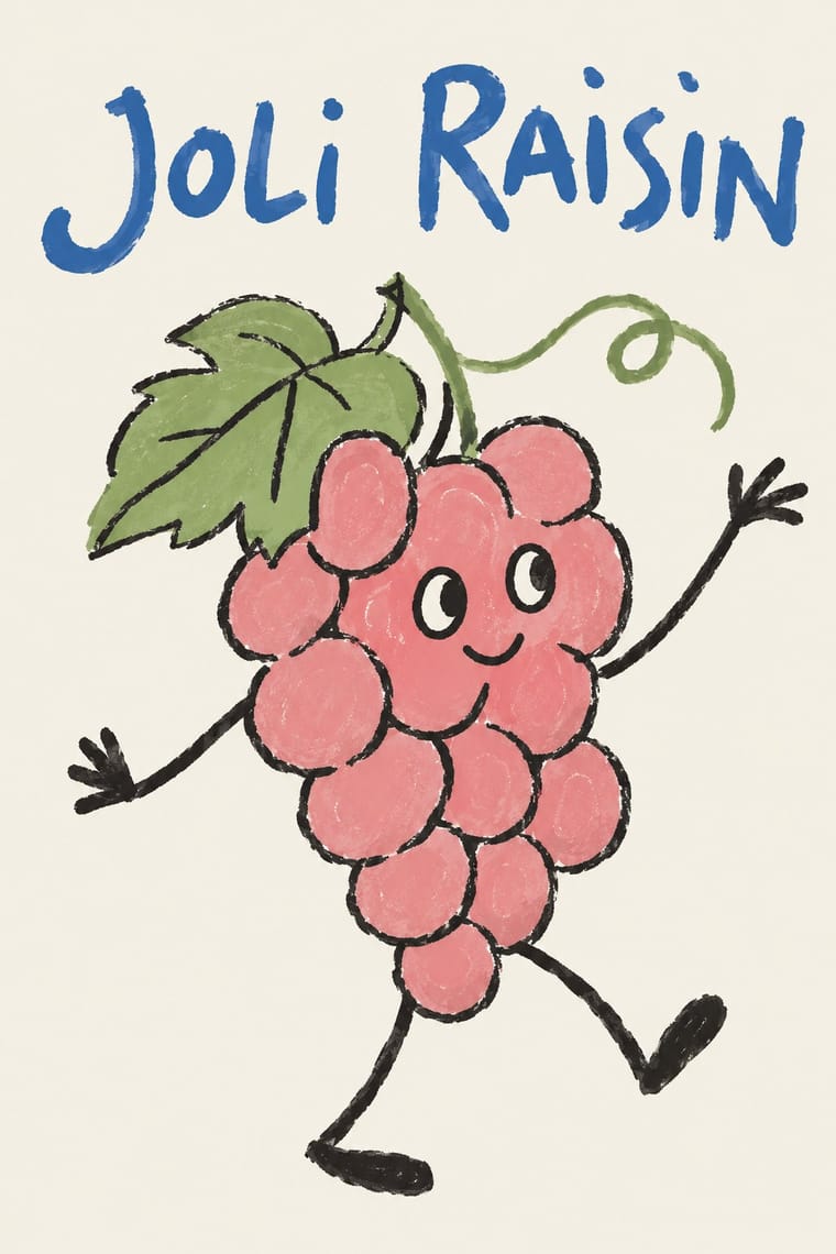
Alice Feiring calls the earlier natural-wine scene punk rock: of Gut Oggau she says 'This is where things grow up and stop being so punk rock' (Punch, 2021). Take punk's refusal of professional polish but drop the collage and the anger: one felt-pen picture on a white label carries the same do-it-yourself stance in a friendlier voice.
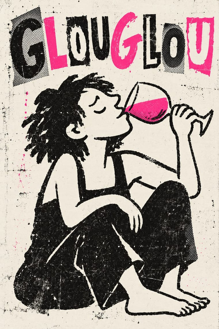
01
What each style brings
Each part of the design comes from the style with the stronger say in it, and each style gives at least two.
Natural Wine Label Art Punk & DIY Zine
- Type from Punk
- Colour from Punk
- Form from Natural Wine Label Art
- Composition from Natural Wine Label Art
- Surface from Punk
02
The type
Open fonts standing in for each style’s own type, which is often hand-drawn or commercial.
Text · Natural Wine Label Art
The labels of the natural (low-intervention) wine scene, which grew from Beaujolais into a worldwide network of small growers, bars and importers. Where the classic label ranks château, appellation and vintage in formal type around a crest or an engraved estate, these give the front to one hand-made picture: a cartoon animal, a crayon or child's drawing, a doodle or a line portrait, with the cuvée name scrawled by hand and the place played down. Each cuvée often gets its own picture, drawn by the grower, their children, friends or a studio that keeps the naive hand.
Caveat; Natural Wine Label Art used Hand-scrawled cuvée names in felt pen, crayon or pencil, written by the same hand as the picture and Cartoonist's hand-lettering drawn into the scene, as in Michel Tolmer's comics and drawings for the French vin naturel scene
03
The colours
The ground and leading colours come from Punk, with a counter-accent from Natural Wine Label Art. The ink reads on the ground at 4.5:1 or more.
Natural Wine Label Art Punk & DIY Zine
-
#f2efe6ground · 36% -
#0d0d0dink · 14% -
#ff2fa0accent · 18% -
#f08a3caccent · 14% -
#d7191caccent · 10% -
#3f6db3accent · 8%
As CSS
:root {
  --ground: #f2efe6;
  --ink: #0d0d0d;
  --accent-1: #ff2fa0;
  --accent-2: #f08a3c;
  --accent-3: #d7191c;
  --accent-4: #3f6db3;
  --font-display: "Rock Salt", cursive;
  --font-text: "Caveat", cursive;
}
Use it with care
Natural Wine Label Art: Gut Oggau's family of faces, Jaime Hayón's drawings for it, Jauma's Tikka the Cosmic Cat and Michel Tolmer's characters are owned artwork: invent your own character, do not prompt an image model for a named illustrator's hand, and never present a generated image as a real grower's label. 'Natural' has no legal definition for wine, and French rules even forbid tying the words 'nature' or 'naturel' directly to 'vin'; the Vin Méthode Nature logo is a private mark for growers who sign its charter (validated by the DGCCRF in March 2020), so do not put it on a design for a wine that is not certified. Keeping the legal mentions quiet must not mean leaving out the label's mandatory particulars.
04
The two styles
05
More combinations
With Natural Wine Label Art
- DTC 'Blanding' / Millennial Minimalism Contrasts · Blanding sells a frictionless, agency-made brand in lowercase geometric sans and pastels; the natural wine label sells a person through an untrained drawing. Use the contrast to decide whether a product should feel designed or made.
- Risograph & Indie Print Culture Pairs well · Both come from the same small-batch maker economy and share a naive drawn idiom; print a short-run cuvée label in two riso inks to add overprint and grain to a felt-pen drawing.
- European Heraldry Contrasts · The crest is the device of the classic château label that natural wine replaced with a face or an animal; put one heraldic charge beside a doodle to show which side of the wine world a bottle stands on.
- French Post-War Visual-Gag Poster (Savignac, Villemot, Morvan) Pairs well · Both put one cartoon figure on a plain ground with the name drawn into the picture; the gag poster is a professional's single punchline at hoarding scale, the wine label an amateur's picture at bottle scale. Borrow Savignac's one-image-one-idea discipline to keep a naive label from turning into a scrapbook.
- Hipster Artisanal Revival Contrasts · The craft boom's centred one-ink badge with an 'Est.' date borrows exactly the heritage authority natural wine turns down; set a crayon animal against a stamped roundel to choose between a new firm dressed as an old one and a grower who signs with a drawing.
- Yuru-chara (Japanese Local Mascot Design) Pairs well · Super Glou's drunken-cat mascot and Jauma's cosmic cat work like local mascots; borrow the yuru-chara habit of one soft, recurring character who appears in a new scene for each product.
With Punk
- Russian Constructivism Pairs well · Borrow Constructivist diagonals and red-and-black bars to give punk collage the agitprop structure post-punk sleeves later adopted.
- Risograph & Indie Print Culture Pairs well · Run punk collages through a riso in fluoro pink and black to keep the DIY ethic while gaining richer, layered colour.
- Corporate Identity Modernism Contrasts · Deface a clean corporate identity with xerox collage to make the critique of polish and authority explicit.
- Frutiger Aero Contrasts · Glossy optimism is everything punk rejects; one torn xerox fragment on an aero gradient reads as instant sabotage.
- Fluxus Graphics (Maciunas) Contrasts · Both mix found type with appropriated pictures, but punk tears and photocopies while Fluxus keeps a clean offset black, justified blocks and a tight edge-to-edge grid; use the Fluxus version when cheap materials should still look ordered.
- Grapus (French Militant Graphic Collective) Contrasts · Both scribble over photographs, but punk's photocopied blacks and ransom-note type are cheap and nihilist, while Grapus prints bright offset colour, mostly on white, in an optimistic, party-backed voice.
- Situationist Détournement Graphics Contrasts · Punk reprised the situationist prank in the late 1970s, but it packs torn photocopies and mixed type into crowded pages; détournement keeps a few recognisable fragments and lets each one say the opposite of what it said. Borrow the rewritten balloon when a punk layout needs a sharper argument.
- Internet Ugly & Meme Vernacular Pairs well · Both make amateur, cheap reproduction a stance; combine ransom-note cut-ups with Impact captions and crude pasted photos for zine-style posters that still read as a joke.