Style combination · Pairs well
Punk × Risograph
Run punk collages through a riso in fluoro pink and black to keep the DIY ethic while gaining richer, layered colour.
01
What each style brings
Each part of the design comes from the style with the stronger say in it, and each style gives at least two.
Punk & DIY Zine Risograph & Indie Print Culture
- Type from Punk
- Colour from Risograph
- Form from Risograph
- Composition from Punk
- Surface from Risograph
02
The type
Open fonts standing in for each style’s own type, which is often hand-drawn or commercial.
Text · Risograph
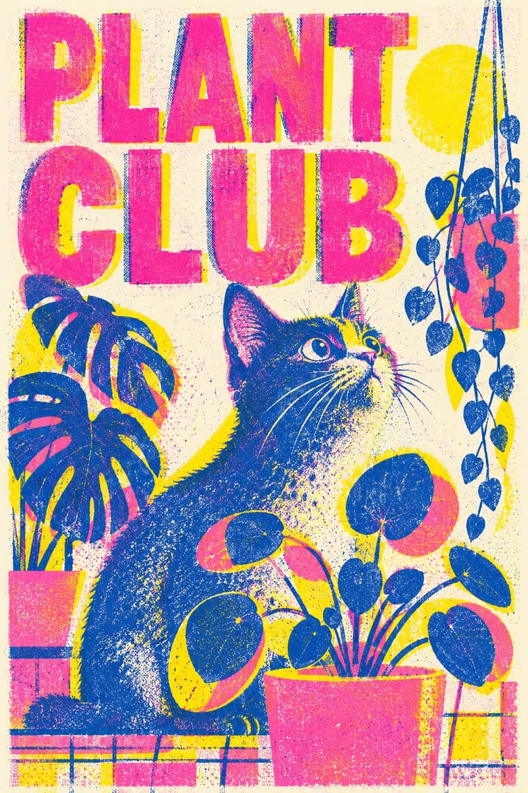
A contemporary culture of zines, art books, posters and prints made on Japanese Risograph stencil duplicators, whose soy-based spot inks (fluorescent pink, yellow, blue, teal) are laid down one drum at a time. Designers embrace the machine's limits: translucent overprints, slight misregistration, grainy coverage and coarse halftones give flat illustration and type a warm, handmade vibrancy at low cost.
Inter; Risograph used Neo-grotesques set large and Monospace and typewriter faces
03
The colours
The ground and leading colours come from Risograph, with a counter-accent from Punk. The ink reads on the ground at 4.5:1 or more.
Punk & DIY Zine Risograph & Indie Print Culture
-
#f4f1eaground · 36% -
#3255a4ink · 14% -
#ff48b0accent · 18% -
#f15060accent · 14% -
#d7191caccent · 10% -
#00838aaccent · 8%
As CSS
:root {
  --ground: #f4f1ea;
  --ink: #3255a4;
  --accent-1: #ff48b0;
  --accent-2: #f15060;
  --accent-3: #d7191c;
  --accent-4: #00838a;
  --font-display: "Rock Salt", cursive;
  --font-text: "Inter", sans-serif;
}
04
The two styles
05
More combinations
With Punk
- Russian Constructivism Pairs well · Borrow Constructivist diagonals and red-and-black bars to give punk collage the agitprop structure post-punk sleeves later adopted.
- Corporate Identity Modernism Contrasts · Deface a clean corporate identity with xerox collage to make the critique of polish and authority explicit.
- Frutiger Aero Contrasts · Glossy optimism is everything punk rejects; one torn xerox fragment on an aero gradient reads as instant sabotage.
- Fluxus Graphics (Maciunas) Contrasts · Both mix found type with appropriated pictures, but punk tears and photocopies while Fluxus keeps a clean offset black, justified blocks and a tight edge-to-edge grid; use the Fluxus version when cheap materials should still look ordered.
- Natural Wine Label Art Pairs well · Alice Feiring calls the earlier natural-wine scene punk rock: of Gut Oggau she says 'This is where things grow up and stop being so punk rock' (Punch, 2021). Take punk's refusal of professional polish but drop the collage and the anger: one felt-pen picture on a white label carries the same do-it-yourself stance in a friendlier voice.
- Grapus (French Militant Graphic Collective) Contrasts · Both scribble over photographs, but punk's photocopied blacks and ransom-note type are cheap and nihilist, while Grapus prints bright offset colour, mostly on white, in an optimistic, party-backed voice.
- Situationist Détournement Graphics Contrasts · Punk reprised the situationist prank in the late 1970s, but it packs torn photocopies and mixed type into crowded pages; détournement keeps a few recognisable fragments and lets each one say the opposite of what it said. Borrow the rewritten balloon when a punk layout needs a sharper argument.
- Internet Ugly & Meme Vernacular Pairs well · Both make amateur, cheap reproduction a stance; combine ransom-note cut-ups with Impact captions and crude pasted photos for zine-style posters that still read as a joke.
With Risograph
- Corporate Identity Modernism Contrasts · Exact Pantone-matched corporate colour is the opposite of riso's drifting inks; use the contrast to signal independence.
- Neo-Swiss Revival Pairs well · Print neo-Swiss grids in two fluorescent riso inks to soften their rigour with grain and overprint.
- Y2K Futurism Contrasts · Glossy chrome renders are everything a riso cannot print; set frictionless screen gloss against tactile grain for deliberate friction.
- WPA Silkscreen Posters Pairs well · WPA silkscreen's flat, separated colour translates directly to riso drums; borrow its layered spot-colour scenes.
- Literatura de Cordel Woodcut Pairs well · Print a cordel-style woodcut on a riso in one ink on tinted stock to keep the pocket-chapbook economy for zines and poetry pamphlets.
- Cubist Pictorial Space Pairs well · Print synthetic-Cubist planes as overlapping flat riso inks so the overprints do the faceting for you.
- Leningrad Avant-Garde Picture Book Pairs well · Today's riso picture books share the few flat inks, bare paper and speckled texture; print a Lebedev-style sequence of floating figures in two or three riso inks.
- Die Neue Typographie Pairs well · Two-colour riso printing suits its black-plus-red restraint for low-budget editorial and posters.