Style combination · Pairs well
Punk × ROSTA Windows
Shares the cheap, fast, many-copies ethos; stencil-and-sequence storytelling translates directly into zines and photocopied flyers.
01
What each style brings
Each part of the design comes from the style with the stronger say in it, and each style gives at least two.
Punk & DIY Zine ROSTA Windows
- Type from Punk
- Colour from Punk
- Form from ROSTA Windows
- Composition from ROSTA Windows
- Surface from Punk
02
The type
Open fonts standing in for each style’s own type, which is often hand-drawn or commercial.
Text · ROSTA Windows
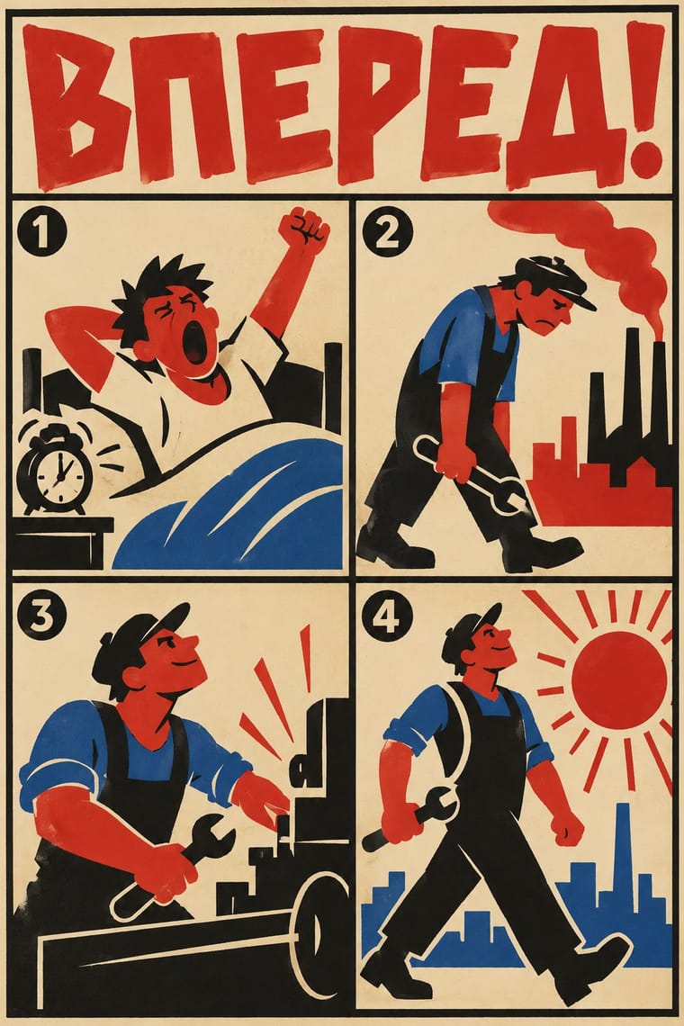
Hand-stencilled satirical news posters made by the Russian Telegraph Agency during the Civil War and hung in empty shop windows, first in Moscow, then in Petrograd and provincial towns. Mikhail Cheremnykh, Vladimir Mayakovsky, Dmitry Moor and others turned the day's news into numbered sequences of crude, flat stock figures in two or three colours, each frame with a short rhymed caption, reviving the lubok as Futurist street agitation.
Archivo; ROSTA Windows used Hand-lettered Cyrillic captions in brush and pen, one under each frame and Blocky hand-drawn Cyrillic capitals for headings and frame numbers
03
The colours
The ground and leading colours come from Punk, with a counter-accent from ROSTA Windows. The ink reads on the ground at 4.5:1 or more.
Punk & DIY Zine ROSTA Windows
-
#f2efe6ground · 36% -
#0d0d0dink · 14% -
#ff2fa0accent · 18% -
#c7281eaccent · 14% -
#c99a3baccent · 10% -
#8c8c8caccent · 8%
As CSS
:root {
  --ground: #f2efe6;
  --ink: #0d0d0d;
  --accent-1: #ff2fa0;
  --accent-2: #c7281e;
  --accent-3: #c99a3b;
  --accent-4: #8c8c8c;
  --font-display: "Rock Salt", cursive;
  --font-text: "Archivo", sans-serif;
}
04
The two styles
05
More combinations
With Punk
- Russian Constructivism Pairs well · Borrow Constructivist diagonals and red-and-black bars to give punk collage the agitprop structure post-punk sleeves later adopted.
- Risograph & Indie Print Culture Pairs well · Run punk collages through a riso in fluoro pink and black to keep the DIY ethic while gaining richer, layered colour.
- Corporate Identity Modernism Contrasts · Deface a clean corporate identity with xerox collage to make the critique of polish and authority explicit.
- Frutiger Aero Contrasts · Glossy optimism is everything punk rejects; one torn xerox fragment on an aero gradient reads as instant sabotage.
- Fluxus Graphics (Maciunas) Contrasts · Both mix found type with appropriated pictures, but punk tears and photocopies while Fluxus keeps a clean offset black, justified blocks and a tight edge-to-edge grid; use the Fluxus version when cheap materials should still look ordered.
- Natural Wine Label Art Pairs well · Alice Feiring calls the earlier natural-wine scene punk rock: of Gut Oggau she says 'This is where things grow up and stop being so punk rock' (Punch, 2021). Take punk's refusal of professional polish but drop the collage and the anger: one felt-pen picture on a white label carries the same do-it-yourself stance in a friendlier voice.
- Grapus (French Militant Graphic Collective) Contrasts · Both scribble over photographs, but punk's photocopied blacks and ransom-note type are cheap and nihilist, while Grapus prints bright offset colour, mostly on white, in an optimistic, party-backed voice.
- Situationist Détournement Graphics Contrasts · Punk reprised the situationist prank in the late 1970s, but it packs torn photocopies and mixed type into crowded pages; détournement keeps a few recognisable fragments and lets each one say the opposite of what it said. Borrow the rewritten balloon when a punk layout needs a sharper argument.
With ROSTA Windows
- Socialist Realist Propaganda Poster Contrasts · The heroic, naturalistic painting that displaced it in the 1930s is the exact opposite of its crude, satirical shorthand.
- Lubok Popular Print Pairs well · Its folk ancestor: keep the lubok's numbered episodes and rhymed verses, but flatten the hand-coloured woodcut into stencilled silhouettes for speed.
- Russian Constructivism Contrasts · The rival revolutionary language of the same years: photomontage, set grotesques and diagonals against hand-stencilled cartoon frames; pick one register per message.
- Escuela Bruguera (Spanish Humour Comics) Contrasts · Both tell satire in sequences of crude, flat-colour stock figures with hand lettering; ROSTA hand-stencilled numbered news frames with rhymed captions for shop windows as open agitation, while Bruguera printed balloon gags in children's weeklies that end on a blow and keep the satire under the fun.
- Kinshasa Popular Painting Pairs well · Both are hand-painted satire with words in the picture for a street audience; borrow ROSTA's panel sequence to break a Kinshasa-style scene and caption into a strip.
- Turkish Weekly Humour Magazines (Gırgır to Uykusuz) Contrasts · Both turn the day's political news into hand-lettered satirical drawings for a mass audience. ROSTA stencilled numbered frames as agitation for the new state; the Turkish weeklies caricatured whoever held power, from Özal to Erdoğan, and were banned or sued for it.
- Atelier Populaire (May '68 Screenprint Poster) Pairs well · Like the ROSTA windows, each sheet answers the day's news by hand with a stark figure and a caption; run single posters as a numbered sequence when one image cannot tell the whole story.
- Dazibao (Big-Character Posters) Pairs well · Both are improvised agitational wall media made faster than print allows; pair their urgency for time-critical campaigns.