Style combination · Contrasts
ROSTA Windows × Turkish Weekly Humour Magazines
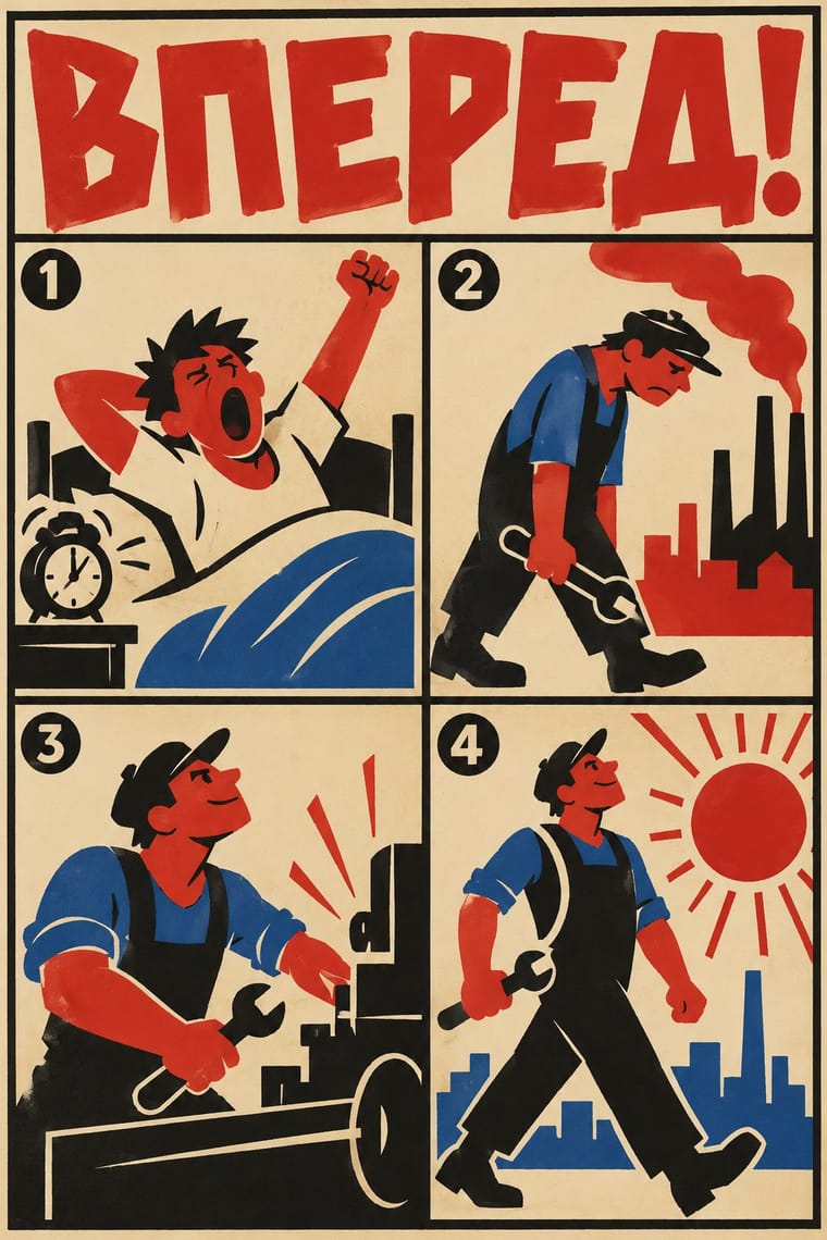
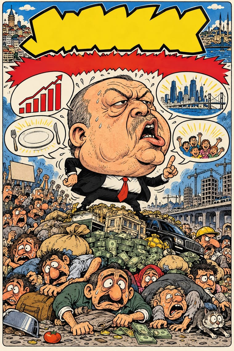
Both turn the day's political news into hand-lettered satirical drawings for a mass audience. ROSTA stencilled numbered frames as agitation for the new state; the Turkish weeklies caricatured whoever held power, from Özal to Erdoğan, and were banned or sued for it.
Mix them and make something ROSTA Windows Turkish Weekly Humour Magazines
01
What each style brings
Each part of the design comes from the style with the stronger say in it, and each style gives at least two.
ROSTA Windows Turkish Weekly Humour Magazines (Gırgır to Uykusuz)
- Type from Turkish Weekly Humour Magazines
- Colour from ROSTA Windows
- Form from Turkish Weekly Humour Magazines
- Composition from ROSTA Windows
- Surface from ROSTA Windows
02
The type
Open fonts standing in for each style’s own type, which is often hand-drawn or commercial.
Display · Turkish Weekly Humour Magazines
Yay!
Londrina Solid, standing in for Hand-lettered capitals in speech balloons and caption blocks, with the Turkish İ, Ş, Ğ and Ç drawn in (the Uykusuz cover of 12 November 2008, the Gırgır cover of 10 August 2011)
Text · ROSTA Windows
Hand-stencilled satirical news posters made by the Russian Telegraph Agency during the Civil War and hung in empty shop windows, first in Moscow, then in Petrograd and provincial towns. Mikhail Cheremnykh, Vladimir Mayakovsky, Dmitry Moor and others turned the day's news into numbered sequences of crude, flat stock figures in two or three colours, each frame with a short rhymed caption, reviving the lubok as Futurist street agitation.
Archivo; ROSTA Windows used Hand-lettered Cyrillic captions in brush and pen, one under each frame and Blocky hand-drawn Cyrillic capitals for headings and frame numbers
03
The colours
The ground and leading colours come from ROSTA Windows, with a counter-accent from Turkish Weekly Humour Magazines. The ink reads on the ground at 4.5:1 or more.
ROSTA Windows Turkish Weekly Humour Magazines (Gırgır to Uykusuz)
-
#ece2c9ground · 36% -
#171512ink · 14% -
#c7281eaccent · 18% -
#c99a3baccent · 14% -
#2f5ea8accent · 10% -
#e8b48caccent · 8%
As CSS
:root {
  --ground: #ece2c9;
  --ink: #171512;
  --accent-1: #c7281e;
  --accent-2: #c99a3b;
  --accent-3: #2f5ea8;
  --accent-4: #e8b48c;
  --font-display: "Londrina Solid", cursive;
  --font-text: "Archivo", sans-serif;
}
Use it with care
Turkish Weekly Humour Magazines (Gırgır to Uykusuz): Avanak Avni, Penguen's penguin trying to fly, Uykusuz's man in a vest and the magazines' mastheads belong to their makers and publishers: draw your own characters and masthead, never ask an image model for a named cartoonist's hand or a real magazine's cover, and do not present a generated cover as an issue of Gırgır, LeMan, Penguen or Uykusuz. This satire has cost its makers dearly (Penguen's Bahadır Baruter faced a one-year prison sentence in 2011 over words drawn on a mosque wall, and LeMan's editors were detained in 2025 over a cartoon read as depicting the Prophet Muhammad), and it carried its own prejudices: Uykusuz and Gırgır caricatures that turned Erdoğan into Obama drew their humour from exaggerating Obama's racial features (Çetintaş 2023), and gag strips such as Otisabi on Uykusuz's back cover made comedy of a man's manipulative seduction of women, which a 2026 study reads as objectifying them, even as it finds the strips also critique and subvert those norms. Do not reproduce either. Aim the satire at power and its pomposity, not at faith, ethnicity, gender or the bodies of the powerless: the swollen head belongs to the leader. Remember too that caricaturing a Turkish head of state has repeatedly brought lawsuits.
04
The two styles
05
More combinations
With ROSTA Windows
- Socialist Realist Propaganda Poster Contrasts · The heroic, naturalistic painting that displaced it in the 1930s is the exact opposite of its crude, satirical shorthand.
- Lubok Popular Print Pairs well · Its folk ancestor: keep the lubok's numbered episodes and rhymed verses, but flatten the hand-coloured woodcut into stencilled silhouettes for speed.
- Punk & DIY Zine Pairs well · Shares the cheap, fast, many-copies ethos; stencil-and-sequence storytelling translates directly into zines and photocopied flyers.
- Russian Constructivism Contrasts · The rival revolutionary language of the same years: photomontage, set grotesques and diagonals against hand-stencilled cartoon frames; pick one register per message.
- Escuela Bruguera (Spanish Humour Comics) Contrasts · Both tell satire in sequences of crude, flat-colour stock figures with hand lettering; ROSTA hand-stencilled numbered news frames with rhymed captions for shop windows as open agitation, while Bruguera printed balloon gags in children's weeklies that end on a blow and keep the satire under the fun.
- Kinshasa Popular Painting Pairs well · Both are hand-painted satire with words in the picture for a street audience; borrow ROSTA's panel sequence to break a Kinshasa-style scene and caption into a strip.
- Atelier Populaire (May '68 Screenprint Poster) Pairs well · Like the ROSTA windows, each sheet answers the day's news by hand with a stark figure and a caption; run single posters as a numbered sequence when one image cannot tell the whole story.
- Dazibao (Big-Character Posters) Pairs well · Both are improvised agitational wall media made faster than print allows; pair their urgency for time-critical campaigns.
With Turkish Weekly Humour Magazines
- Escuela Bruguera (Spanish Humour Comics) Contrasts · Both are weekly humour magazines from a stable of cartoonists, with grotesque caricature in hand-lettered panels. Bruguera kept its satire of manners under children's slapstick for Franco's censors; the Turkish weeklies put named politicians on the cover every week and took the lawsuits that followed.
- Arab Independent Comics (Samandal, TokTok, Lab619, Skefkef) Contrasts · Both are collectives' magazines that satirise power in street dialect and have been taken to court for it. The Arab magazines are small art-comics anthologies with no house style and no topical cover; the Turkish weeklies were mass newsstand titles built around one cover caricature of the week's news.
- American Four-Colour Comic Book (Golden to Bronze Age) Contrasts · Both lettered balloons by hand in capitals over cartoon figures for the newsstand, and Gırgır took its balloons and photomontage from Mad, which began in 1952 as Harvey Kurtzman's comic book for EC. The American comic book told serial adventures in four-colour letterpress; the Turkish weeklies built each issue around one topical caricature of the week's politics, then an anthology of signed gag corners.
- Turkish Modernist Poster & Graphic Design Contrasts · Same city, same decades, opposite density: Istanbul's poster designers reduced a play or film to one flat idea on an open field, while the humour weeklies packed a cover with a caricature, balloons, headline band and price box. Borrow the poster's single idea to calm a crowded cover.
- Arab Children's Comic Magazines (Samir to Majid) Contrasts · The same weekly cartoon-magazine machine aimed at adults and at power: its swollen caricature and political covers show what the children's weeklies kept out.
- Simplicissimus Satirical Style (Munich) Contrasts · A later weekly humour magazine of the same satirical stance: Gırgır, Penguen and Uykusuz pack covers with speech balloons, comic strips and colour; Simplicissimus gives one framed drawing and one caption.
- Underground Comix Contrasts · Both learned from Mad and crowd hand-lettered caricature into the panel, but the Istanbul weeklies are mass-circulation collective magazines whose cover lampoons the week's politics, while comix are self-published books whose shock is sex, drugs and taboo.
- O Pasquim Satirical Press Pairs well · Another cartoonist-led weekly where satire and local idiom carry political commentary under pressure.