Style combination · Contrasts
Analog Horror Graphics × Weirdcore
Both turn nostalgia into unease and share The Backrooms, but weirdcore is a still snapshot of an empty place with one small lowercase caption, while analog horror is a sequence of broadcast or tape fragments in an official voice and plain capitals. Choose the found image or the fake transmission.
Mix them and make something Analog Horror Graphics Weirdcore
01
What each style brings
Each part of the design comes from the style with the stronger say in it, and each style gives at least two.
Analog Horror Graphics Weirdcore & Dreamcore
- Colour from Analog Horror Graphics
- Form from Weirdcore
- Composition from Weirdcore
- Surface from Analog Horror Graphics
02
The type
Open fonts standing in for each style’s own type, which is often hand-drawn or commercial.
Display · Analog Horror Graphics
Memory
Big Shoulders, standing in for 'Grainy VCR text onscreen' (Kok, 2022): the blocky, fixed-width lettering of tape-deck on-screen displays and station character generators, sometimes scrolling across the picture; The Mandela Catalogue's captions are often lowercase ('suspect identified', 'answers lie beneath'), the exception to the capitals rule
Text · Weirdcore
An internet aesthetic popularised on Reddit, TikTok and YouTube in the early 2020s, with dreamcore as its softer, pastel, cloud-filled sister. Found or low-quality snapshots of empty, half-familiar places (playgrounds, classrooms, malls, corridors) are crudely edited: disembodied eyes in clouds or darkness, faceless figures in doorways, and short captions such as 'nothing is real' in red or inside black voids. The aim is anemoia, a nostalgia for places one never knew, turned into unease and the feeling of being watched.
Instrument Sans; Weirdcore used Short captions in out-of-place red text ('are you lost?', 'nothing is real'), typed in whatever plain default face the editing app offers and dropped onto the photograph and White text inside black rectangular voids pasted over the picture, the void heightening the message
03
The colours
The ground and leading colours come from Analog Horror Graphics, with a counter-accent from Weirdcore. The ink reads on the ground at 4.5:1 or more.
Analog Horror Graphics Weirdcore & Dreamcore
-
#0b0b0bground · 36% -
#ecececink · 14% -
#bfbf00accent · 18% -
#ff0000accent · 14% -
#bf0000accent · 10% -
#cfc07aaccent · 8%
As CSS
:root {
  --ground: #0b0b0b;
  --ink: #ececec;
  --accent-1: #bfbf00;
  --accent-2: #ff0000;
  --accent-3: #bf0000;
  --accent-4: #cfc07a;
  --font-display: "Big Shoulders", sans-serif;
  --font-text: "Instrument Sans", sans-serif;
}
Use it with care
Analog Horror Graphics: Fake emergency alerts can be mistaken for real ones: in the United States 47 CFR § 11.45 bars transmitting EAS codes or the Attention Signal, or a recording or simulation of them, outside real emergencies and authorised tests, so keep real alert tones, codes and agency names out of anything that may be broadcast, and label a fictional warning as fiction. Keep strobing static and flashing alert screens to three flashes a second or fewer (WCAG 2.3.1). Invent the seal and flag on a fictional alert screen: real national emblems can be protected by law, and Indonesian law forbids showing the Garuda Pancasila damaged or altered from its prescribed shape, colours and proportions (first in Law 24/2009, since moved into the Criminal Code and narrowed by the Constitutional Court). The blue Peringatan Darurat Garuda is also a living pro-democracy protest symbol, not a horror prop. The genre corrupts other people's footage (The Beginner's Bible in The Mandela Catalogue), so use public-domain or licensed material. Gemini Home Entertainment's creatures grew out of 'classic internet creepypastas surrounding Skinwalkers or the Wendigo' (Kok, 2022). The skin-walker belongs to Navajo (Diné) tradition and is rarely discussed with outsiders, and Native critics such as Adrienne Keene have objected to non-Navajo writers using it; the wendigo comes from Algonquian folklore. Do not turn these or other Indigenous beliefs into monsters for a design.
Weirdcore & Dreamcore: Weirdcore's found snapshots are other people's photographs, often of real homes, schools and playgrounds (the Backrooms photo was a real shop interior in Wisconsin, identified only in 2024): shoot or license your own places, and leave identifiable children and private interiors out. Its makers describe it as built to unsettle, from 'existentialism and derealization' (Nylon, 2021) to an 'aesthetic that can cause a panic attack' (a @unttochable video quoted by i-D, 2021), so take care before aiming it at children or using it near mental-health subjects, and keep video cuts to three or fewer flashes a second (WCAG 2.3.1).
04
The two styles
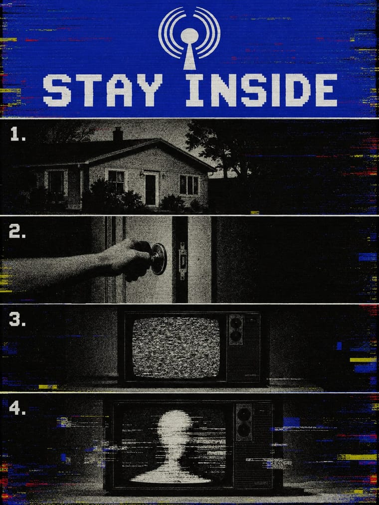
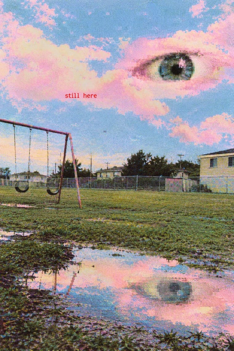
05
More combinations
With Analog Horror Graphics
- Demoscene Graphics (Cracktros, Demos & Text-Mode Art) Contrasts · Both put bitmap type on black screens, but the demoscene shows a machine running flawlessly at its limit and analog horror shows one failing. Pick mastery or breakdown.
- Synthwave / Outrun Contrasts · Both finish 1980s screens with VHS tracking noise, scanlines and grain, but synthwave treats the decade with affection, in neon grids, chrome type and sunsets, while analog horror makes it a flat, official screen that is failing. Keep neon and chrome out, and let the noise mean something is wrong.
- Glitch Art & Datamosh Graphics Contrasts · Henty traces analog horror to the 'glitch aesthetics' of earlier internet horror. Glitch art breaks a digital file and makes the damage the subject; analog horror dates the damage to a dying VHS tape or a weak broadcast signal and uses it to hide what is happening. Keep the noise in service of the story, not as the picture.
- Plain Tobacco Packaging Contrasts · Both frighten with the flat, mandatory voice of an official warning: plain packaging does it for real, in print, with matt drab brown, clinical photographs and Helvetica capitals; analog horror fakes it on a screen and lets the signal decay. Borrow plain packaging's uncompromising flatness for a fictional warning screen, and save the noise for the moment the threat appears.
- Hauntology & Ghost Box Design Contrasts · Henty, who puts his study of analog horror 'firmly in the remit of Hauntology', calls the subgenre 'deeply intertwined and expressive of the nostalgic trends Hauntology rests on'. Both fake a past institution's public voice and let it turn eerie, but Ghost Box and Scarfolk design 1970s print in flat offset colour on paper, while analog horror fakes 1980s and 1990s broadcasts and tapes on screen and lets the signal decay. Choose the printed pastiche or the corrupted transmission.
- PS1 / Lo-Fi 3D Revival (PSX Aesthetic) Contrasts · Both mine 1990s screens for fear, and Puppet Combo borrows from VHS, but analog horror fakes flat 2D broadcast and tape graphics, while the PSX revival builds navigable, textured 3D spaces. Choose the warning screen or the walkable room.
With Weirdcore
- Vaporwave Contrasts · Tanni's genealogy starts with vaporwave's spectral reuse of web imagery; vaporwave collages pastel consumer debris, busts and Japanese text with ironic luxury, while weirdcore empties the frame and drops the joke. Keep the found picture but swap the bust for a vacant playground to move from irony to unease.
- Early Web Vernacular Pairs well · Frame a weirdcore still in an old browser window, a default dialog box or a low-resolution GIF to make its debt to the amateur early web explicit; keep the window empty rather than crowding it with the early web's badges and counters.
- Internet Ugly & Meme Vernacular Contrasts · Both caption a crude found picture, but white Impact capitals ask for a laugh and a crowd to copy them; one small red lowercase line asks whether you are lost. Decide which the caption is for before choosing the picture.
- Lo-fi Anime Aesthetic Contrasts · Both are nostalgic online moods set to lo-fi music, but lofi paints a lived-in, occupied room that comforts; weirdcore photographs an empty one that watches back. Choose lofi for focus and calm, weirdcore when the brief wants disquiet.
- Hauntology & Ghost Box Design Contrasts · Both rebuild a misremembered past from found pictures and let nostalgia turn eerie, but Ghost Box designs the haunting: a Penguin-style grid, bold grotesque in a ruled band, a flat colour field and an institutional voice. Weirdcore drops grid, brand and author, and lets an anonymous snapshot and one small caption do it. Choose Ghost Box for an archival, designed eeriness and weirdcore for a found, amateur one.
- Surrealist Graphics Pairs well · Magritte's single displaced object in a calm, ordinary space is the grammar weirdcore remakes with snapshots and phone edits; study it so the one wrong thing (an eye, a door, a figure) feels placed rather than random.
- Glitch Art & Datamosh Graphics Pairs well · Borrow compression damage and an abrupt datamosh between two stills, but treat the damage as the decay of a memory rather than the subject of the work, and keep the rest of the snapshot readable.
- Yami-Kawaii (Sick-Cute) Contrasts · Uncanny low-resolution photography against polished, cute vector illustration.