Style combination · Contrasts
Internet Ugly × Weirdcore
Both caption a crude found picture, but white Impact capitals ask for a laugh and a crowd to copy them; one small red lowercase line asks whether you are lost. Decide which the caption is for before choosing the picture.
01
What each style brings
Each part of the design comes from the style with the stronger say in it, and each style gives at least two.
Internet Ugly & Meme Vernacular Weirdcore & Dreamcore
- Type from Internet Ugly
- Colour from Internet Ugly
- Form from Internet Ugly
- Composition from Weirdcore
- Surface from Weirdcore
02
The type
Open fonts standing in for each style’s own type, which is often hand-drawn or commercial.
Display · Internet Ugly
Together
Anton, standing in for Impact (Geoffrey Lee, Stephenson Blake, 1965), set white with a black outline
Text · Weirdcore
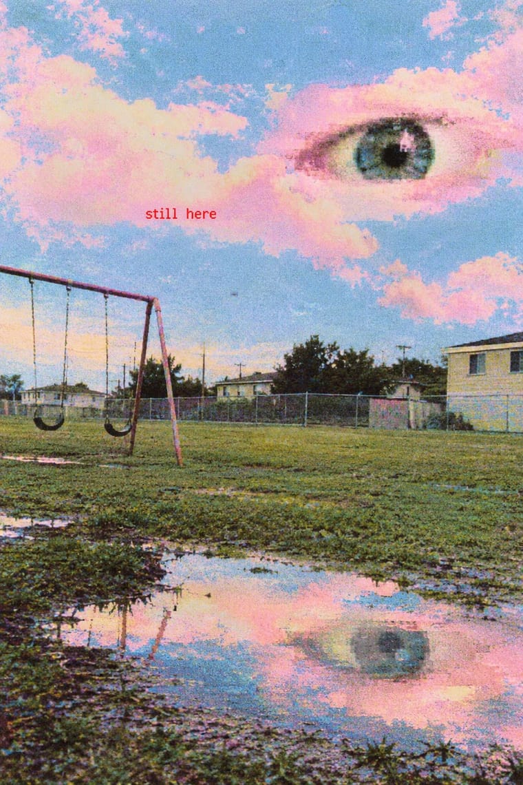
An internet aesthetic popularised on Reddit, TikTok and YouTube in the early 2020s, with dreamcore as its softer, pastel, cloud-filled sister. Found or low-quality snapshots of empty, half-familiar places (playgrounds, classrooms, malls, corridors) are crudely edited: disembodied eyes in clouds or darkness, faceless figures in doorways, and short captions such as 'nothing is real' in red or inside black voids. The aim is anemoia, a nostalgia for places one never knew, turned into unease and the feeling of being watched.
Instrument Sans; Weirdcore used Short captions in out-of-place red text ('are you lost?', 'nothing is real'), typed in whatever plain default face the editing app offers and dropped onto the photograph and White text inside black rectangular voids pasted over the picture, the void heightening the message
03
The colours
The ground and leading colours come from Internet Ugly, with a counter-accent from Weirdcore. The ink reads on the ground at 4.5:1 or more.
Internet Ugly & Meme Vernacular Weirdcore & Dreamcore
-
#ffffffground · 36% -
#000000ink · 14% -
#00a2e8accent · 18% -
#ff0000accent · 14% -
#ff7f27accent · 10% -
#cfc07aaccent · 8%
As CSS
:root {
  --ground: #ffffff;
  --ink: #000000;
  --accent-1: #00a2e8;
  --accent-2: #ff0000;
  --accent-3: #ff7f27;
  --accent-4: #cfc07a;
  --font-display: "Anton", sans-serif;
  --font-text: "Instrument Sans", sans-serif;
}
Use it with care
Internet Ugly & Meme Vernacular: Most meme templates are photographs of real people, often children, or licensed stock. Success Kid is Laney Griner's son: the photo has been licensed to advertisers, and in January 2020 she sent a cease-and-desist letter to a congressman whose fundraising campaign used it without permission. Distracted Boyfriend is microstock, and its photographer says use without a proper licence is not allowed. License a template or make a new picture for commercial or political work. Check what a format means now: some characters that spread through 4chan were taken up as hate symbols (the ADL listed Pepe the Frog, Matt Furie's 2005 Boy's Club character, in 2016, while noting that most uses are not hateful). Reaction images of Black people posted by non-Black users and brands read as digital blackface (Lauren Michele Jackson, Teen Vogue, 2017), and deep-fried memes came out of Black Twitter, so credit where formats come from. When brands and campaigns borrow a format, its makers often protest or drop it (Douglas).
Weirdcore & Dreamcore: Weirdcore's found snapshots are other people's photographs, often of real homes, schools and playgrounds (the Backrooms photo was a real shop interior in Wisconsin, identified only in 2024): shoot or license your own places, and leave identifiable children and private interiors out. Its makers describe it as built to unsettle, from 'existentialism and derealization' (Nylon, 2021) to an 'aesthetic that can cause a panic attack' (a @unttochable video quoted by i-D, 2021), so take care before aiming it at children or using it near mental-health subjects, and keep video cuts to three or fewer flashes a second (WCAG 2.3.1).
04
The two styles
05
More combinations
With Internet Ugly
- Punk & DIY Zine Pairs well · Both make amateur, cheap reproduction a stance; combine ransom-note cut-ups with Impact captions and crude pasted photos for zine-style posters that still read as a joke.
- International Typographic Style Contrasts · Drop one rage face or Impact caption into a strict Swiss grid to show how much of design's authority comes from polish.
- Brutalist Web Design Pairs well · Put MS Paint drawings and image macros on a raw-HTML page of default fonts and blue links; both treat software defaults as honesty rather than lack of taste.
- Acid Graphics / New Ugly Contrasts · Acid Graphics' 'New Ugly' is rendered by professionals in chrome and 3D; Internet Ugly is ugly because it is quick and amateur. Decide which kind of ugly a brief needs before borrowing either.
- Corporate Memphis Contrasts · Brand-safe flat illustration is what meme makers mock; a brand that borrows meme templates risks the backlash Douglas describes, as communities drop co-opted formats.
- Indie Sleaze Pairs well · Both live on casual web platforms and refuse polish; Indie Sleaze takes the music-scene snapshot where Internet Ugly takes meme vernacular.
- Instagram Slideshow Activism (Social-Justice Infographics) Contrasts · The meme vernacular is its ironic other and the language of its parodies: crude, found and knowing where the slideshow is polished and sincere.
- 'Good Morning' Greeting Images (WhatsApp Forward Vernacular) Contrasts · The same forwarding networks with the opposite intent: borrow the meme's speed and template logic, and even its jokes, but keep the greeting affectionate rather than ironic.
With Weirdcore
- Vaporwave Contrasts · Tanni's genealogy starts with vaporwave's spectral reuse of web imagery; vaporwave collages pastel consumer debris, busts and Japanese text with ironic luxury, while weirdcore empties the frame and drops the joke. Keep the found picture but swap the bust for a vacant playground to move from irony to unease.
- Early Web Vernacular Pairs well · Frame a weirdcore still in an old browser window, a default dialog box or a low-resolution GIF to make its debt to the amateur early web explicit; keep the window empty rather than crowding it with the early web's badges and counters.
- Lo-fi Anime Aesthetic Contrasts · Both are nostalgic online moods set to lo-fi music, but lofi paints a lived-in, occupied room that comforts; weirdcore photographs an empty one that watches back. Choose lofi for focus and calm, weirdcore when the brief wants disquiet.
- Hauntology & Ghost Box Design Contrasts · Both rebuild a misremembered past from found pictures and let nostalgia turn eerie, but Ghost Box designs the haunting: a Penguin-style grid, bold grotesque in a ruled band, a flat colour field and an institutional voice. Weirdcore drops grid, brand and author, and lets an anonymous snapshot and one small caption do it. Choose Ghost Box for an archival, designed eeriness and weirdcore for a found, amateur one.
- Surrealist Graphics Pairs well · Magritte's single displaced object in a calm, ordinary space is the grammar weirdcore remakes with snapshots and phone edits; study it so the one wrong thing (an eye, a door, a figure) feels placed rather than random.
- Glitch Art & Datamosh Graphics Pairs well · Borrow compression damage and an abrupt datamosh between two stills, but treat the damage as the decay of a memory rather than the subject of the work, and keep the rest of the snapshot readable.
- Analog Horror Graphics Contrasts · Both turn nostalgia into unease and share The Backrooms, but weirdcore is a still snapshot of an empty place with one small lowercase caption, while analog horror is a sequence of broadcast or tape fragments in an official voice and plain capitals. Choose the found image or the fake transmission.
- Yami-Kawaii (Sick-Cute) Contrasts · Uncanny low-resolution photography against polished, cute vector illustration.