Style combination · Contrasts
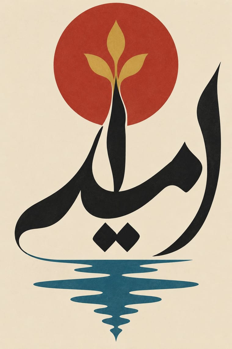
Iranian Modernist Graphic Design × International Typographic Style
Iranian designers deliberately sidestepped the Swiss grid; set neutral Latin type against expressive Persian letters to dramatise system versus script.
Mix them and make something Iranian Modernist Graphic Design International Typographic Style
01
What each style brings
Each part of the design comes from the style with the stronger say in it, and each style gives at least two.
Iranian Modernist Graphic Design International Typographic Style
- Type from Iranian Modernist Graphic Design
- Colour from International Typographic Style
- Form from Iranian Modernist Graphic Design
- Composition from International Typographic Style
- Surface from Iranian Modernist Graphic Design
02
The type
Open fonts standing in for each style’s own type, which is often hand-drawn or commercial.
Text · International Typographic Style
A post-war refinement of the New Typography in which the mathematical grid, objective photography and neo-grotesque sans-serifs were used to communicate with clarity and neutrality. Taught at the Basel and Zurich schools, it became the default language of international corporate and institutional communication.
Inter; International Typographic Style used Akzidenz-Grotesk and Helvetica
03
The colours
The ground and leading colours come from International Typographic Style, with a counter-accent from Iranian Modernist Graphic Design. The ink reads on the ground at 4.5:1 or more.
Iranian Modernist Graphic Design International Typographic Style
-
#f2f0e9ground · 36% -
#111111ink · 14% -
#e1251baccent · 18% -
#c49a3aaccent · 14% -
#1f4e9caccent · 10% -
#b0322aaccent · 8%
As CSS
:root {
  --ground: #f2f0e9;
  --ink: #111111;
  --accent-1: #e1251b;
  --accent-2: #c49a3a;
  --accent-3: #1f4e9c;
  --accent-4: #b0322a;
  --font-display: "Rakkas", cursive;
  --font-text: "Inter", sans-serif;
}
04
The two styles

05
More combinations
With Iranian Modernist Graphic Design
- Polish Poster School Pairs well · Combine the Polish school's painted metaphor with Persian lettering for a conceptual cultural poster.
- Cairo–Beirut Arab Modernist Book & Periodical Design Pairs well · Tehran's Kanoon and Beirut's Dar al-Fata al-Arabi were parallel 1970s children's-publishing cultures; combine Persian calligraphic covers with Arab picture-book drawing for a regional series.
- Islamic Geometric & Calligraphic Tradition Pairs well · Use girih geometry as the hidden construction grid for stretched and interlocked calligraphic letters.
- Square Kufic (Bannāʾī) Pairs well · Persian Wikipedia records bannāʾī in modern posters, logos and letterheads, and the atlas's Iranian modernist entry counts it among its Persian scripts; pair a square-Kufic title block with a Nastaʿlīq line and one flat figure for a Persian cultural poster.
- Persian Popular Narrative (Lithographs & Coffeehouse Painting) Pairs well · Farshid Mesghali collaged coloured clippings of Qajar lithograph illustrations for a poster for the Tehran International Festival of Films for Children and Young Adults (dated November 1967 by Marzolph); crop and enlarge a hatched lithograph figure inside a modernist, white-ground layout.
- Greek Tourism Modernism (EOT) Contrasts · Both are 1960s national modernisms that turned heritage into modern posters: Tehran built it from calligraphic letterforms, EOT from photographed antiquities under a single word of sans; compare them to choose between letter-led and object-led heritage modernism.
- Turkish Modernist Poster & Graphic Design Contrasts · Its Iranian contemporary also learned from the Polish poster, but built its posters on Persian calligraphy and miniature; after the 1928 alphabet reform Turkish designers worked in Latin letters and quoted Kufic only as a reduced sign. Choose Tehran when the letterform should be the protagonist, Istanbul when a drawn figure should be.
- Persian Miniature (Ilkhanid, Timurid and Safavid Book Painting) Pairs well · Iranian modernists drew on miniature imagery; take one stylised figure, a cloud band or a gold rule from the miniature and set it in the open, single-focus space of a modern poster rather than copying a whole crowded page.
With International Typographic Style
- Art Nouveau Contrasts · Ornamental curves against an orthogonal grid make a strong deliberate tension.
- Brutalist Web Design Pairs well · Strip the grid to raw HTML defaults to get a rawer, contemporary take on Swiss honesty.
- Psychedelic Poster Contrasts · Its exact opposite on legibility; borrow one swirling element to break a too-cold Swiss layout.
- Japanese Postwar Modernism Pairs well · Add Japanese restraint and emblematic colour fields to the grid for warmth without losing order.
- American Traditional Tattoo Flash Contrasts · Rational grid and sans-serif against sentimental, hand-lettered emblems: one flash motif on a Swiss layout makes a sharp contrast.
- Graffiti & Hip-Hop Graphics Contrasts · Put a single tag or throw-up over a strict Swiss grid to stage the clash between institutional order and a street voice.
- Pop Art Graphics Contrasts · Set one loud appropriated Pop image inside a strict grid with a neutral grotesque so the irony reads as deliberate rather than chaotic.
- Italian Painted Film Poster (Rome Studios) Contrasts · Grid, restraint and photographic objectivity are the opposite of a crowded painted montage.