Style combination · Pairs well
Persian Miniature × Iranian Modernist Graphic Design
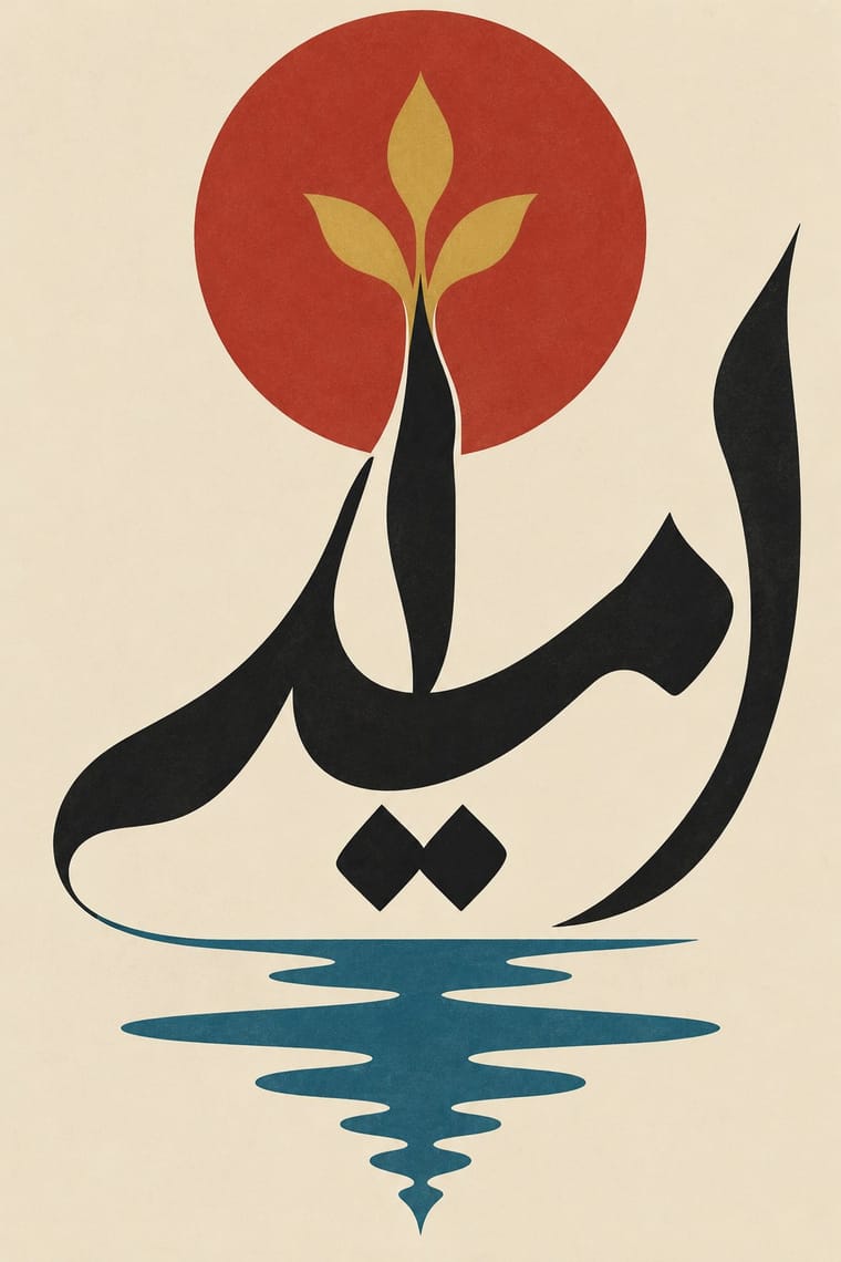
Iranian modernists drew on miniature imagery; take one stylised figure, a cloud band or a gold rule from the miniature and set it in the open, single-focus space of a modern poster rather than copying a whole crowded page.
Mix them and make something Persian Miniature Iranian Modernist Graphic Design
01
What each style brings
Each part of the design comes from the style with the stronger say in it, and each style gives at least two.
Persian Miniature (Ilkhanid, Timurid and Safavid Book Painting) Iranian Modernist Graphic Design
- Type from Iranian Modernist Graphic Design
- Colour from Persian Miniature
- Form from Persian Miniature
- Composition from Persian Miniature
- Surface from Iranian Modernist Graphic Design
02
The type
Open fonts standing in for each style’s own type, which is often hand-drawn or commercial.
Text · Persian Miniature
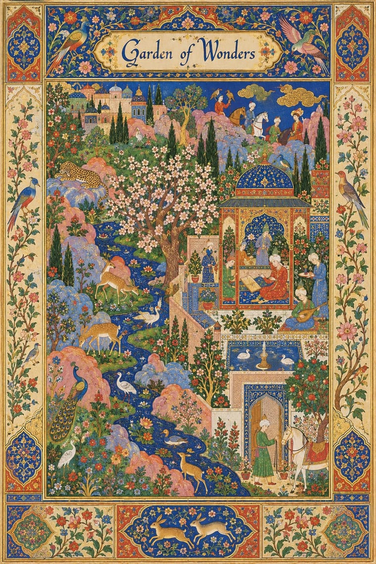
The court book painting of Iran and Timurid Herat, formed in Mongol Tabriz from Islamic, Byzantine and Chinese models: from Rashid al-Din's Jamiʿ al-tawarikh (1314) and the Great Mongol Shahnama to Behzad's Herat and the Shahnama of Shah Tahmasp, ending in the album pages of Safavid Isfahan. Small, elegant figures crowd a picture set into ruled columns of verse and framed by coloured rules and gilded margins. Space climbs the page under a high horizon, without linear perspective or cast shadow, in lapis, vermilion, malachite, gold and silver.
EB Garamond; Persian Miniature used Nastaʿlīq, the hanging Persian hand of Timurid and Safavid manuscripts, written in ruled columns around the paintings and Headings written in an illuminated panel across the full width of the text block, set apart from the text in gold and colour, as on the first text page of the Shiraz Shahnama of 1444, where the basmala heads the preface (Cleveland Museum of Art, 1956.10.b)
03
The colours
The ground and leading colours come from Persian Miniature, with a counter-accent from Iranian Modernist Graphic Design. The ink reads on the ground at 4.5:1 or more.
Persian Miniature (Ilkhanid, Timurid and Safavid Book Painting) Iranian Modernist Graphic Design
-
#efe4c8ground · 36% -
#1f3f8fink · 14% -
#c8412caccent · 18% -
#c49a3aaccent · 14% -
#d98f86accent · 10% -
#4f8a4aaccent · 8%
As CSS
:root {
  --ground: #efe4c8;
  --ink: #1f3f8f;
  --accent-1: #c8412c;
  --accent-2: #c49a3a;
  --accent-3: #d98f86;
  --accent-4: #4f8a4a;
  --font-display: "Rakkas", cursive;
  --font-text: "EB Garamond", serif;
}
Use it with care
Persian Miniature (Ilkhanid, Timurid and Safavid Book Painting): Some histories and poems in this tradition depict the Prophet Muhammad, such as his Night Journey (Miʿraj) on Buraq (a Bustan of Saʿdi folio of c. 1525–35, made probably in Bukhara and Herat rather than in Safavid Iran; Metropolitan Museum of Art, 1974.294.2); after about 1500 Persian painters usually veiled his face, and many Muslims consider any image of him forbidden, so do not adapt or generate such scenes, never supply a face for the Prophet, and keep holy figures off trivial products. Verses, names of God and Qur'anic phrases in the text panels are real texts: have them written or checked by a fluent reader of Persian and Arabic and never fill panels with pseudo-script. Many famous folios are dispersed: George Demotte broke up the Great Mongol Shahnama and altered its pages, and Arthur Houghton gave folios of the Shahnama of Shah Tahmasp to the Metropolitan Museum and sold others one by one before the remains of the manuscript went to Tehran in 1994, so credit each leaf to its manuscript as well as to its present collection. The court tradition declines from the 17th century, which is why the period ends in 1700, but the art of miniature is still practised (Abu'l-Hasan Khan Gaffari in 19th-century Qajar Iran, Mahmoud Farshchian (1930–2025) in our own time); it is living heritage, inscribed on UNESCO's Representative List in 2020 on a joint nomination by Azerbaijan, Iran, Türkiye and Uzbekistan and passed on from master to apprentice, so commission or credit practising painters rather than tracing their work, credit the court and city (Tabriz, Herat, Shiraz, Isfahan) rather than a single modern nation, and never present a generated image as a historical folio.
04
The two styles
05
More combinations
With Persian Miniature
- Armenian Manuscript Illumination Contrasts · Both frame jewel-coloured paintings with gold and ornament, but Armenian Gospel books build symmetrical arcades, canon tables and bird letters for sacred text, while Persian pages crowd secular epic and lyric scenes into an asymmetric, climbing space; decide whether the frame or the story leads.
- Persian Popular Narrative (Lithographs & Coffeehouse Painting) Pairs well · Its popular heir: the same epics in ruled columns of Nastaʿlīq, but drawn in hatched black ink for lithography; pair a court-style coloured frame with a lithographic line drawing to move between luxury and street register.
- Rinpa & Saga-bon Contrasts · Another court art of gold and mineral colour, but Rinpa enlarges a few plants on open gold, while the Persian page fills every corner with small figures and flowers; borrow Rinpa's emptiness to calm a crowded miniature-inspired layout.
- International Typographic Style Contrasts · Its opposite: neutral sans, white space and a modular grid against crowded, gilded, figurative pages; a single framed miniature panel can give a strict grid a narrative focal point.
- Kanoon Children's Book Illustration (Iran, 1965 to 1979) Pairs well · A possible visual kinship in framed compartments and ornament; not established by the cited sources.
- Baghdad School of Arab Book Painting (Maqamat Illustration) Pairs well · Both are figural book painting; borrow the Persian jewel palette and panel framing, but keep the Arab school's plainer, documentary social types.
- Burmese Parabaik Painting (Konbaung Folding Books) Contrasts · Persian book painting crowds a ruled picture field with pattern, architecture and figures under a high horizon without cast shadow; the parabaik leaves the cream paper open, uses European recession and keeps its rich ornament for the covers.
With Iranian Modernist Graphic Design
- Polish Poster School Pairs well · Combine the Polish school's painted metaphor with Persian lettering for a conceptual cultural poster.
- International Typographic Style Contrasts · Iranian designers deliberately sidestepped the Swiss grid; set neutral Latin type against expressive Persian letters to dramatise system versus script.
- Cairo–Beirut Arab Modernist Book & Periodical Design Pairs well · Tehran's Kanoon and Beirut's Dar al-Fata al-Arabi were parallel 1970s children's-publishing cultures; combine Persian calligraphic covers with Arab picture-book drawing for a regional series.
- Islamic Geometric & Calligraphic Tradition Pairs well · Use girih geometry as the hidden construction grid for stretched and interlocked calligraphic letters.
- Square Kufic (Bannāʾī) Pairs well · Persian Wikipedia records bannāʾī in modern posters, logos and letterheads, and the atlas's Iranian modernist entry counts it among its Persian scripts; pair a square-Kufic title block with a Nastaʿlīq line and one flat figure for a Persian cultural poster.
- Persian Popular Narrative (Lithographs & Coffeehouse Painting) Pairs well · Farshid Mesghali collaged coloured clippings of Qajar lithograph illustrations for a poster for the Tehran International Festival of Films for Children and Young Adults (dated November 1967 by Marzolph); crop and enlarge a hatched lithograph figure inside a modernist, white-ground layout.
- Greek Tourism Modernism (EOT) Contrasts · Both are 1960s national modernisms that turned heritage into modern posters: Tehran built it from calligraphic letterforms, EOT from photographed antiquities under a single word of sans; compare them to choose between letter-led and object-led heritage modernism.
- Turkish Modernist Poster & Graphic Design Contrasts · Its Iranian contemporary also learned from the Polish poster, but built its posters on Persian calligraphy and miniature; after the 1928 alphabet reform Turkish designers worked in Latin letters and quoted Kufic only as a reduced sign. Choose Tehran when the letterform should be the protagonist, Istanbul when a drawn figure should be.