Style combination · Contrasts
Iranian Modernist Graphic Design × Turkish Modernist Poster
Its Iranian contemporary also learned from the Polish poster, but built its posters on Persian calligraphy and miniature; after the 1928 alphabet reform Turkish designers worked in Latin letters and quoted Kufic only as a reduced sign. Choose Tehran when the letterform should be the protagonist, Istanbul when a drawn figure should be.
Mix them and make something Iranian Modernist Graphic Design Turkish Modernist Poster
01
What each style brings
Each part of the design comes from the style with the stronger say in it, and each style gives at least two.
Iranian Modernist Graphic Design Turkish Modernist Poster & Graphic Design
- Type from Iranian Modernist Graphic Design
- Colour from Iranian Modernist Graphic Design
- Form from Turkish Modernist Poster
- Composition from Turkish Modernist Poster
- Surface from Turkish Modernist Poster
02
The type
Open fonts standing in for each style’s own type, which is often hand-drawn or commercial.
Text · Turkish Modernist Poster
The posters of Istanbul's first generation of professional graphic designers for theatres, films, festivals and exhibitions. Mengü Ertel, Yurdaer Altıntaş and later Bülent Erkmen reduced each play or film to one visual idea or pun: a figure, mask, eye or object drawn as flat, simplified shapes in two or three inks on an open field of colour or white, with a hand-drawn or bold serif title. From the 1980s Erkmen pared the language down further to a giant word, a stripe or one photographed detail.
Newsreader; Turkish Modernist Poster used Hand-drawn title lettering by the designers themselves, e.g. Altıntaş's heavy lowercase 'aptal kız' (Kent Oyuncuları, 1961) and his condensed brush capitals for Dormen Tiyatrosu's 'Bugün Git Yarın Gel' and Bold and book serif titles centred above the image (Erkmen's Kent Oyuncuları posters and 'Les Civilisations Anatoliennes', 1983, in a Times-like transitional serif), and heavy serif capitals on Ertel's 'Jan Dark'ın Çilesi' and 'Le Gardien'
03
The colours
The ground and leading colours come from Iranian Modernist Graphic Design, with a counter-accent from Turkish Modernist Poster. The ink reads on the ground at 4.5:1 or more.
Iranian Modernist Graphic Design Turkish Modernist Poster & Graphic Design
-
#efe6d2ground · 36% -
#1a1a1aink · 14% -
#c49a3aaccent · 18% -
#c8162daccent · 14% -
#007266accent · 10% -
#36345aaccent · 8%
As CSS
:root {
  --ground: #efe6d2;
  --ink: #1a1a1a;
  --accent-1: #c49a3a;
  --accent-2: #c8162d;
  --accent-3: #007266;
  --accent-4: #36345a;
  --font-display: "Rakkas", cursive;
  --font-text: "Newsreader", serif;
}
Use it with care
Turkish Modernist Poster & Graphic Design: These posters are the signed work of named designers, several of them living or recently dead: borrow the method (one flat sign, two or three inks, an open field), not a particular poster. Karagöz shadow theatre is a living tradition on UNESCO's Representative List of the Intangible Cultural Heritage of Humanity (2009), and square Kufic often spells sacred names such as Allah, Muhammad or Ali, so do not cut either into decoration without knowing what it says.
04
The two styles
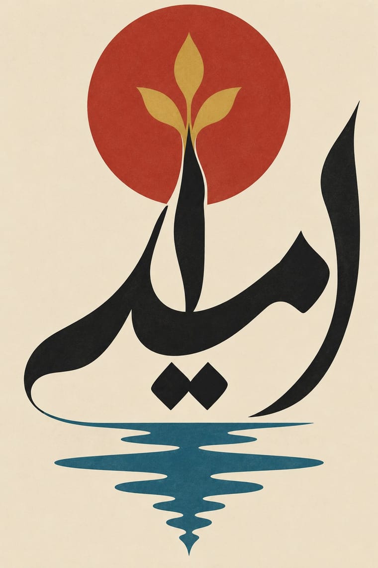
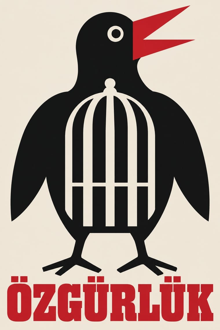
05
More combinations
With Iranian Modernist Graphic Design
- Polish Poster School Pairs well · Combine the Polish school's painted metaphor with Persian lettering for a conceptual cultural poster.
- International Typographic Style Contrasts · Iranian designers deliberately sidestepped the Swiss grid; set neutral Latin type against expressive Persian letters to dramatise system versus script.
- Cairo–Beirut Arab Modernist Book & Periodical Design Pairs well · Tehran's Kanoon and Beirut's Dar al-Fata al-Arabi were parallel 1970s children's-publishing cultures; combine Persian calligraphic covers with Arab picture-book drawing for a regional series.
- Islamic Geometric & Calligraphic Tradition Pairs well · Use girih geometry as the hidden construction grid for stretched and interlocked calligraphic letters.
- Square Kufic (Bannāʾī) Pairs well · Persian Wikipedia records bannāʾī in modern posters, logos and letterheads, and the atlas's Iranian modernist entry counts it among its Persian scripts; pair a square-Kufic title block with a Nastaʿlīq line and one flat figure for a Persian cultural poster.
- Persian Popular Narrative (Lithographs & Coffeehouse Painting) Pairs well · Farshid Mesghali collaged coloured clippings of Qajar lithograph illustrations for a poster for the Tehran International Festival of Films for Children and Young Adults (dated November 1967 by Marzolph); crop and enlarge a hatched lithograph figure inside a modernist, white-ground layout.
- Greek Tourism Modernism (EOT) Contrasts · Both are 1960s national modernisms that turned heritage into modern posters: Tehran built it from calligraphic letterforms, EOT from photographed antiquities under a single word of sans; compare them to choose between letter-led and object-led heritage modernism.
- Persian Miniature (Ilkhanid, Timurid and Safavid Book Painting) Pairs well · Iranian modernists drew on miniature imagery; take one stylised figure, a cloud band or a gold rule from the miniature and set it in the open, single-focus space of a modern poster rather than copying a whole crowded page.
With Turkish Modernist Poster
- Polish Poster School Contrasts · The same conceptual-poster network: Turkish designers showed at the Warsaw Poster Biennale from 1966 and Ertel's posters entered the Wilanów archive in 1968. The Polish school paints, collages and distorts its single idea; the Turkish posters cut it into flat shapes in two or three clean inks. Choose Warsaw for unease, Istanbul for a crisp visual pun.
- Square Kufic (Bannāʾī) Pairs well · Erkmen set the Latin initials TİEM on a square-Kufic grid for the Türk ve İslam Eserleri Müzesi logo, and Ertel drew on Kufic for a Ministry of Culture logo; borrow the bannāʾī grid as a structure for a mark, but check what any Kufic letters spell before using them.
- International Typographic Style Pairs well · A background influence that came through teaching rather than through the poster makers themselves: the Bauhaus-modelled State School of Applied Fine Arts (1957), whose functionalism Erzincan sees following 'a trajectory parallel to the International Typographic Style', trained Aydın Erkmen and İlhan Bilge, not Ertel, Altıntaş or Bülent Erkmen, and the Academy's Grafik Atölyesi taught 'less is more' from 1967. Set a festival's credits on a column grid beside one flat figure, as Altıntaş set the credits of the film poster 'Sen de Gitme' (1996) in three columns.
- Early Turkish Republican Graphic Design Contrasts · İhap Hulusi's generation modelled figures in lithographed light and shade for banks, monopolies and state campaigns; the modernists who followed worked for theatres and festivals and replaced the modelled figure with a flat sign and, later, with type. Use the Republican posters for warmth and official confidence, the modernists for wit.
- Turkish Weekly Humour Magazines (Gırgır to Uykusuz) Contrasts · Same city, same decades, opposite density: Istanbul's poster designers reduced a play or film to one flat idea on an open field, while the humour weeklies packed a cover with a caricature, balloons, headline band and price box. Borrow the poster's single idea to calm a crowded cover.