Style combination · Contrasts
PC Music Graphics × Vaporwave
Both are ironic about consumer culture, but vaporwave collages faded pastel ruins of the 1990s, while PC Music renders one pristine new product.
01
What each style brings
Each part of the design comes from the style with the stronger say in it, and each style gives at least two.
PC Music Graphics Vaporwave
- Type from Vaporwave
- Form from PC Music Graphics
- Composition from PC Music Graphics
- Surface from PC Music Graphics
02
The type
Open fonts standing in for each style’s own type, which is often hand-drawn or commercial.
Text · PC Music Graphics
The release artwork of London's PC Music label (2013-2023) and its immediate circle (Diamond Wright, Sophie, Timothy Luke): early hyperpop that treats a song as a polished synthetic product, not the later glitchy, maximalist hyperpop. One object, often a 3D render or a retouched portrait, gleams on a plain ground: plastic, milled aluminium, a pink capsule, a blue disc. Ideas are taken literally and pushed until strange, with puns on brands and computer culture. Dazed called the look 'bouncy, shiny, commercial, plastic, unnatural, metallic'.
Inter; PC Music Graphics used Custom display lettering after Rudolf Koch and Berthold Wolpe, with a Renaissance, woodcut feel and Comic Sans and other early-web system defaults, quoted knowingly
03
The colours
The ground and leading colours come from Vaporwave, with a counter-accent from PC Music Graphics. The ink reads on the ground at 4.5:1 or more.
PC Music Graphics Vaporwave
-
#1a1040ground · 36% -
#fffb96ink · 14% -
#01cdfeaccent · 18% -
#f2ff1faccent · 14% -
#05ffa1accent · 10% -
#e0151faccent · 8%
As CSS
:root {
  --ground: #1a1040;
  --ink: #fffb96;
  --accent-1: #01cdfe;
  --accent-2: #f2ff1f;
  --accent-3: #05ffa1;
  --accent-4: #e0151f;
  --font-display: "Syncopate", sans-serif;
  --font-text: "Inter", sans-serif;
}
04
The two styles

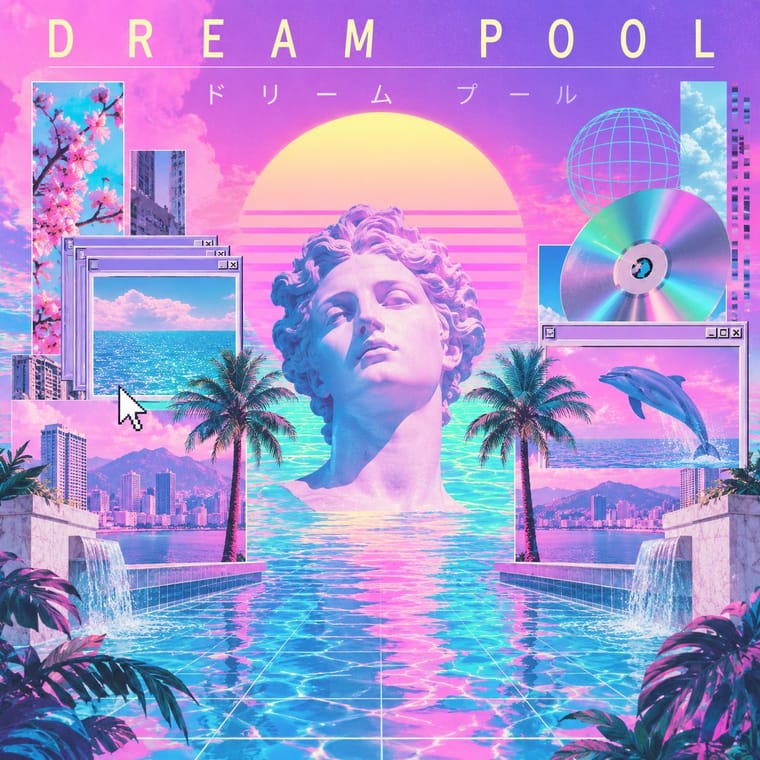
05
More combinations
With PC Music Graphics
- Hipgnosis Photographic Concept Sleeve Contrasts · Both take an idea literally and push it until it turns strange, but Hipgnosis staged it in a real place with a camera, while PC Music renders a synthetic product on a blank field.
- Glitch Art & Datamosh Graphics Contrasts · Later hyperpop and glitchcore lean on glitchy, cluttered, datamoshed edits that corrupt the image; PC Music keeps the surface flawless.
- Acid Graphics / New Ugly Contrasts · Neighbours in the late 2010s club scene, but acid graphics crowd chrome, blackletter and neon on black, where PC Music isolates one clean object on a plain field.
- Kawaii Design Pairs well · Add kawaii's cute characters and pink to the label's plastic packshots for its bubblegum, Hannah Diamond side.
- Op Art Graphics Pairs well · Borrow vibrating line patterns, as Month of Mayhem did, to make a glossy object shimmer on a spinning record or a screen.
- Y2K Futurism Contrasts · Same chrome, gloss and 3D renders, but Y2K believed in the millennium's technology; PC Music quotes the gloss as a product with a straight face and a pun.
- Gabber and Hardcore Graphics (Rotterdam and Thunderdome) Contrasts · Glossy chrome and loud colour appear in both, but hardcore keeps them aggressive where hyperpop makes them sugary.
With Vaporwave
- International Typographic Style Contrasts · Swiss objectivity is vaporwave's antithesis; a strict grid can frame its chaos for editorial or music-packaging use.
- Bitmap & Pixel Graphics Pairs well · Use pixel fonts, dithered gradients and Windows-style dialog boxes as framing devices for vaporwave collages.
- Memphis Design Pairs well · Memphis terrazzo, squiggles and pastel laminates ground vaporwave's busts and grids in genuine 1980s decorative language.
- Ma & Wabi-sabi Aesthetics Contrasts · Wabi-sabi's natural imperfection and quiet earth tones are the analogue counterpoint to vaporwave's synthetic, plastic nostalgia.
- Generative-AI Image Aesthetic Pairs well · Vaporwave's ironic distance is the antidote to AI's earnest polish; frame generated images as found kitsch to make the artificiality the point.
- Frutiger Aero Pairs well · Both trade on mid-2000s tech nostalgia; mix Aero bubbles and skies with vaporwave's pastel 3D for retro-internet campaigns.
- Weirdcore & Dreamcore Contrasts · Tanni's genealogy starts with vaporwave's spectral reuse of web imagery; vaporwave collages pastel consumer debris, busts and Japanese text with ironic luxury, while weirdcore empties the frame and drops the joke. Keep the found picture but swap the bust for a vacant playground to move from irony to unease.
- Early Web Vernacular Pairs well · Vaporwave already mines this archive; combine tiled backgrounds and default fonts with its pastel 3D for nostalgic net art.