Style combination · Pairs well
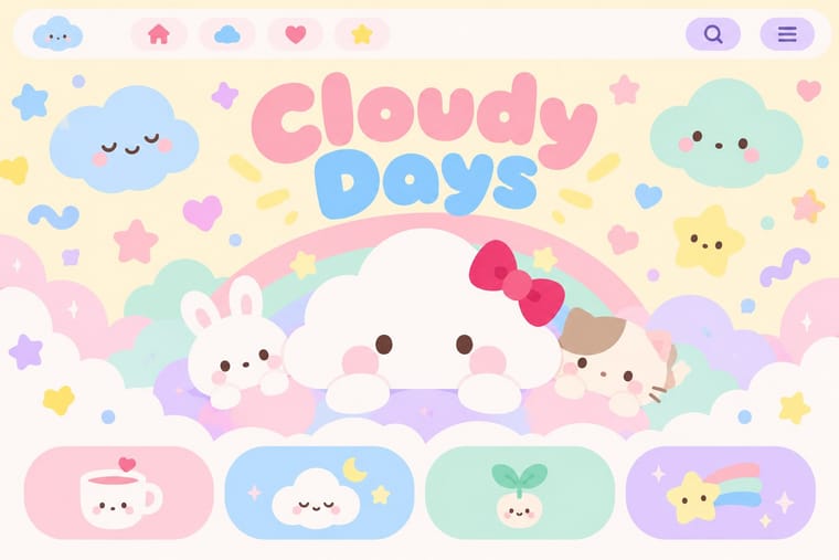
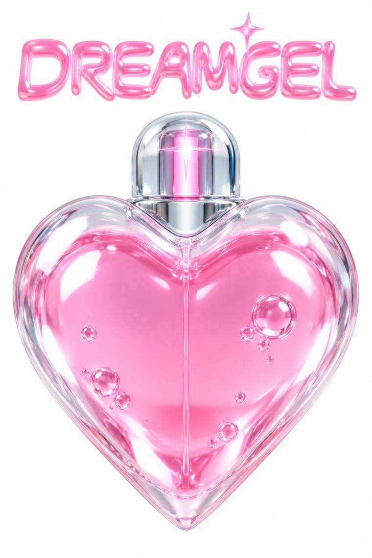
Kawaii Design × PC Music Graphics
Add kawaii's cute characters and pink to the label's plastic packshots for its bubblegum, Hannah Diamond side.
01
What each style brings
Each part of the design comes from the style with the stronger say in it, and each style gives at least two.
Kawaii Design PC Music Graphics
- Type from Kawaii Design
- Colour from Kawaii Design
- Form from Kawaii Design
- Composition from PC Music Graphics
- Surface from PC Music Graphics
02
The type
Open fonts standing in for each style’s own type, which is often hand-drawn or commercial.
Display · Kawaii Design
Wow
Zen Maru Gothic, standing in for Maru-ji (rounded teenage handwriting, 1970s)
Text · PC Music Graphics
The release artwork of London's PC Music label (2013-2023) and its immediate circle (Diamond Wright, Sophie, Timothy Luke): early hyperpop that treats a song as a polished synthetic product, not the later glitchy, maximalist hyperpop. One object, often a 3D render or a retouched portrait, gleams on a plain ground: plastic, milled aluminium, a pink capsule, a blue disc. Ideas are taken literally and pushed until strange, with puns on brands and computer culture. Dazed called the look 'bouncy, shiny, commercial, plastic, unnatural, metallic'.
Inter; PC Music Graphics used Custom display lettering after Rudolf Koch and Berthold Wolpe, with a Renaissance, woodcut feel and Comic Sans and other early-web system defaults, quoted knowingly
03
The colours
The ground and leading colours come from Kawaii Design, with a counter-accent from PC Music Graphics. The ink reads on the ground at 4.5:1 or more.
Kawaii Design PC Music Graphics
-
#fff4a3ground · 36% -
#141414ink · 14% -
#e60033accent · 18% -
#a8d8ffaccent · 14% -
#ff9ccfaccent · 10% -
#cdb4ffaccent · 8%
As CSS
:root {
  --ground: #fff4a3;
  --ink: #141414;
  --accent-1: #e60033;
  --accent-2: #a8d8ff;
  --accent-3: #ff9ccf;
  --accent-4: #cdb4ff;
  --font-display: "Zen Maru Gothic", sans-serif;
  --font-text: "Inter", sans-serif;
}
04
The two styles
05
More combinations
With Kawaii Design
- Techno-Futurist Graphics Pairs well · A cute mascot inside a dense techno-corporate layout softens its satire; Groovisions' Chappie is the model.
- Grunge Typography Contrasts · Grunge's dirt and illegibility is kawaii's opposite; one cute character on a distressed texture creates knowing dissonance.
- Memphis Design Pairs well · Kawaii characters sit happily on Memphis pastel geometry; combine them for playful packaging with a little more edge.
- Dark Tech Minimalism Contrasts · Use a single pastel mascot or emoji moment to humanise a cold, dark interface without changing its structure.
- Claymorphism & Soft 3D Pairs well · Kawaii's oversized heads, minimal faces and scattered sparkles translate directly into clay volumes; use its character rules for mascots and emoji so the 3D figures stay simple and readable at small sizes.
- Moomin Graphics (Tove Jansson's Pen-Drawn World and its Licensed Afterlife) Contrasts · Its round, white characters sit near kawaii fancy goods, but they keep a hatched, melancholy world around them that kawaii fancy goods leave out.
- Superflat Contrasts · Kawaii offers sincere, simple, pastel cuteness for fancy goods; switch to Superflat when the cute should be saturated, crowded, many-eyed and ironic, a comment on consumer culture rather than a product of it.
- VTuber Avatar and Stream Graphics Contrasts · Its parent in cute character culture, but kawaii fixes a static mascot on pastel goods and print; switch to VTuber graphics when the character has to move, talk and answer a live chat, with a performer's voice and a whole stream screen around it.
With PC Music Graphics
- Hipgnosis Photographic Concept Sleeve Contrasts · Both take an idea literally and push it until it turns strange, but Hipgnosis staged it in a real place with a camera, while PC Music renders a synthetic product on a blank field.
- Vaporwave Contrasts · Both are ironic about consumer culture, but vaporwave collages faded pastel ruins of the 1990s, while PC Music renders one pristine new product.
- Glitch Art & Datamosh Graphics Contrasts · Later hyperpop and glitchcore lean on glitchy, cluttered, datamoshed edits that corrupt the image; PC Music keeps the surface flawless.
- Acid Graphics / New Ugly Contrasts · Neighbours in the late 2010s club scene, but acid graphics crowd chrome, blackletter and neon on black, where PC Music isolates one clean object on a plain field.
- Op Art Graphics Pairs well · Borrow vibrating line patterns, as Month of Mayhem did, to make a glossy object shimmer on a spinning record or a screen.
- Y2K Futurism Contrasts · Same chrome, gloss and 3D renders, but Y2K believed in the millennium's technology; PC Music quotes the gloss as a product with a straight face and a pun.
- Gabber and Hardcore Graphics (Rotterdam and Thunderdome) Contrasts · Glossy chrome and loud colour appear in both, but hardcore keeps them aggressive where hyperpop makes them sugary.