Style combination · Contrasts
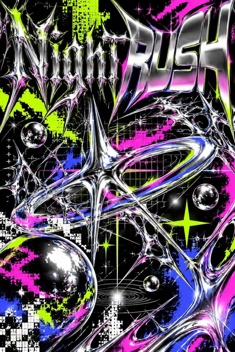
Acid Graphics × PC Music Graphics
Neighbours in the late 2010s club scene, but acid graphics crowd chrome, blackletter and neon on black, where PC Music isolates one clean object on a plain field.
01
What each style brings
Each part of the design comes from the style with the stronger say in it, and each style gives at least two.
Acid Graphics / New Ugly PC Music Graphics
- Type from Acid Graphics
- Colour from Acid Graphics
- Form from PC Music Graphics
- Composition from PC Music Graphics
- Surface from Acid Graphics
-
PC Music Graphics avoids glitch: this is where the two pull against each other, which is the point of the contrast.
02
The type
Open fonts standing in for each style’s own type, which is often hand-drawn or commercial.
Text · PC Music Graphics
The release artwork of London's PC Music label (2013-2023) and its immediate circle (Diamond Wright, Sophie, Timothy Luke): early hyperpop that treats a song as a polished synthetic product, not the later glitchy, maximalist hyperpop. One object, often a 3D render or a retouched portrait, gleams on a plain ground: plastic, milled aluminium, a pink capsule, a blue disc. Ideas are taken literally and pushed until strange, with puns on brands and computer culture. Dazed called the look 'bouncy, shiny, commercial, plastic, unnatural, metallic'.
Inter; PC Music Graphics used Custom display lettering after Rudolf Koch and Berthold Wolpe, with a Renaissance, woodcut feel and Comic Sans and other early-web system defaults, quoted knowingly
03
The colours
The ground and leading colours come from Acid Graphics, with a counter-accent from PC Music Graphics. The ink reads on the ground at 4.5:1 or more.
Acid Graphics / New Ugly PC Music Graphics
-
#000000ground · 36% -
#ffffffink · 14% -
#ccff00accent · 18% -
#f2ff1faccent · 14% -
#ff1ad9accent · 10% -
#e0151faccent · 8%
As CSS
:root {
  --ground: #000000;
  --ink: #ffffff;
  --accent-1: #ccff00;
  --accent-2: #f2ff1f;
  --accent-3: #ff1ad9;
  --accent-4: #e0151f;
  --font-display: "Tilt Warp", sans-serif;
  --font-text: "Inter", sans-serif;
}
04
The two styles

05
More combinations
With Acid Graphics
- Neo-Swiss Revival Contrasts · Set a single liquid-chrome wordmark inside a clean neo-Swiss grid so information stays legible around the spectacle.
- Graffiti & Hip-Hop Graphics Pairs well · Graffiti wildstyle letter structures translate naturally into chrome 3D renders for gig posters and merch.
- Corporate Memphis Contrasts · Acid graphics defines itself against Corporate Memphis' friendliness; lean into the contrast to signal underground credibility.
- Techno-Futurist Graphics Pairs well · Borrow The Designers Republic's corporate-parody logos and tiny technical captions to give acid layouts a systematic backbone.
- Rave & Acid House Graphics Pairs well · Acid graphics is rave's digital heir; reuse the chrome logotype and fluorescent-on-black palette with contemporary 3D tools.
- Post-Binary Typography (Bye Bye Binary and Inclusive French Type) Pairs well · The collective's banners share Acid Graphics' blackletter, spiky stars, gradients and chrome-like lettering; borrow that repertoire for a manifesto banner or flyer, but keep the post-binary glyph legible as the subject rather than the surface effect.
- Glitch Art & Datamosh Graphics Contrasts · Acid graphics renders polished chrome and adds glitch as a finish; glitch art breaks the file and keeps what comes out. Decide whether a brief wants spectacle or exposure.
- Gothic Blackletter & Fraktur Tradition Pairs well · Its club-poster revival: acid graphics mixes blackletter with liquid chrome, ultra-wide grotesques and pixel faces. Render one broken-letter wordmark in chrome on black and leave the parchment, rubrics and justified page behind.
With PC Music Graphics
- Hipgnosis Photographic Concept Sleeve Contrasts · Both take an idea literally and push it until it turns strange, but Hipgnosis staged it in a real place with a camera, while PC Music renders a synthetic product on a blank field.
- Vaporwave Contrasts · Both are ironic about consumer culture, but vaporwave collages faded pastel ruins of the 1990s, while PC Music renders one pristine new product.
- Glitch Art & Datamosh Graphics Contrasts · Later hyperpop and glitchcore lean on glitchy, cluttered, datamoshed edits that corrupt the image; PC Music keeps the surface flawless.
- Kawaii Design Pairs well · Add kawaii's cute characters and pink to the label's plastic packshots for its bubblegum, Hannah Diamond side.
- Op Art Graphics Pairs well · Borrow vibrating line patterns, as Month of Mayhem did, to make a glossy object shimmer on a spinning record or a screen.
- Y2K Futurism Contrasts · Same chrome, gloss and 3D renders, but Y2K believed in the millennium's technology; PC Music quotes the gloss as a product with a straight face and a pun.
- Gabber and Hardcore Graphics (Rotterdam and Thunderdome) Contrasts · Glossy chrome and loud colour appear in both, but hardcore keeps them aggressive where hyperpop makes them sugary.