Style combination · Pairs well
NSK Retro-Avant-Garde × Post-Punk Record Sleeve
Both quote an earlier image whole on a quiet or dark field and let a coded title do the rest; borrow Saville's restraint to make an NSK-style quotation read as a designed object rather than a provocation.
Mix them and make something NSK Retro-Avant-Garde Post-Punk Record Sleeve
01
What each style brings
Each part of the design comes from the style with the stronger say in it, and each style gives at least two.
NSK Retro-Avant-Garde Post-Punk Record Sleeve (Stiff, Factory, 4AD)
- Type from Post-Punk Record Sleeve
- Colour from NSK Retro-Avant-Garde
- Form from NSK Retro-Avant-Garde
- Composition from NSK Retro-Avant-Garde
- Surface from Post-Punk Record Sleeve
02
The type
Open fonts standing in for each style’s own type, which is often hand-drawn or commercial.
Display · Post-Punk Record Sleeve
Memory
Syne; Post-Punk Record Sleeve used Peter Saville's colour-coded alphabet, one coloured block per letter, decoded by a wheel on the back of Power, Corruption & Lies (1983) and used for the title of Blue Monday and Small, ordered sans-serif capitals in the manner of Jan Tschichold's New Typography, which Saville took as his model from the 1978 Factory poster onwards
Text · NSK Retro-Avant-Garde
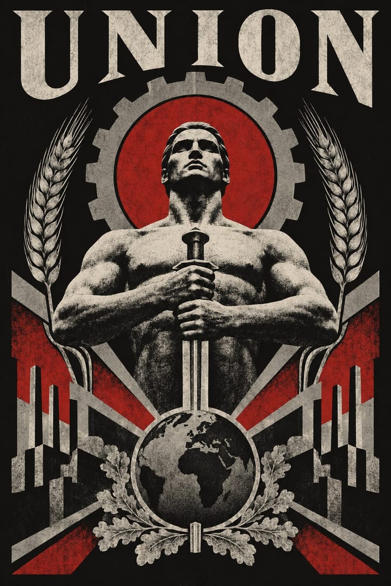
The retro-avant-garde of Neue Slowenische Kunst, founded in Ljubljana in 1984 by Laibach, IRWIN and the Scipion Nasice Sisters Theatre, with Novi kolektivizem as its design department. Its posters, emblems, flags and NSK State passports lift socialist-realist, Nazi, religious and Suprematist images whole, join incompatible symbols in solemn, centred heraldry, and over-identify with power instead of mocking it. The 1987 Youth Day poster, reworked from a Nazi painting, is the best-known case.
Archivo; NSK Retro-Avant-Garde used Heavy block sans capitals for the name LAIBACH on the 1980 Thrower posters and Constructed mixed-case display capitals of the 'NEUE SLOWENISCHE KUNST' wordmark under the NSK coat of arms
03
The colours
The ground and leading colours come from NSK Retro-Avant-Garde, with a counter-accent from Post-Punk Record Sleeve. The ink reads on the ground at 4.5:1 or more.
NSK Retro-Avant-Garde Post-Punk Record Sleeve (Stiff, Factory, 4AD)
-
#121212ground · 36% -
#ebe5d6ink · 14% -
#b31b1baccent · 18% -
#f2c230accent · 14% -
#8c8c88accent · 10% -
#b8963eaccent · 8%
As CSS
:root {
  --ground: #121212;
  --ink: #ebe5d6;
  --accent-1: #b31b1b;
  --accent-2: #f2c230;
  --accent-3: #8c8c88;
  --accent-4: #b8963e;
  --font-display: "Syne", sans-serif;
  --font-text: "Archivo", sans-serif;
}
Use it with care
NSK Retro-Avant-Garde: NSK's sources include Nazi propaganda, and its emblem incorporates John Heartfield's swastika of axes: taken out of its context such imagery reads as endorsement rather than critique, and showing Nazi symbols is restricted by law in Germany and several other countries. The black cross, the NSK coat of arms and the NSK passport belong to living artists who still use them, so do not copy them. Make a new quotation from public-domain state imagery, and only for a setting that can carry the provocation and make its critical frame clear. The NSK passport, an art project that is not valid for travel, has been taken for a real document: there are stories of holders crossing a border on one when their Bosnian passport failed in the 1990s, and by 2007 a growing number of applicants from one town in Nigeria treated it, in IRWIN's words, as 'a viable document'. Never make a mock passport, ID card, stamp or banknote that could be mistaken for, or used as, a real state document.
Post-Punk Record Sleeve (Stiff, Factory, 4AD): The sleeves are in copyright, and several of their quoted images have their own authors, such as Harold Craft's pulsar plot and Bernard Pierre Wolff's photograph of the Appiani tomb: make a new quotation from a public-domain or licensed source rather than copying a Factory, Stiff or 4AD cover or its colour code.
04
The two styles
05
More combinations
With NSK Retro-Avant-Garde
- Socialist Realist Propaganda Poster Contrasts · The same workers, torches and flags, but socialist realism believes them and NSK joins them to their enemies; choose between them by asking whether the viewer should be moved or made uneasy.
- Suprematism Pairs well · NSK turned Malevich's black cross into a heraldic badge; set one Suprematist primitive dead centre, framed by a cog or wreath, to turn pure form into insignia.
- Punk & DIY Zine Contrasts · Both answered power in the early 1980s, but punk is crude, cut-up and loud while NSK is polished, centred and solemn; use the pair to choose between shouting at power and impersonating it.
- AIZ Political Photomontage (Heartfield) Contrasts · NSK lifts Nazi and socialist emblems whole into solemn, centred heraldry and over-identifies with power, leaving the verdict open; AIZ builds the same kind of centred emblem, like the axe swastika, but always adds a caption that convicts. Choose by whether the viewer should be left uneasy or told what to think.
- Solidarność & Polish Underground Graphics Contrasts · Both answered a socialist state in the 1980s, but NSK impersonates power in solemn, centred heraldry, while the Polish underground mocked it with jokes, and the Orange Alternative with dwarfs, and Solidarity kept its reverence for church and nation; choose between over-identifying and laughing.
- Zagreb Modernist Graphics (EXAT 51 to Teatar &TD) Contrasts · A later Yugoslav answer to power: Ljubljana's retro-avant-garde of the 1980s lifts socialist, Nazi and religious emblems whole and joins them in solemn heraldry, while Zagreb's designers of the 1950s–70s kept such emblems out and built their posters from abstract units and letters; choose between impersonating power through its symbols and a sign system with none.
With Post-Punk Record Sleeve
- Surrealist Graphics Pairs well · Vaughan Oliver drew on Dalí and Surrealism; add an uncanny juxtaposition to a blurred, textured 23 Envelope photograph for a dream-like sleeve.
- Die Neue Typographie Pairs well · Saville's model: borrow Tschichold's asymmetric placement and small sans-serif capitals, then replace his photographs with one quoted image to get a cool, ordered sleeve.
- Swiss Punk / New Wave Typography Contrasts · Both took modernism apart in the same years: Weingart's Basel school layered type and broke the grid, while post-punk sleeves quoted one borrowed image and withheld the type; choose between layering and withholding.
- Afrobeat Sleeve Art Contrasts · Lemi Ghariokwu's sleeves fill every inch to state the record's argument, while post-punk sleeves leave the name off and say nothing; use the pair to decide how much a cover should explain.
- Minimalist Graphic Design Pairs well · Both let one image or word stand on an empty field; minimalism keeps it calm and neutral, post-punk adds a borrowed image, a code and a darker mood.
- Punk & DIY Zine Contrasts · Same scene, opposite means: punk pasted ransom-note collage onto photocopies, post-punk withheld text and printed one quoted image offset on special stock; choose between shouting and withholding.
- Hipgnosis Photographic Concept Sleeve Contrasts · The generation that made it look dated: post-punk designers quoted one found image and coded or shrank the type, where Hipgnosis paid for elaborate location shoots and darkroom work. Choose between quoting a picture and staging one.
- 2 Tone Graphics Contrasts · Shares restraint and a single focal point, but swaps abstraction for a cartoon mascot.