Style combination · Pairs well
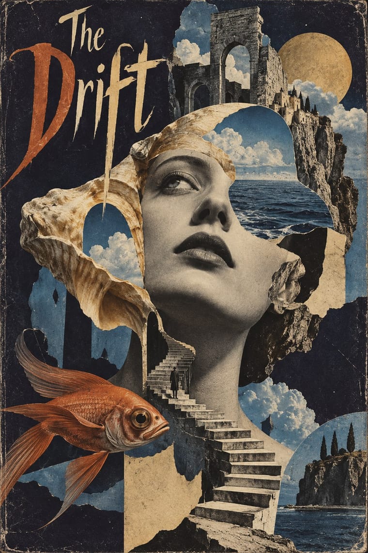
Post-Punk Record Sleeve × Surrealist Graphics
Vaughan Oliver drew on Dalí and Surrealism; add an uncanny juxtaposition to a blurred, textured 23 Envelope photograph for a dream-like sleeve.
Mix them and make something Post-Punk Record Sleeve Surrealist Graphics
01
What each style brings
Each part of the design comes from the style with the stronger say in it, and each style gives at least two.
Post-Punk Record Sleeve (Stiff, Factory, 4AD) Surrealist Graphics
- Type from Post-Punk Record Sleeve
- Colour from Post-Punk Record Sleeve
- Form from Surrealist Graphics
- Composition from Surrealist Graphics
- Surface from Post-Punk Record Sleeve
-
Surrealist Graphics avoids flat: this is where the two pull against each other.
02
The type
Open fonts standing in for each style’s own type, which is often hand-drawn or commercial.
Display · Post-Punk Record Sleeve
Okay
Syne; Post-Punk Record Sleeve used Peter Saville's colour-coded alphabet, one coloured block per letter, decoded by a wheel on the back of Power, Corruption & Lies (1983) and used for the title of Blue Monday and Small, ordered sans-serif capitals in the manner of Jan Tschichold's New Typography, which Saville took as his model from the 1978 Factory poster onwards
Text · Surrealist Graphics
Launched by André Breton's 1924 manifesto, Surrealism sought the marvellous in dreams, chance and the unconscious. Its graphic legacy (uncanny collage from old engravings, solarised and cameraless photographs, impossible juxtapositions painted with illusionistic precision) passed through magazines like Minotaure into fashion, advertising and book design on both sides of the Atlantic.
Bodoni Moda; Surrealist Graphics used Artists' hand-lettered mastheads and Didone and Victorian display faces lifted from 19th-century catalogues
03
The colours
The ground and leading colours come from Post-Punk Record Sleeve, with a counter-accent from Surrealist Graphics. The ink reads on the ground at 4.5:1 or more.
Post-Punk Record Sleeve (Stiff, Factory, 4AD) Surrealist Graphics
-
#111111ground · 36% -
#ece6daink · 14% -
#f2c230accent · 18% -
#a24a2aaccent · 14% -
#b8963eaccent · 10% -
#d8b77aaccent · 8%
As CSS
:root {
  --ground: #111111;
  --ink: #ece6da;
  --accent-1: #f2c230;
  --accent-2: #a24a2a;
  --accent-3: #b8963e;
  --accent-4: #d8b77a;
  --font-display: "Syne", sans-serif;
  --font-text: "Bodoni Moda", serif;
}
Use it with care
Post-Punk Record Sleeve (Stiff, Factory, 4AD): The sleeves are in copyright, and several of their quoted images have their own authors, such as Harold Craft's pulsar plot and Bernard Pierre Wolff's photograph of the Appiani tomb: make a new quotation from a public-domain or licensed source rather than copying a Factory, Stiff or 4AD cover or its colour code.
04
The two styles
05
More combinations
With Post-Punk Record Sleeve
- Die Neue Typographie Pairs well · Saville's model: borrow Tschichold's asymmetric placement and small sans-serif capitals, then replace his photographs with one quoted image to get a cool, ordered sleeve.
- Swiss Punk / New Wave Typography Contrasts · Both took modernism apart in the same years: Weingart's Basel school layered type and broke the grid, while post-punk sleeves quoted one borrowed image and withheld the type; choose between layering and withholding.
- Afrobeat Sleeve Art Contrasts · Lemi Ghariokwu's sleeves fill every inch to state the record's argument, while post-punk sleeves leave the name off and say nothing; use the pair to decide how much a cover should explain.
- Minimalist Graphic Design Pairs well · Both let one image or word stand on an empty field; minimalism keeps it calm and neutral, post-punk adds a borrowed image, a code and a darker mood.
- Punk & DIY Zine Contrasts · Same scene, opposite means: punk pasted ransom-note collage onto photocopies, post-punk withheld text and printed one quoted image offset on special stock; choose between shouting and withholding.
- Hipgnosis Photographic Concept Sleeve Contrasts · The generation that made it look dated: post-punk designers quoted one found image and coded or shrank the type, where Hipgnosis paid for elaborate location shoots and darkroom work. Choose between quoting a picture and staging one.
- 2 Tone Graphics Contrasts · Shares restraint and a single focal point, but swaps abstraction for a cartoon mascot.
- British Style Press (The Face, i-D and Arena) Contrasts · Same years and city: Saville kept type sparse or left it off and quoted one image on a single square. Brody's own Fetish and Cabaret Voltaire sleeves belong to that genre; this entry is the editorial system he built alongside them, with oversized drawn headlines across a whole magazine.
With Surrealist Graphics
- Corporate Identity Modernism Contrasts · Place a single dream image inside a strict corporate grid; the calm system heightens the strangeness.
- Isotype Pictorial Statistics Contrasts · Isotype's one-symbol-one-meaning is the antithesis of Surrealist ambiguity; decide whether the viewer should decode or be disturbed.
- Psychedelic Poster Pairs well · Psychedelic posters revived Surrealist dream imagery; combine them for hallucinatory figurative work with melting forms.
- Polish Poster School Pairs well · Polish poster artists fused Surrealist metaphor with painterly lettering; borrow the method for cultural posters built on one uncanny image.
- Brodovitch Editorial Design (Harper's Bazaar) Pairs well · Take its isolated body parts, torn edges and dreamlike juxtaposition, but apply them to the photographic spread.
- AIZ Political Photomontage (Heartfield) Pairs well · Surrealist photography also makes the impossible look photographed; take its dream logic when a brief needs strangeness, and add the AIZ headline and caption when that strangeness has to land a political point.
- Emblem Book (Motto, Picture & Epigram) Pairs well · Both find meaning in the gap between a picture and the words beside it; pair a framed, uncanny object with a terse motto above and a short verse below for an editorial series that asks to be decoded.
- Basel Object Poster (Swiss Sachplakat) Pairs well · Both paint ordinary things with illusionistic precision until they look strange; borrow a Magritte-like juxtaposition to push a Basel still life from product portrait to visual riddle, as Leupin did with his newspaper and globe.