Style combination · Contrasts
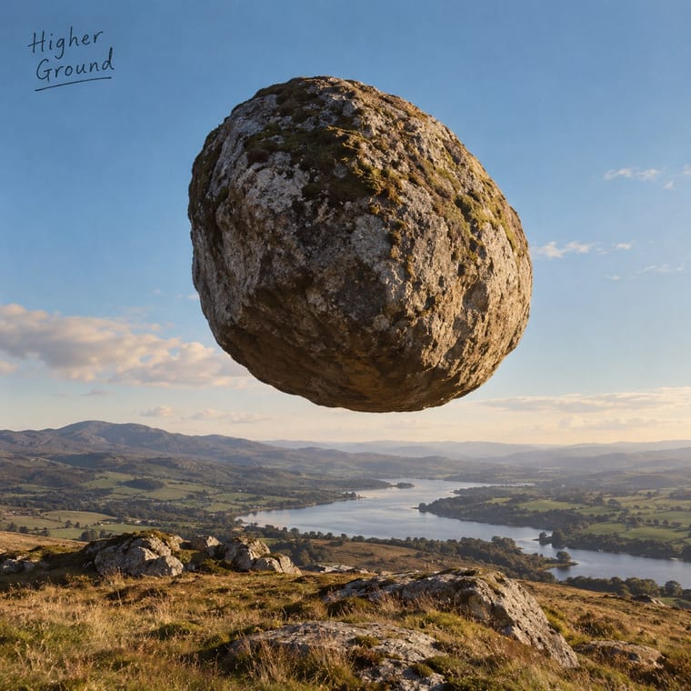
Hipgnosis Photographic Concept Sleeve × Post-Punk Record Sleeve
The generation that made it look dated: post-punk designers quoted one found image and coded or shrank the type, where Hipgnosis paid for elaborate location shoots and darkroom work. Choose between quoting a picture and staging one.
Mix them and make something Hipgnosis Photographic Concept Sleeve Post-Punk Record Sleeve
01
What each style brings
Each part of the design comes from the style with the stronger say in it, and each style gives at least two.
Hipgnosis Photographic Concept Sleeve Post-Punk Record Sleeve (Stiff, Factory, 4AD)
- Type from Post-Punk Record Sleeve
- Colour from Hipgnosis Photographic Concept Sleeve
- Form from Hipgnosis Photographic Concept Sleeve
- Composition from Hipgnosis Photographic Concept Sleeve
- Surface from Post-Punk Record Sleeve
02
The type
Open fonts standing in for each style’s own type, which is often hand-drawn or commercial.
Display · Post-Punk Record Sleeve
Wow.
Syne; Post-Punk Record Sleeve used Peter Saville's colour-coded alphabet, one coloured block per letter, decoded by a wheel on the back of Power, Corruption & Lies (1983) and used for the title of Blue Monday and Small, ordered sans-serif capitals in the manner of Jan Tschichold's New Typography, which Saville took as his model from the 1978 Factory poster onwards
Text · Hipgnosis Photographic Concept Sleeve
The sleeves the London studio Hipgnosis made for Pink Floyd, Led Zeppelin, Genesis, Peter Gabriel, 10cc and others from 1968 to 1983. The front is rarely a band portrait or a title: it is a staged photograph of an impossible or deadpan event in a real place, often a pun on the title or a lyric, finished by hand in the darkroom with multiple printing, tinting and cut-and-paste long before Photoshop. George Hardie's crisp pen-and-ink graphics, stickers and inner sleeves carry what lettering there is. Thorgerson carried the idiom on after 1983, as on The Division Bell (1994).
Inter; Hipgnosis Photographic Concept Sleeve used Technical pen-and-ink logo and Rubber-stamped title on brown paper
03
The colours
The ground and leading colours come from Hipgnosis Photographic Concept Sleeve, with a counter-accent from Post-Punk Record Sleeve. The ink reads on the ground at 4.5:1 or more.
Hipgnosis Photographic Concept Sleeve Post-Punk Record Sleeve (Stiff, Factory, 4AD)
-
#141414ground · 36% -
#eee8dcink · 14% -
#d8642caccent · 18% -
#f2c230accent · 14% -
#c9a46baccent · 10% -
#b8963eaccent · 8%
As CSS
:root {
  --ground: #141414;
  --ink: #eee8dc;
  --accent-1: #d8642c;
  --accent-2: #f2c230;
  --accent-3: #c9a46b;
  --accent-4: #b8963e;
  --font-display: "Syne", sans-serif;
  --font-text: "Inter", sans-serif;
}
Use it with care
Hipgnosis Photographic Concept Sleeve: The sleeves, their photographs and the Dark Side of the Moon prism are in copyright and the archive is held privately by Aubrey Powell: stage and photograph your own pun rather than recreating a Hipgnosis image, and never present a design as a Hipgnosis, Pink Floyd or Led Zeppelin cover. Some sleeves rest on nudity, including two young children on Houses of the Holy, or on jokes Thorgerson himself later called 'not exactly the most politically correct' (Lovedrive) and 'quite sexist' (Technical Ecstasy): borrow the staging and the wit, not those subjects.
Post-Punk Record Sleeve (Stiff, Factory, 4AD): The sleeves are in copyright, and several of their quoted images have their own authors, such as Harold Craft's pulsar plot and Bernard Pierre Wolff's photograph of the Appiani tomb: make a new quotation from a public-domain or licensed source rather than copying a Factory, Stiff or 4AD cover or its colour code.
04
The two styles
05
More combinations
With Hipgnosis Photographic Concept Sleeve
- ECM Sleeve Aesthetic (Munich) Pairs well · Both keep the musicians and most of the type off the front and let one photograph of a wide landscape carry the record; ECM leaves it wintry and still, Hipgnosis puts an absurd event in it. Add ECM's silence and tiny type to a Hipgnosis concept for a quieter, stranger cover.
- Psychedelic Poster Contrasts · Same Pink Floyd scene, opposite answer: Hipgnosis's 1969 Royal Festival Hall poster is still a psychedelic dreamscape collage, but by Atom Heart Mother the band wanted 'something plain' and got a cow. Swap melting hand-lettering and vibrating colour for one calm photograph and almost no type.
- Pop Art Graphics Pairs well · Atom Heart Mother's cow is said to have been inspired by Warhol's cow wallpaper: take pop's deadpan, single everyday subject, photograph it in a real landscape instead of screenprinting it, and let the absence of a title make it strange.
- Surrealist Graphics Contrasts · The parent: Thorgerson said he took from Magritte 'a sort of love of oddity' and of 'juxtaposition or contrariness' (Tate, 2011). The Surrealists built the uncanny from engraving collage, painting and darkroom tricks for magazines and galleries; Hipgnosis staged it as a full-colour location photograph on a mass-market record and played it for a pun. Choose surrealism for dream and desire, Hipgnosis for a deadpan joke that could almost be real.
- Dutch Expressive Postmodernism (Studio Dumbar & Hard Werken) Contrasts · Studio Dumbar also built scenes and photographed them, but filled the set with mismatched type and flat modernist shapes; Hipgnosis kept the lettering off the picture and made the scene look plausible. Choose between a visibly constructed set and a believable impossibility.
- PC Music Graphics Contrasts · Both take an idea literally and push it until it turns strange, but Hipgnosis staged it in a real place with a camera, while PC Music renders a synthetic product on a blank field.
- West German Conceptual Film & Culture Poster (Hillmann and Rambow) Pairs well · Hipgnosis also builds impossible scenes for the camera and lets the photograph vouch for them; add Rambow's plain ground and one line of set grotesque when such a staged photo has to work as a street poster rather than a record sleeve.
With Post-Punk Record Sleeve
- Surrealist Graphics Pairs well · Vaughan Oliver drew on Dalí and Surrealism; add an uncanny juxtaposition to a blurred, textured 23 Envelope photograph for a dream-like sleeve.
- Die Neue Typographie Pairs well · Saville's model: borrow Tschichold's asymmetric placement and small sans-serif capitals, then replace his photographs with one quoted image to get a cool, ordered sleeve.
- Swiss Punk / New Wave Typography Contrasts · Both took modernism apart in the same years: Weingart's Basel school layered type and broke the grid, while post-punk sleeves quoted one borrowed image and withheld the type; choose between layering and withholding.
- Afrobeat Sleeve Art Contrasts · Lemi Ghariokwu's sleeves fill every inch to state the record's argument, while post-punk sleeves leave the name off and say nothing; use the pair to decide how much a cover should explain.
- Minimalist Graphic Design Pairs well · Both let one image or word stand on an empty field; minimalism keeps it calm and neutral, post-punk adds a borrowed image, a code and a darker mood.
- Punk & DIY Zine Contrasts · Same scene, opposite means: punk pasted ransom-note collage onto photocopies, post-punk withheld text and printed one quoted image offset on special stock; choose between shouting and withholding.
- 2 Tone Graphics Contrasts · Shares restraint and a single focal point, but swaps abstraction for a cartoon mascot.
- British Style Press (The Face, i-D and Arena) Contrasts · Same years and city: Saville kept type sparse or left it off and quoted one image on a single square. Brody's own Fetish and Cabaret Voltaire sleeves belong to that genre; this entry is the editorial system he built alongside them, with oversized drawn headlines across a whole magazine.