Style combination · Pairs well
Minimalist Graphic Design × Post-Punk Record Sleeve
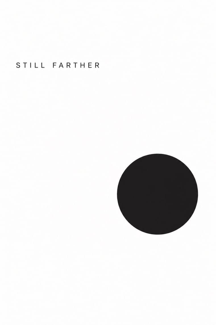
Both let one image or word stand on an empty field; minimalism keeps it calm and neutral, post-punk adds a borrowed image, a code and a darker mood.
Mix them and make something Minimalist Graphic Design Post-Punk Record Sleeve
01
What each style brings
Each part of the design comes from the style with the stronger say in it, and each style gives at least two.
Minimalist Graphic Design Post-Punk Record Sleeve (Stiff, Factory, 4AD)
- Type from Post-Punk Record Sleeve
- Colour from Minimalist Graphic Design
- Form from Minimalist Graphic Design
- Composition from Minimalist Graphic Design
- Surface from Post-Punk Record Sleeve
02
The type
Open fonts standing in for each style’s own type, which is often hand-drawn or commercial.
Display · Post-Punk Record Sleeve
Form
Syne; Post-Punk Record Sleeve used Peter Saville's colour-coded alphabet, one coloured block per letter, decoded by a wheel on the back of Power, Corruption & Lies (1983) and used for the title of Blue Monday and Small, ordered sans-serif capitals in the manner of Jan Tschichold's New Typography, which Saville took as his model from the 1978 Factory poster onwards
Text · Minimalist Graphic Design
Modernism reduced to its barest means, informed by 1960s Minimal art and Japanese emptiness: one image or line of type, vast white or neutral space, a monochrome or near-monochrome palette and meticulous typographic detail. From ECM record sleeves to Muji and Apple packaging, it signals quality, calm and confidence by withholding rather than adding.
Inter; Minimalist Graphic Design used Helvetica Neue and Akzidenz-Grotesk
03
The colours
The ground and leading colours come from Minimalist Graphic Design, with a counter-accent from Post-Punk Record Sleeve. The ink reads on the ground at 4.5:1 or more.
Minimalist Graphic Design Post-Punk Record Sleeve (Stiff, Factory, 4AD)
-
#ffffffground · 36% -
#1a1a1aink · 14% -
#d9d6d0accent · 18% -
#f2c230accent · 14% -
#8c8a86accent · 10% -
#b8963eaccent · 8%
As CSS
:root {
  --ground: #ffffff;
  --ink: #1a1a1a;
  --accent-1: #d9d6d0;
  --accent-2: #f2c230;
  --accent-3: #8c8a86;
  --accent-4: #b8963e;
  --font-display: "Syne", sans-serif;
  --font-text: "Inter", sans-serif;
}
Use it with care
Post-Punk Record Sleeve (Stiff, Factory, 4AD): The sleeves are in copyright, and several of their quoted images have their own authors, such as Harold Craft's pulsar plot and Bernard Pierre Wolff's photograph of the Appiani tomb: make a new quotation from a public-domain or licensed source rather than copying a Factory, Stiff or 4AD cover or its colour code.
04
The two styles
05
More combinations
With Minimalist Graphic Design
- ECM Sleeve Aesthetic (Munich) Pairs well · ECM's record sleeves carry the same reduction into music since 1970: one corresponding image, a few lines of small type and a great deal of silence; borrow their wintry photograph and tiny type when a minimal layout needs mood rather than system.
- Ma & Wabi-sabi Aesthetics Pairs well · Add one imperfect texture or natural material so the emptiness feels contemplative rather than sterile.
- Memphis Design Contrasts · Memphis's clashing patterns are the antidote to minimal reticence; a single Memphis accent makes a minimal layout playful.
- Dark Tech Minimalism Pairs well · Invert the palette to near-black and keep the same reduction for a contemporary technology register.
- Neo-Andean Architecture (Cholets) Contrasts · Its exact opposite on ornament and colour; one symmetrical fluorescent panel in a white, empty layout reads as a loud statement of identity.
- Neoclassical Book Typography Pairs well · Set a single Didone headline in minimalism's empty, monochrome field for the classic luxury-fashion register.
- Renaissance Book Typography Pairs well · Keep classical page proportions and a humanist serif but strip the ornament to give minimal layouts warmth and authority.
- Afrobeat Sleeve Art Contrasts · Its exact opposite on density; a single minimal element on a Lemi-style sleeve stands out sharply, and vice versa.
With Post-Punk Record Sleeve
- Surrealist Graphics Pairs well · Vaughan Oliver drew on Dalí and Surrealism; add an uncanny juxtaposition to a blurred, textured 23 Envelope photograph for a dream-like sleeve.
- Die Neue Typographie Pairs well · Saville's model: borrow Tschichold's asymmetric placement and small sans-serif capitals, then replace his photographs with one quoted image to get a cool, ordered sleeve.
- Swiss Punk / New Wave Typography Contrasts · Both took modernism apart in the same years: Weingart's Basel school layered type and broke the grid, while post-punk sleeves quoted one borrowed image and withheld the type; choose between layering and withholding.
- Afrobeat Sleeve Art Contrasts · Lemi Ghariokwu's sleeves fill every inch to state the record's argument, while post-punk sleeves leave the name off and say nothing; use the pair to decide how much a cover should explain.
- Punk & DIY Zine Contrasts · Same scene, opposite means: punk pasted ransom-note collage onto photocopies, post-punk withheld text and printed one quoted image offset on special stock; choose between shouting and withholding.
- Hipgnosis Photographic Concept Sleeve Contrasts · The generation that made it look dated: post-punk designers quoted one found image and coded or shrank the type, where Hipgnosis paid for elaborate location shoots and darkroom work. Choose between quoting a picture and staging one.
- 2 Tone Graphics Contrasts · Shares restraint and a single focal point, but swaps abstraction for a cartoon mascot.
- British Style Press (The Face, i-D and Arena) Contrasts · Same years and city: Saville kept type sparse or left it off and quoted one image on a single square. Brody's own Fetish and Cabaret Voltaire sleeves belong to that genre; this entry is the editorial system he built alongside them, with oversized drawn headlines across a whole magazine.