Style combination · Contrasts
Neoclassical Book Typography × Renaissance Book Typography
Its direct ancestor and foil: swap calligraphic Garalde type, woodcut initials and borders for vertical stress, hairlines and bare white space to see how far reduction alone can carry a page.
Mix them and make something Neoclassical Book Typography Renaissance Book Typography
01
What each style brings
Each part of the design comes from the style with the stronger say in it, and each style gives at least two.
Neoclassical Book Typography Renaissance Book Typography
- Type from Neoclassical Book Typography
- Colour from Neoclassical Book Typography
- Form from Renaissance Book Typography
- Composition from Neoclassical Book Typography
- Surface from Renaissance Book Typography
-
Neoclassical Book Typography avoids carved line: this is where the two pull against each other, which is the point of the contrast.
02
The type
Open fonts standing in for each style’s own type, which is often hand-drawn or commercial.
Display · Neoclassical Book Typography
Civic
Bodoni Moda, standing in for Bodoni (Giambattista Bodoni, Parma)
Text · Renaissance Book Typography
The printed book as shaped by humanist Italy and France: roman and italic types modelled on humanist handwriting, a single justified text block set in harmonious proportions within generous margins, and woodcut initials, borders and printer's devices as the only ornament. Its page became the default model of the Western book for the next five centuries.
EB Garamond; Renaissance Book Typography used Jenson's roman and Griffo's roman
03
The colours
The ground and leading colours come from Neoclassical Book Typography, with a counter-accent from Renaissance Book Typography. The ink reads on the ground at 4.5:1 or more.
Neoclassical Book Typography Renaissance Book Typography
-
#f6f1e4ground · 36% -
#141210ink · 14% -
#a32d24accent · 18% -
#c9bfa8accent · 14% -
#b8973faccent · 10% -
#5f5a52accent · 8%
As CSS
:root {
  --ground: #f6f1e4;
  --ink: #141210;
  --accent-1: #a32d24;
  --accent-2: #c9bfa8;
  --accent-3: #b8973f;
  --accent-4: #5f5a52;
  --font-display: "Bodoni Moda", serif;
  --font-text: "EB Garamond", serif;
}
04
The two styles
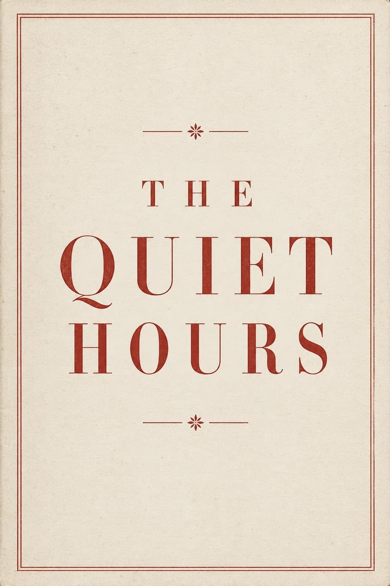
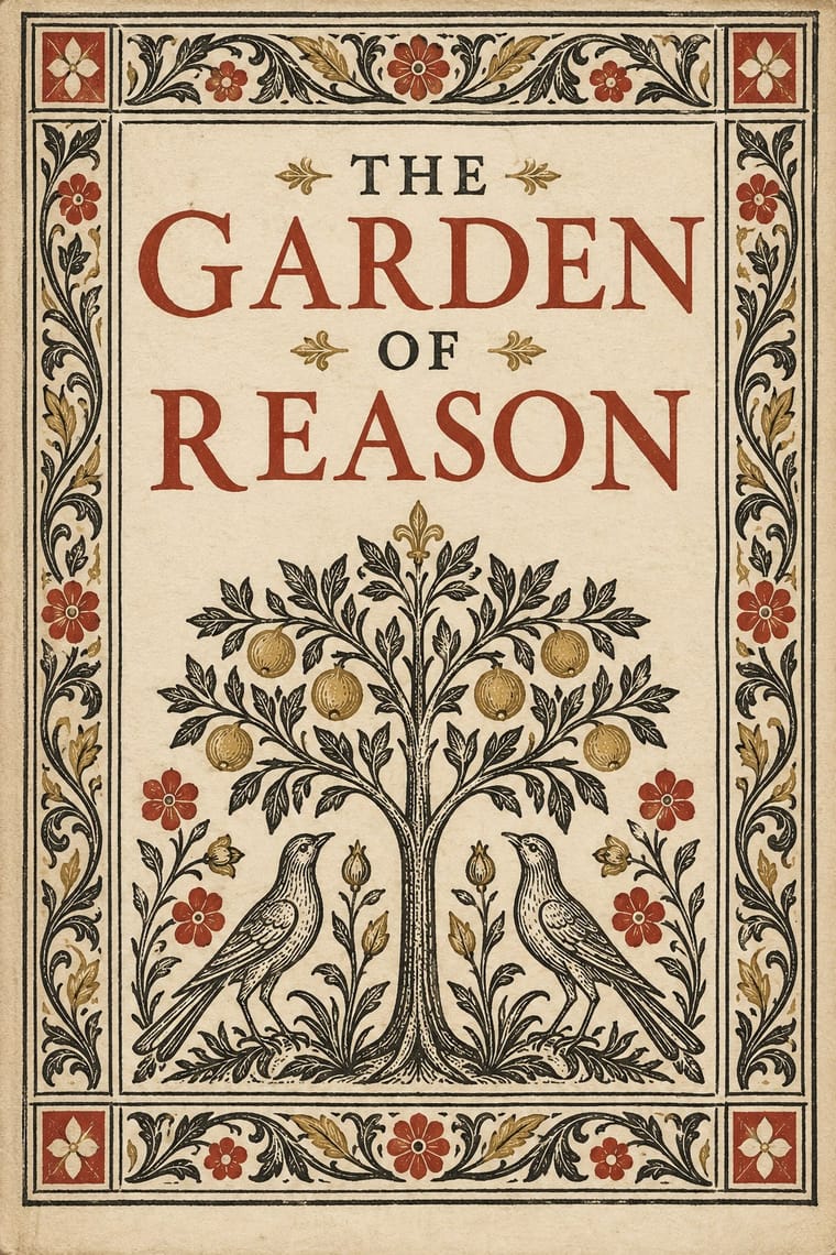
05
More combinations
With Neoclassical Book Typography
- Minimalist Graphic Design Pairs well · Set a single Didone headline in minimalism's empty, monochrome field for the classic luxury-fashion register.
- Victorian Letterpress & Wood Type Contrasts · Victorian fat faces blew the Didone up into display type and mixed many faces per sheet; set one face in graded sizes instead when you want calm rather than clamour.
- Die Neue Typographie Contrasts · Tschichold's asymmetric, sans-serif programme was written against exactly this centred classical page; use the clash to choose a stance deliberately.
- Bulaq (Amiriyya) Naskh Book Printing Pairs well · In an Arabic–Latin edition, face a justified, rule-framed Naskh page with a centred transitional or Didone page; both make type, rules and margins the only luxury.
- DTC 'Blanding' / Millennial Minimalism Contrasts · Luxury's other reduction: a single Didone wordmark signals heritage where the lowercase sans signals approachability.
With Renaissance Book Typography
- Minimalist Graphic Design Pairs well · Keep classical page proportions and a humanist serif but strip the ornament to give minimal layouts warmth and authority.
- Arts & Crafts Movement Pairs well · Morris's Kelmscott Press revived Jenson's roman; pair a Renaissance text block with dense Arts & Crafts borders for a private-press feel.
- Gothic Blackletter & Fraktur Tradition Contrasts · The humanist roman was drawn against the gothic textura it replaced in Italy: open, round and light where blackletter is dense, broken and dark.
- Islamic Geometric & Calligraphic Tradition Pairs well · Use arabesque or moresque fleurons, as Venetian and Lyon printers did, to frame a classical text block.
- International Typographic Style Contrasts · Centred, justified and serifed versus asymmetric, ragged and sans: the clearest foil for deciding which order a page should follow.
- Ethiopian Ge'ez Manuscript & Haräg Illumination Pairs well · Ge'ez manuscripts share the logic of black text with red rubrics; borrow the principle of red for names and headings, not the sacred imagery.
- Gothic Book of Hours (Illuminated Devotional Book) Contrasts · Compare a hand-painted devotional opening with a printed humanist text page: the former gives pictures and illuminated margins a larger organising role, while the latter centres roman type and measured margins.
- Emblem Book (Motto, Picture & Epigram) Contrasts · Its parent shares the humanist roman and italic, the paper and the woodcut, but lets text carry the page with ornament at its edges; the emblem book puts a framed picture at the centre of every page and makes it part of the argument.