Style combination · Pairs well
Minimalist Graphic Design × Woodland School
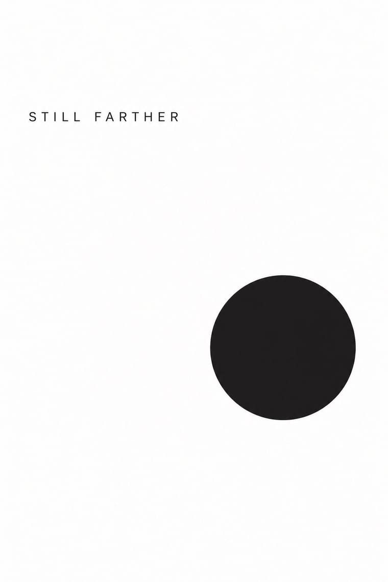
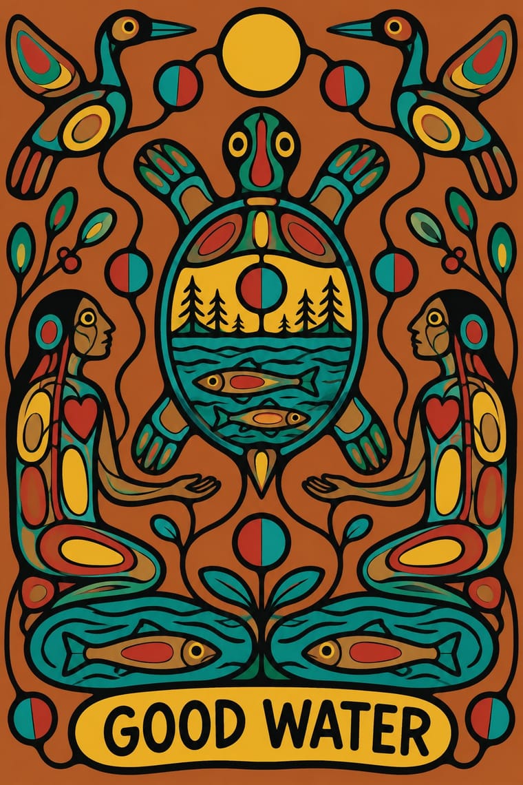
Give a commissioned Woodland painting or print a quiet, white, sparsely typeset layout so the artist's outline and colour carry the whole page, as on a book cover or exhibition poster.
Mix them and make something Minimalist Graphic Design Woodland School
01
What each style brings
Each part of the design comes from the style with the stronger say in it, and each style gives at least two.
Minimalist Graphic Design Woodland School (Legend Painting)
- Type from Minimalist Graphic Design
- Colour from Woodland School
-
Minimalist Graphic Design avoids full polychrome: this is where the two pull against each other.
- Form from Woodland School
- Composition from Minimalist Graphic Design
- Surface from Woodland School
02
The type
Open fonts standing in for each style’s own type, which is often hand-drawn or commercial.
Display · Minimalist Graphic Design
Tide
Inter Tight, standing in for Helvetica Neue (light weights)
Text · Woodland School
A school of painting from northwestern Ontario, made public when Norval Morrisseau showed at Toronto's Pollock Gallery in 1962 and carried on by Ojibwe, Odawa, Oji-Cree and Cree artists such as Daphne Odjig and Carl Ray. Legends, spirit beings and visions, drawn from rock paintings and Midewiwin birchbark scrolls, are painted in heavy black outlines around flat, bright colour, in x-ray views of organs and inner energy lines, joined by lines of communication and divided circles, with no ground line or horizon. Red Lake's Triple K screenprints, murals and book and album covers took it public.
Caveat; Woodland School used Cree syllabics as the painter's signature and Pencil signature, date and edition number in the margin of limited-edition screenprints
03
The colours
The ground and leading colours come from Woodland School, with a counter-accent from Minimalist Graphic Design. The ink reads on the ground at 4.5:1 or more.
Minimalist Graphic Design Woodland School (Legend Painting)
-
#f2c230ground · 36% -
#141210ink · 14% -
#c8322baccent · 18% -
#f1efeaaccent · 14% -
#b8642eaccent · 10% -
#8c8a86accent · 8%
As CSS
:root {
  --ground: #f2c230;
  --ink: #141210;
  --accent-1: #c8322b;
  --accent-2: #f1efea;
  --accent-3: #b8642e;
  --accent-4: #8c8a86;
  --font-display: "Inter Tight", sans-serif;
  --font-text: "Caveat", cursive;
}
Use it with care
Woodland School (Legend Painting): Woodland painting is the living practice of named Anishinaabe, Oji-Cree and Cree artists, and it draws on sacred knowledge: Morrisseau's relatives and community discouraged him from painting sacred subjects because Anishinaabe protocols forbid sharing ceremonial knowledge, Carl Ray was among the first Cree painters to set aside the bans on depicting sacred legends, and the imagery comes from Midewiwin scrolls and rock paintings. That was their decision to make, not an outsider's. Do not assemble thunderbirds, divided circles, power lines or x-ray bodies into a generic 'Indigenous' look, and never imitate a painter's hand or syllabic signature: a Thunder Bay ring run by David Voss from 1996 to 2019 turned out thousands of fake Morrisseaus by pencilling outlines and filling letter-coded flat colour, and its leader was jailed in 2024. Commission or license work from Woodland artists, such as Saul Williams of North Caribou Lake First Nation, and credit them by name and nation.
04
The two styles
05
More combinations
With Minimalist Graphic Design
- ECM Sleeve Aesthetic (Munich) Pairs well · ECM's record sleeves carry the same reduction into music since 1970: one corresponding image, a few lines of small type and a great deal of silence; borrow their wintry photograph and tiny type when a minimal layout needs mood rather than system.
- Ma & Wabi-sabi Aesthetics Pairs well · Add one imperfect texture or natural material so the emptiness feels contemplative rather than sterile.
- Memphis Design Contrasts · Memphis's clashing patterns are the antidote to minimal reticence; a single Memphis accent makes a minimal layout playful.
- Dark Tech Minimalism Pairs well · Invert the palette to near-black and keep the same reduction for a contemporary technology register.
- Neo-Andean Architecture (Cholets) Contrasts · Its exact opposite on ornament and colour; one symmetrical fluorescent panel in a white, empty layout reads as a loud statement of identity.
- Neoclassical Book Typography Pairs well · Set a single Didone headline in minimalism's empty, monochrome field for the classic luxury-fashion register.
- Renaissance Book Typography Pairs well · Keep classical page proportions and a humanist serif but strip the ornament to give minimal layouts warmth and authority.
- Afrobeat Sleeve Art Contrasts · Its exact opposite on density; a single minimal element on a Lemi-style sleeve stands out sharply, and vice versa.
With Woodland School
- Pop Art Graphics Contrasts · Both arrived in screenprint with flat colour behind a black line in the 1960s and 70s, but Pop quotes consumer images with irony and halftone, while Woodland prints carry legend and vision with none of either.
- Cubist Pictorial Space Pairs well · Daphne Odjig took the overlapping planes of the Cubism she encountered in Toronto into her own curving, strongly outlined Woodland painting; when a layout wants overlapping flat planes, overlap type and colour panels around a commissioned Woodland image rather than imitating her hand.
- Harlem Renaissance Graphic Art Contrasts · Both set flat, stylised figures to spiritual and communal ends, but Aaron Douglas's Harlem graphics print hard-edged silhouettes in one to three flat colours, stepping their tone where concentric rings of light cross them among Deco angles, while Woodland painting closes many bright colours inside a continuous black contour and opens each body in x-ray.
- Northwest Coast Formline Design Contrasts · Both enclose spirit and crest beings in black line, but formline swells and tapers its line through a codified grammar of ovoids and U-forms in a few colours, while a Woodland contour keeps a steady weight around free, many-coloured fields and opens the body in x-ray; never fuse the two into a generic 'Native' look.