Style combination · Contrasts
Northwest Coast Formline Design × Woodland School
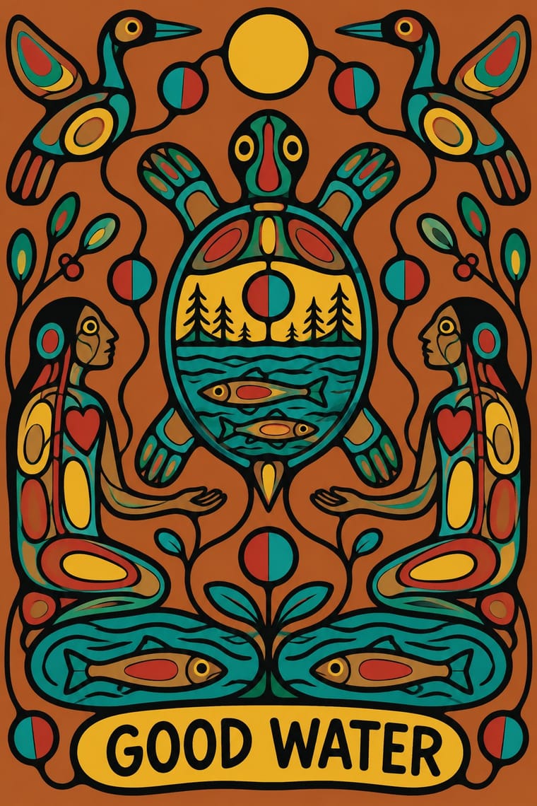
Both enclose spirit and crest beings in black line, but formline swells and tapers its line through a codified grammar of ovoids and U-forms in a few colours, while a Woodland contour keeps a steady weight around free, many-coloured fields and opens the body in x-ray; never fuse the two into a generic 'Native' look.
Mix them and make something Northwest Coast Formline Design Woodland School
01
What each style brings
Each part of the design comes from the style with the stronger say in it, and each style gives at least two.
Northwest Coast Formline Design Woodland School (Legend Painting)
- Type from Woodland School
-
- Colour from Northwest Coast Formline Design
- Form from Northwest Coast Formline Design
- Composition from Northwest Coast Formline Design
- Surface from Woodland School
02
The type
Open fonts standing in for each style’s own type, which is often hand-drawn or commercial.
Display · Woodland School
Vow
Caveat, standing in for Pencil signature, date and edition number in the margin of limited-edition screenprints (each Triple K print signed and numbered by the artist)
Text · Northwest Coast Formline Design
The two-dimensional design system of the northern Northwest Coast nations, painted, carved and woven onto boxes, house fronts, robes and hats, and printed as serigraphs since the 1960s. A continuous black primary formline that swells and tapers joins ovoids, U-forms and S-forms into hereditary crest beings, with red secondary lines and blue-green tertiary areas. The figure is split, splayed and compressed until it fills its field.
Archivo; Northwest Coast Formline Design used Hand-lettered captions and titling in Yahgulanaas's Haida Manga and Latin faces with full Lingít and X̱aad Kíl orthographic support (x̱, g̱, ḵ), e.g. Noto Sans, for accompanying text
03
The colours
The ground and leading colours come from Northwest Coast Formline Design, with a counter-accent from Woodland School. The ink reads on the ground at 4.5:1 or more.
Northwest Coast Formline Design Woodland School (Legend Painting)
-
#efe9ddground · 36% -
#141414ink · 14% -
#a8261daccent · 18% -
#b98a5eaccent · 14% -
#b8642eaccent · 10% -
#3b7a74accent · 8%
As CSS
:root {
  --ground: #efe9dd;
  --ink: #141414;
  --accent-1: #a8261d;
  --accent-2: #b98a5e;
  --accent-3: #b8642e;
  --accent-4: #3b7a74;
  --font-display: "Caveat", cursive;
  --font-text: "Archivo", sans-serif;
}
Use it with care
Northwest Coast Formline Design: Formline images are hereditary crests: the raven, eagle, killer whale, bear, beaver and other beings belong to particular clans, houses and lineages, their display is tied to rights validated at potlatches and feasts, and some designs and stories are restricted. The tradition belongs to the Haida, Tlingit, Tsimshian and Heiltsuk nations, not to a generic 'Pacific Northwest' style. Commission or license work from artists of those nations, credit them by name and nation, and never redraw crests or assemble pseudo-formline from ovoids and U-forms.
Woodland School (Legend Painting): Woodland painting is the living practice of named Anishinaabe, Oji-Cree and Cree artists, and it draws on sacred knowledge: Morrisseau's relatives and community discouraged him from painting sacred subjects because Anishinaabe protocols forbid sharing ceremonial knowledge, Carl Ray was among the first Cree painters to set aside the bans on depicting sacred legends, and the imagery comes from Midewiwin scrolls and rock paintings. That was their decision to make, not an outsider's. Do not assemble thunderbirds, divided circles, power lines or x-ray bodies into a generic 'Indigenous' look, and never imitate a painter's hand or syllabic signature: a Thunder Bay ring run by David Voss from 1996 to 2019 turned out thousands of fake Morrisseaus by pencilling outlines and filling letter-coded flat colour, and its leader was jailed in 2024. Commission or license work from Woodland artists, such as Saul Williams of North Caribou Lake First Nation, and credit them by name and nation.
04
The two styles
05
More combinations
With Northwest Coast Formline Design
- Art Nouveau Contrasts · Art Nouveau's free whiplash shows by contrast how codified formline is: every swell, taper and ovoid follows rules, so study Holm's analysis before drawing a single curve.
- International Typographic Style Pairs well · For institutional and bilingual work, let a commissioned formline crest carry identity and set all text in a neutral grotesque on a grid, well clear of the figure.
- Kōwhaiwhai & Toi Māori Design Contrasts · Both are Indigenous red, black and white systems of positive and negative shape, but formline is figurative and modular while kōwhaiwhai is abstract and banded; never merge them into generic 'tribal' pattern.
- Generative-AI Image Aesthetic Contrasts · Generated 'Northwest Coast' imagery breaks both the formline grammar and crest ownership; when a project needs this language, commission a Northwest Coast artist instead of prompting a model.
- Mixteca-Puebla Codex Painting Contrasts · Both are Indigenous American sign systems of contour and flat colour, but formline swells and tapers its line into ovoids and U-forms in symmetric crests, while the codex keeps an even, unmodulated contour around profile figures strung along a guided reading path; do not merge them as generic 'Native' art.
- Torres Strait Islander Linocut Contrasts · Both translate carved crest and totemic art into prints, but formline builds beings from swelling ovoids and U-forms in flat red and black, while Torres Strait linocut builds them from fields of fine hatching; study the difference and never blend two nations' visual languages.
- Diné (Navajo) Weaving Design Contrasts · Both are North American Indigenous systems. Formline is figurative, curvilinear and built on crests, and Diné weaving is abstract, angular and terraced. Never merge them into a generic 'Native' pattern.
- Kamon (Japanese Family Crests) Contrasts · Both are hereditary crest systems, but formline fills a red-and-black field with split, swelling creatures while a mon is a tiny symmetric silhouette in emptiness; compare them to decide between abundance and reduction.
With Woodland School
- Pop Art Graphics Contrasts · Both arrived in screenprint with flat colour behind a black line in the 1960s and 70s, but Pop quotes consumer images with irony and halftone, while Woodland prints carry legend and vision with none of either.
- Cubist Pictorial Space Pairs well · Daphne Odjig took the overlapping planes of the Cubism she encountered in Toronto into her own curving, strongly outlined Woodland painting; when a layout wants overlapping flat planes, overlap type and colour panels around a commissioned Woodland image rather than imitating her hand.
- Minimalist Graphic Design Pairs well · Give a commissioned Woodland painting or print a quiet, white, sparsely typeset layout so the artist's outline and colour carry the whole page, as on a book cover or exhibition poster.
- Harlem Renaissance Graphic Art Contrasts · Both set flat, stylised figures to spiritual and communal ends, but Aaron Douglas's Harlem graphics print hard-edged silhouettes in one to three flat colours, stepping their tone where concentric rings of light cross them among Deco angles, while Woodland painting closes many bright colours inside a continuous black contour and opens each body in x-ray.