Style combination · Pairs well
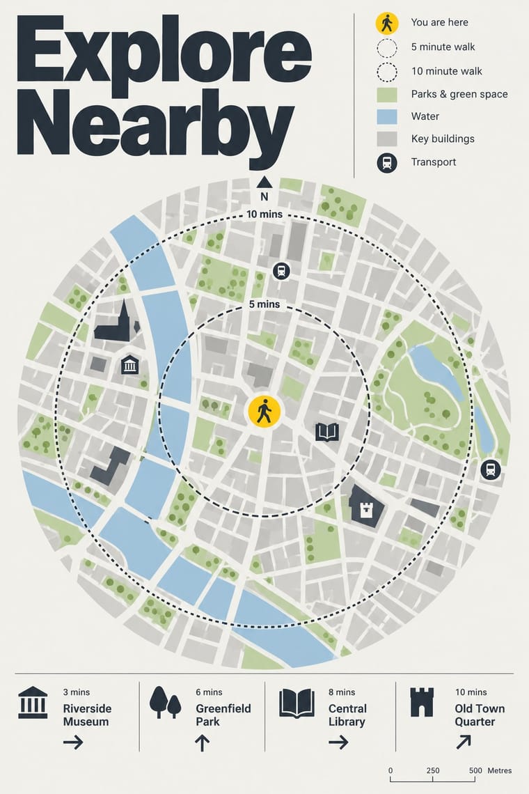
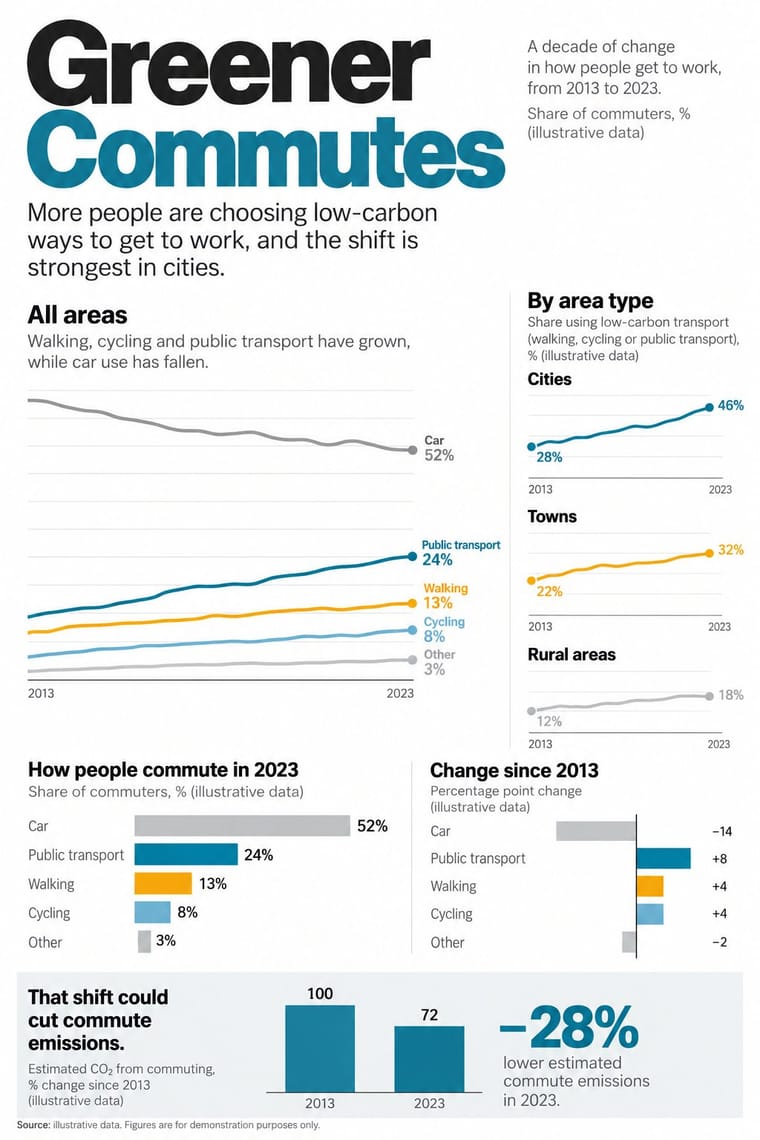
Legible City Wayfinding × Newsroom Data Graphics
Add the annotated locator maps of data journalism to explain a neighbourhood with the same heads-up clarity.
Mix them and make something Legible City Wayfinding Newsroom Data Graphics
01
What each style brings
Each part of the design comes from the style with the stronger say in it, and each style gives at least two.
Legible City Wayfinding (Heads-Up Pedestrian Maps) Newsroom Data Graphics & Scrollytelling
- Type from Legible City Wayfinding
- Colour from Newsroom Data Graphics
- Form from Legible City Wayfinding
- Composition from Newsroom Data Graphics
- Surface from Legible City Wayfinding
02
The type
Open fonts standing in for each style’s own type, which is often hand-drawn or commercial.
Display · Legible City Wayfinding
Grid
Fira Sans, standing in for New Johnston, Transport for London's corporate humanist sans, used by AIG as Legible London's identifying font on its vitreous enamel and steel signs
Text · Newsroom Data Graphics
The house style of newspaper graphics desks since about 2009–2011 (the New York Times graphics desk, D3.js, the Guardian Datablog): conventional charts drawn from the data, on a white or pale paper ground with light grey gridlines and no axis titles, lines labelled directly in place of a legend where possible and short annotations saying what to look at. A flush-left title states the finding and a source line closes the chart; one highlight colour picks out the story against grey context. In long-form pieces the graphic stays pinned while the text scrolls past and steps it through its states.
Inter; Newsroom Data Graphics used Helvetica and Arial
03
The colours
The ground and leading colours come from Newsroom Data Graphics, with a counter-accent from Legible City Wayfinding. The ink reads on the ground at 4.5:1 or more.
Legible City Wayfinding (Heads-Up Pedestrian Maps) Newsroom Data Graphics & Scrollytelling
-
#ffffffground · 36% -
#222222ink · 14% -
#faab18accent · 18% -
#1380a1accent · 14% -
#a9c8deaccent · 10% -
#b9d3a0accent · 8%
As CSS
:root {
  --ground: #ffffff;
  --ink: #222222;
  --accent-1: #faab18;
  --accent-2: #1380a1;
  --accent-3: #a9c8de;
  --accent-4: #b9d3a0;
  --font-display: "Fira Sans", sans-serif;
  --font-text: "Inter", sans-serif;
}
Use it with care
Newsroom Data Graphics & Scrollytelling: The look signals checked, sourced reporting: never use it to present invented, unsourced or AI-generated figures as data, always name the source, and do not copy a newspaper's proprietary typefaces, masthead or logo. Give every chart a text summary and do not let colour alone carry the meaning, for readers who use screen readers or cannot tell the highlight colours apart. In a mock-up or generated image the figures are invented: label them plainly as illustrative (for example 'Source: illustrative data'), and never attribute them to a real newspaper, agency, survey or person.
04
The two styles
05
More combinations
With Legible City Wayfinding
- Isotype Pictorial Statistics Contrasts · Both turn information into friendly pictures, but Isotype counts identical pictograms in rows while these maps draw particular buildings in their place.
- London Transport Design Pairs well · The parent: Legible London is a TfL system in TfL's New Johnston that extends the Underground's single-system idea from stations to the streets between them; borrow the discipline of one family repeated everywhere.
- British Road Signage (Kinneir & Calvert) Contrasts · An influence from the same British public-information lineage, but road signs give drivers arrows and place names read at speed, while these totems give walkers a map to stand and read.
- GOV.UK Design (GDS Style) Pairs well · Civic, research-led and plain-spoken; pair the street maps with GOV.UK's plain screens for a public service that reads the same on the pavement and the phone.
- Schematic Transit Diagram (Beck Tube Map Idiom) Pairs well · Pair the schematic network with heads-up street maps so users can move from topology to true geography.
With Newsroom Data Graphics
- Dark Tech Minimalism Contrasts · The dark dashboard shows unannotated metrics in tiles for people who already know what to look for; the newsroom chart sits on white and tells a general reader in words what the data shows. Add a finding title and one annotation when a dashboard has to explain itself.
- Isotype Pictorial Statistics Pairs well · When the count is of people, swap the bar for an Isotype row of repeated figures and keep the newsroom's flush-left finding title, annotations and source line.
- International Typographic Style Pairs well · Swiss flush-left grotesque setting on a strict grid carries the chart style into print editions, posters and reports while keeping the same rational voice.
- GOV.UK Design (GDS Style) Pairs well · Both are plain public-information web design on a white column with colours that each have one job; set the charts inside GOV.UK-style plain-text pages for public data releases.
- Data Humanism Contrasts · Newsroom graphics use chart types readers already know, labelled directly so they can be read at a glance; data humanism invents a new hand-drawn code for each dataset and asks for slow reading. Use the newsroom chart for the finding, a hand-drawn data portrait for the people behind it.
- Instagram Slideshow Activism (Social-Justice Infographics) Contrasts · Sourced charts with a stated finding are the next step from a slide of bare bullet-point claims; the source line on every slide is common ground, since @soyouwanttotalkabout's maker said hers stood out for 'including sources at the bottom of every slide'.
- Sketchnoting and Graphic Recording Contrasts · Drawn live from speech rather than constructed from data; the pairing makes a plain summary more personal.