Style combination · Pairs well
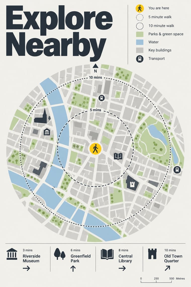
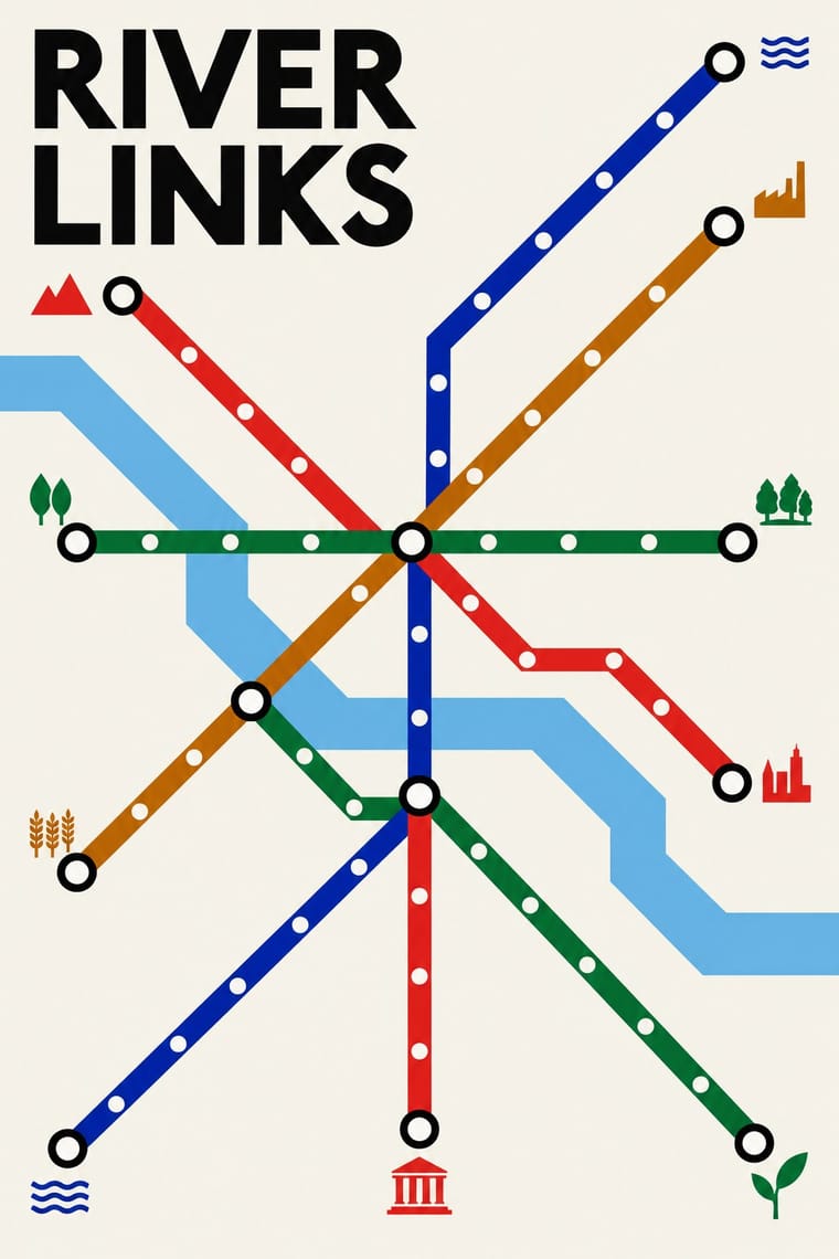
Legible City Wayfinding × Schematic Transit Diagram
Pair the schematic network with heads-up street maps so users can move from topology to true geography.
Mix them and make something Legible City Wayfinding Schematic Transit Diagram
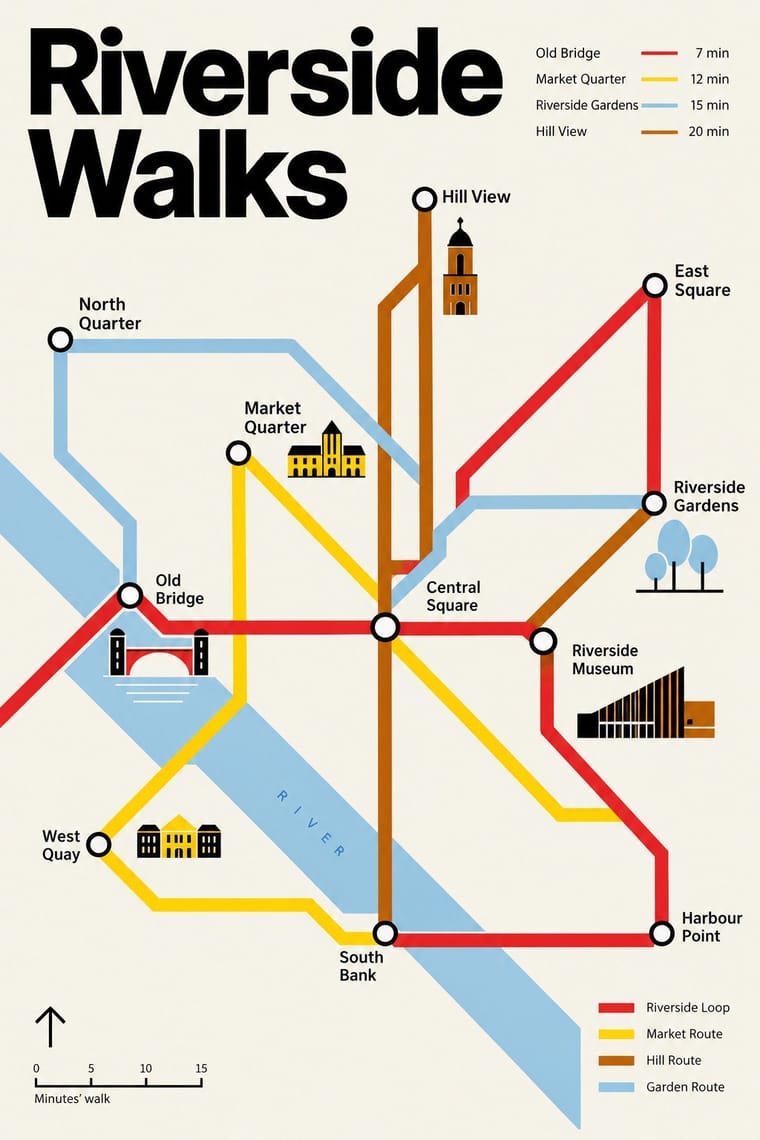
01
What each style brings
Each part of the design comes from the style with the stronger say in it, and each style gives at least two.
Legible City Wayfinding (Heads-Up Pedestrian Maps) Schematic Transit Diagram (Beck Tube Map Idiom)
- Type from Legible City Wayfinding
- Colour from Schematic Transit Diagram
- Form from Schematic Transit Diagram
- Composition from Schematic Transit Diagram
- Surface from Legible City Wayfinding
02
The type
Open fonts standing in for each style’s own type, which is often hand-drawn or commercial.
Display · Legible City Wayfinding
Index
Fira Sans, standing in for New Johnston, Transport for London's corporate humanist sans, used by AIG as Legible London's identifying font on its vitreous enamel and steel signs
Text · Legible City Wayfinding
City-wide pedestrian wayfinding in which the sign is a map. Free-standing totems such as Legible London's Monolith, Midilith and Minilith carry 'heads-up' maps turned to the way the reader faces, a 'you are here' point ringed by a five-minute walking circle (fifteen minutes on the larger planner maps), and key landmarks drawn as small buildings on a flat street plan (in three dimensions in Bristol and London). A calm sans, high-contrast panels and one identifying accent, such as London's yellow top strip, make a single system of streets, stations, bus shelters and printed maps.
Fira Sans; Legible City Wayfinding used New Johnston, Transport for London's corporate humanist sans, used by AIG as Legible London's identifying font on its vitreous enamel and steel signs and Bristol Transit, the 'simple font specially designed for the city' on Bristol Legible City's signs
03
The colours
The ground and leading colours come from Schematic Transit Diagram, with a counter-accent from Legible City Wayfinding. The ink reads on the ground at 4.5:1 or more.
Legible City Wayfinding (Heads-Up Pedestrian Maps) Schematic Transit Diagram (Beck Tube Map Idiom)
-
#f6f3eaground · 36% -
#000000ink · 14% -
#dc241faccent · 18% -
#ffd100accent · 14% -
#b36305accent · 10% -
#a9c8deaccent · 8%
As CSS
:root {
  --ground: #f6f3ea;
  --ink: #000000;
  --accent-1: #dc241f;
  --accent-2: #ffd100;
  --accent-3: #b36305;
  --accent-4: #a9c8de;
  --font-display: "Fira Sans", sans-serif;
  --font-text: "Fira Sans", sans-serif;
}
04
The two styles
05
More combinations
With Legible City Wayfinding
- Isotype Pictorial Statistics Contrasts · Both turn information into friendly pictures, but Isotype counts identical pictograms in rows while these maps draw particular buildings in their place.
- London Transport Design Pairs well · The parent: Legible London is a TfL system in TfL's New Johnston that extends the Underground's single-system idea from stations to the streets between them; borrow the discipline of one family repeated everywhere.
- British Road Signage (Kinneir & Calvert) Contrasts · An influence from the same British public-information lineage, but road signs give drivers arrows and place names read at speed, while these totems give walkers a map to stand and read.
- GOV.UK Design (GDS Style) Pairs well · Civic, research-led and plain-spoken; pair the street maps with GOV.UK's plain screens for a public service that reads the same on the pavement and the phone.
- Newsroom Data Graphics & Scrollytelling Pairs well · Add the annotated locator maps of data journalism to explain a neighbourhood with the same heads-up clarity.