Style combination · Contrasts
British Road Signage × Legible City Wayfinding
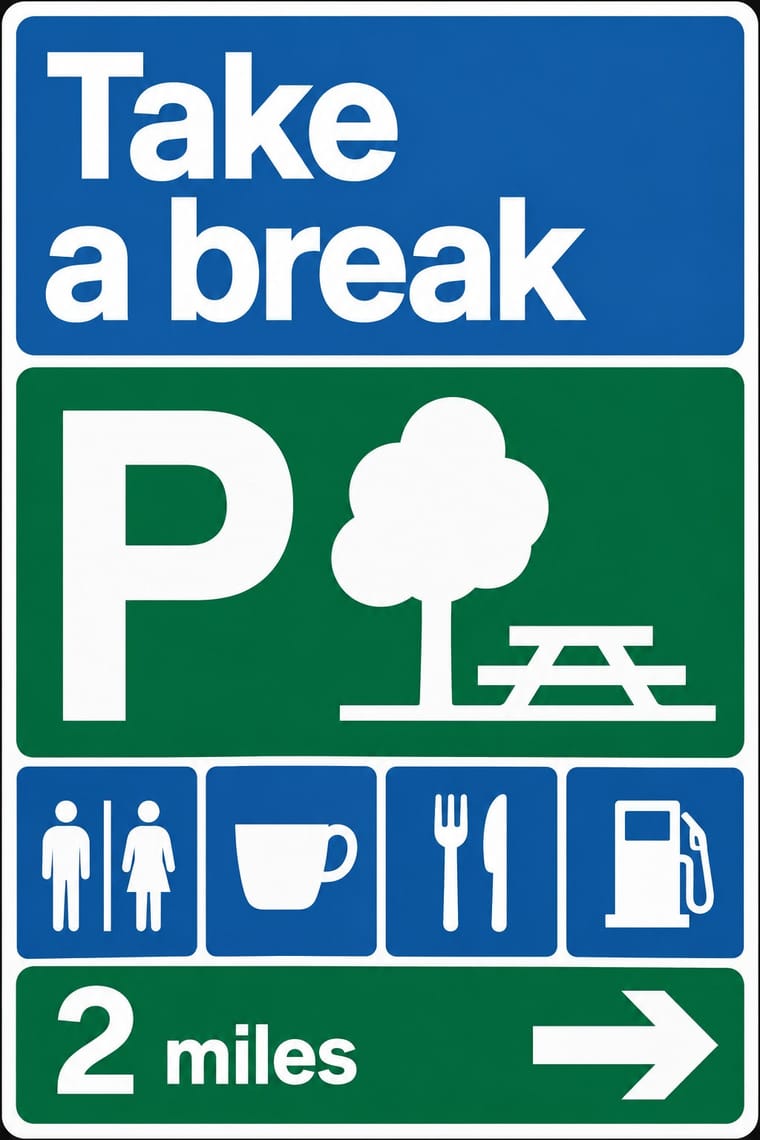
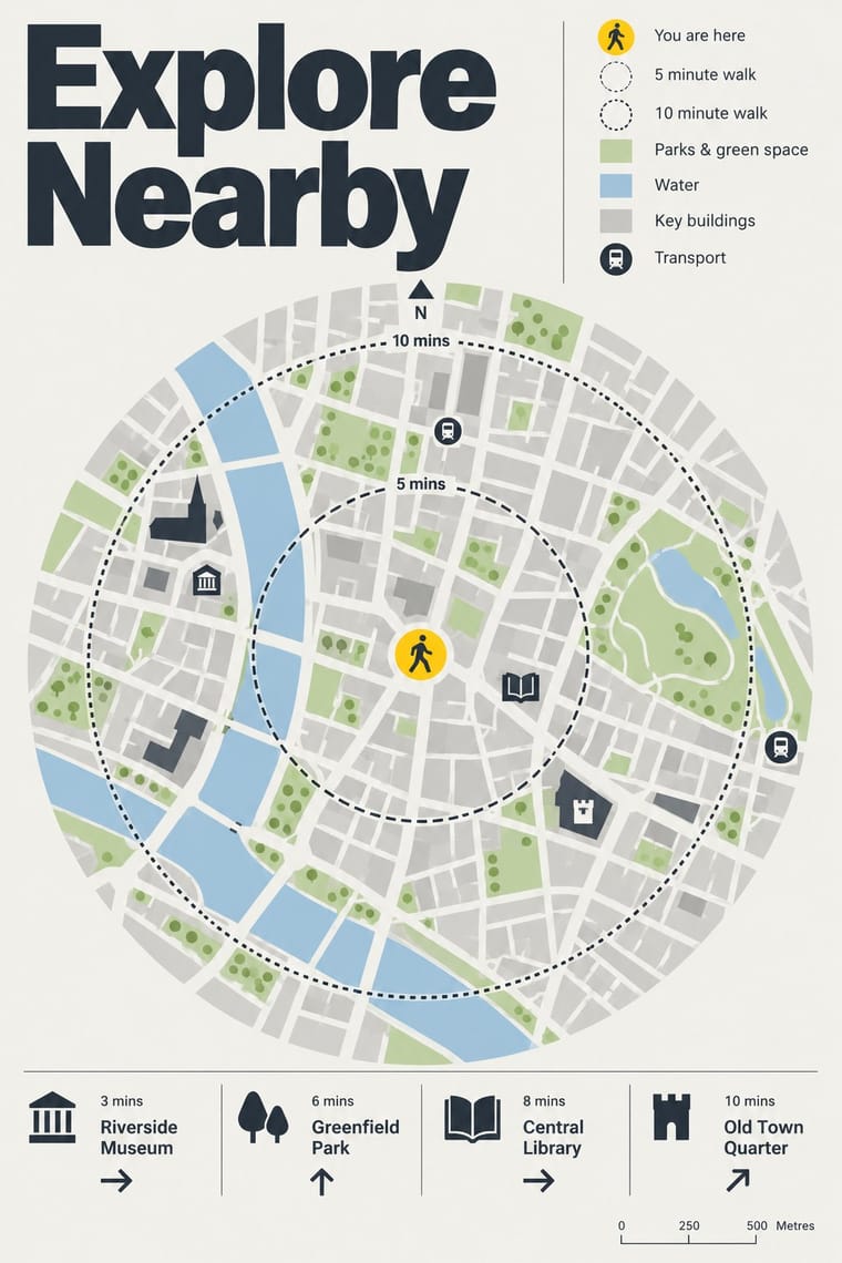
An influence from the same British public-information lineage, but road signs give drivers arrows and place names read at speed, while these totems give walkers a map to stand and read.
Mix them and make something British Road Signage Legible City Wayfinding
01
What each style brings
Each part of the design comes from the style with the stronger say in it, and each style gives at least two.
British Road Signage (Kinneir & Calvert) Legible City Wayfinding (Heads-Up Pedestrian Maps)
- Type from Legible City Wayfinding
- Colour from British Road Signage
- Form from British Road Signage
- Composition from British Road Signage
- Surface from Legible City Wayfinding
02
The type
Open fonts standing in for each style’s own type, which is often hand-drawn or commercial.
Display · Legible City Wayfinding
Form
Fira Sans, standing in for New Johnston, Transport for London's corporate humanist sans, used by AIG as Legible London's identifying font on its vitreous enamel and steel signs
Text · British Road Signage
The national sign system Jock Kinneir and Margaret Calvert designed for Britain's motorways, first used on the Preston By-pass in 1958, and through the Worboys Committee for all roads from 1 January 1965. Place names are set in mixed case in their Transport lettering, spaced on tiles measured in stroke widths. Colour codes the road (blue motorway, green primary with yellow numbers, white local, brown for tourism from the mid-1980s), red triangles warn and circles command with Calvert's pictograms, and junctions are drawn as maps: a kit of parts written into law.
Inter; British Road Signage used Transport (Jock Kinneir and Margaret Calvert, 1957–1963) and Motorway
03
The colours
The ground and leading colours come from British Road Signage, with a counter-accent from Legible City Wayfinding. The ink reads on the ground at 4.5:1 or more.
British Road Signage (Kinneir & Calvert) Legible City Wayfinding (Heads-Up Pedestrian Maps)
-
#ffffffground · 36% -
#111111ink · 14% -
#ffd200accent · 18% -
#d6001caccent · 14% -
#a9c8deaccent · 10% -
#1d5aa5accent · 8%
As CSS
:root {
  --ground: #ffffff;
  --ink: #111111;
  --accent-1: #ffd200;
  --accent-2: #d6001c;
  --accent-3: #a9c8de;
  --accent-4: #1d5aa5;
  --font-display: "Fira Sans", sans-serif;
  --font-text: "Inter", sans-serif;
}
Use it with care
British Road Signage (Kinneir & Calvert): These signs carry legal force: the Traffic Signs Regulations and General Directions prescribe them, so borrow the method (mixed case, colour and shape codes, a kit of parts) but never make a look-alike that a road user could take for a real traffic sign. The lettering is licensed too: GDS Transport is reserved for GOV.UK services, and New Transport is a commercial typeface from A2-Type.
04
The two styles
05
More combinations
With British Road Signage
- GOV.UK Design (GDS Style) Pairs well · GOV.UK sets a descendant of the same lettering, GDS Transport (reserved for its own services), flush left on white screens without the colour code or pictograms; pair the two when a public service needs signs and screens to speak in one voice.
- Isotype Pictorial Statistics Pairs well · Neurath's counted rows of figures and Calvert's single warning silhouettes share the flat black profile; combine them for public information that both explains a situation and tells people what to do.
- London Transport Design Contrasts · Pick's Underground also held one public system together with a sans and a few colours, but surrounded it with commissioned artists' posters; the road signs allow no art at all, so choose London Transport when a system needs a cultural voice and the road signs when it must only inform.
- Hand-Painted Signage & Vernacular Lettering Contrasts · The signwriter varies letter, flourish and colour for each job, where the Worboys kit fixes every letter and gap by regulation; set the two side by side to decide how much of a maker's hand a public sign can carry.
- HfG Ulm Systematic Design Contrasts · Both govern design by a written rule book, but Ulm ruled a company's print with a flush-left grid and one grotesque, while the Worboys kit rules roadside panels through colour, shape and pictogram codes read at speed; start from Ulm for a corporate programme and from the road signs when the reader is moving.
- Nutri-Score (Front-of-Pack Colour-Grade Label) Pairs well · Both are public signs built from a manual of fixed sizes, colours and clear zones; take the road-sign discipline when a colour-scale rating has to be applied by thousands of firms without drifting.
With Legible City Wayfinding
- Isotype Pictorial Statistics Contrasts · Both turn information into friendly pictures, but Isotype counts identical pictograms in rows while these maps draw particular buildings in their place.
- London Transport Design Pairs well · The parent: Legible London is a TfL system in TfL's New Johnston that extends the Underground's single-system idea from stations to the streets between them; borrow the discipline of one family repeated everywhere.
- GOV.UK Design (GDS Style) Pairs well · Civic, research-led and plain-spoken; pair the street maps with GOV.UK's plain screens for a public service that reads the same on the pavement and the phone.
- Newsroom Data Graphics & Scrollytelling Pairs well · Add the annotated locator maps of data journalism to explain a neighbourhood with the same heads-up clarity.
- Schematic Transit Diagram (Beck Tube Map Idiom) Pairs well · Pair the schematic network with heads-up street maps so users can move from topology to true geography.