Style combination · Pairs well
GOV.UK Design × Legible City Wayfinding
Civic, research-led and plain-spoken; pair the street maps with GOV.UK's plain screens for a public service that reads the same on the pavement and the phone.
Mix them and make something GOV.UK Design Legible City Wayfinding
01
What each style brings
Each part of the design comes from the style with the stronger say in it, and each style gives at least two.
GOV.UK Design (GDS Style) Legible City Wayfinding (Heads-Up Pedestrian Maps)
- Type from Legible City Wayfinding
- Colour from Legible City Wayfinding
- Form from GOV.UK Design
- Composition from GOV.UK Design
- Surface from GOV.UK Design
02
The type
Open fonts standing in for each style’s own type, which is often hand-drawn or commercial.
Display · Legible City Wayfinding
Grid
Fira Sans, standing in for New Johnston, Transport for London's corporate humanist sans, used by AIG as Legible London's identifying font on its vitreous enamel and steel signs
Text · GOV.UK Design
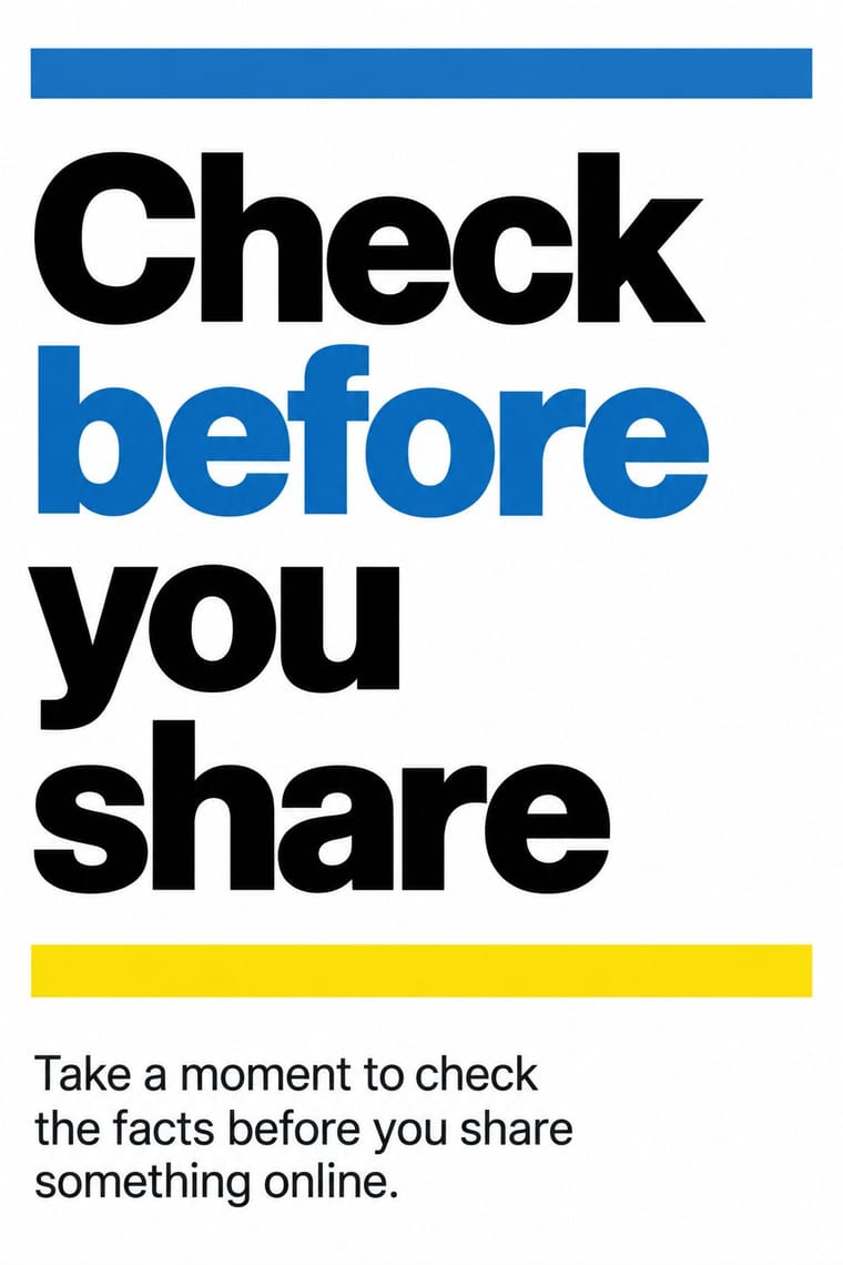
The text-led design of GOV.UK, the UK government's single website, built by the Government Digital Service from 2012 and codified in the GOV.UK Design System (2018). Pages are white, with the main content in a two-thirds column set flush left and in sentence case in GDS Transport, a cut of Kinneir and Calvert's road-sign lettering, in two weights. Pictures and icons are avoided. Size, weight and thick rules build the hierarchy, each colour has one job (yellow marks only keyboard focus), and services ask one question per page.
Inter; GOV.UK Design used GDS Transport and Transport, the British road-sign lettering by Jock Kinneir and Margaret Calvert (1957-1963), from which New Transport descends
03
The colours
The ground and leading colours come from Legible City Wayfinding, with a counter-accent from GOV.UK Design. The ink reads on the ground at 4.5:1 or more.
GOV.UK Design (GDS Style) Legible City Wayfinding (Heads-Up Pedestrian Maps)
-
#f2f1ecground · 36% -
#2b3640ink · 14% -
#ffd100accent · 18% -
#1d70b8accent · 14% -
#a9c8deaccent · 10% -
#ca3535accent · 8%
As CSS
:root {
  --ground: #f2f1ec;
  --ink: #2b3640;
  --accent-1: #ffd100;
  --accent-2: #1d70b8;
  --accent-3: #a9c8de;
  --accent-4: #ca3535;
  --font-display: "Fira Sans", sans-serif;
  --font-text: "Inter", sans-serif;
}
Use it with care
GOV.UK Design (GDS Style): GOV.UK's branding belongs to the UK government's own services. The Design System tells services that are not part of GOV.UK to replace its branded assets, use a header without GOV.UK branding, use an alternative to the GDS Transport font and drop the GOV.UK brand blue. Borrow the approach, not the identity, and never make a page that could pass as an official government service.
04
The two styles
05
More combinations
With GOV.UK Design
- International Typographic Style Pairs well · Swiss flush-left grotesque setting and grid discipline give the same rational base; use it for printed and signage material that should read as the same voice.
- Corporate Memphis Contrasts · Corporate Memphis fills screens with flat cartoon people, which GOV.UK's guidance asks services to avoid; one reaches for friendliness through illustration, the other for inclusiveness through plain text.
- Flat Design Contrasts · Flat design leads with icons, tiles and bright colour fields; GOV.UK removes them and lets words and rules do the work. Compare both when deciding whether an icon helps or only decorates.
- London Transport Design Pairs well · Another British public system held together by fixed constants (one typeface, one emblem, a few colours); borrow its commissioned posters for campaigns that sit outside the plain service pages.
- Plain Tobacco Packaging Pairs well · Another state system of fixed constants where each colour has one job; borrow its plain wording and one-message-per-surface discipline for the leaflets and screens that sit around a health warning.
- British Road Signage (Kinneir & Calvert) Pairs well · GOV.UK sets a descendant of the same lettering, GDS Transport (reserved for its own services), flush left on white screens without the colour code or pictograms; pair the two when a public service needs signs and screens to speak in one voice.
- Penguin Paperback Design (Three Bands to the Marber Grid) Pairs well · Both are British systems that set one sans in fixed positions on white and let rules build the hierarchy; GOV.UK refuses pictures and gives each colour one job, so borrow Penguin's one colour per series when a text-led service has to sort many sections at a glance.
- Newsroom Data Graphics & Scrollytelling Pairs well · Both are plain public-information web design on a white column with colours that each have one job; set the charts inside GOV.UK-style plain-text pages for public data releases.
With Legible City Wayfinding
- Isotype Pictorial Statistics Contrasts · Both turn information into friendly pictures, but Isotype counts identical pictograms in rows while these maps draw particular buildings in their place.
- London Transport Design Pairs well · The parent: Legible London is a TfL system in TfL's New Johnston that extends the Underground's single-system idea from stations to the streets between them; borrow the discipline of one family repeated everywhere.
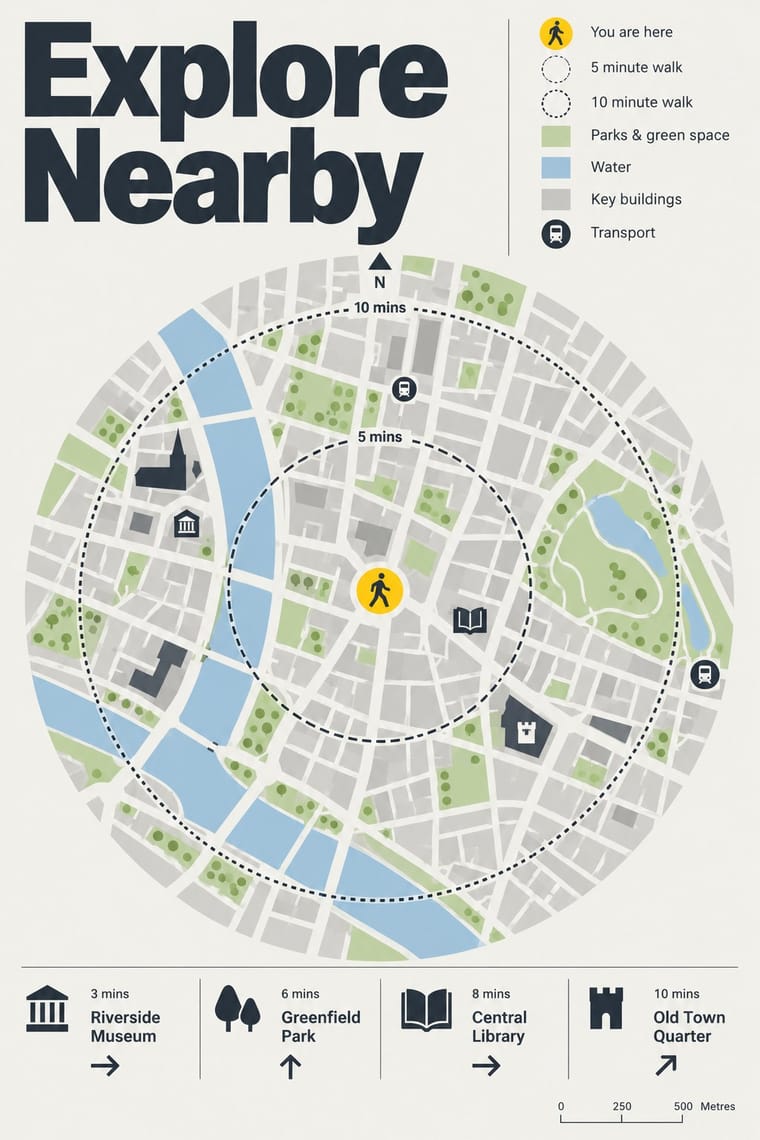
- British Road Signage (Kinneir & Calvert) Contrasts · An influence from the same British public-information lineage, but road signs give drivers arrows and place names read at speed, while these totems give walkers a map to stand and read.
- Newsroom Data Graphics & Scrollytelling Pairs well · Add the annotated locator maps of data journalism to explain a neighbourhood with the same heads-up clarity.
- Schematic Transit Diagram (Beck Tube Map Idiom) Pairs well · Pair the schematic network with heads-up street maps so users can move from topology to true geography.