Style combination · Pairs well
Indian Pop-Kitsch Design × Pop Art Graphics
Open summed up Playclan's tees as 'Indian pop art on a T-shirt' and Nida Mahmood invoked Warhol's principle of drawing attention to something 'basic and in-your-face'; borrow Pop's repeated grid of one commodity (a row of chai glasses or tea packets) to give a desi icon gallery weight.
Mix them and make something Indian Pop-Kitsch Design Pop Art Graphics
01
What each style brings
Each part of the design comes from the style with the stronger say in it, and each style gives at least two.
Indian Pop-Kitsch Design (Desi Kitsch) Pop Art Graphics
- Type from Indian Pop-Kitsch Design
- Colour from Pop Art Graphics
- Form from Indian Pop-Kitsch Design
- Composition from Indian Pop-Kitsch Design
- Surface from Pop Art Graphics
02
The type
Open fonts standing in for each style’s own type, which is often hand-drawn or commercial.
Display · Indian Pop-Kitsch Design
Okay
Yatra One, standing in for Truck painters' shaded block capitals for slogans such as 'Horn OK Please', which Avid Learning's press release for the 2019 'Kitsch and the City' panel at NGMA Mumbai named among Mumbai's kitsch: 'the letters "Horn Ok Please" in block fonts'
Text · Pop Art Graphics
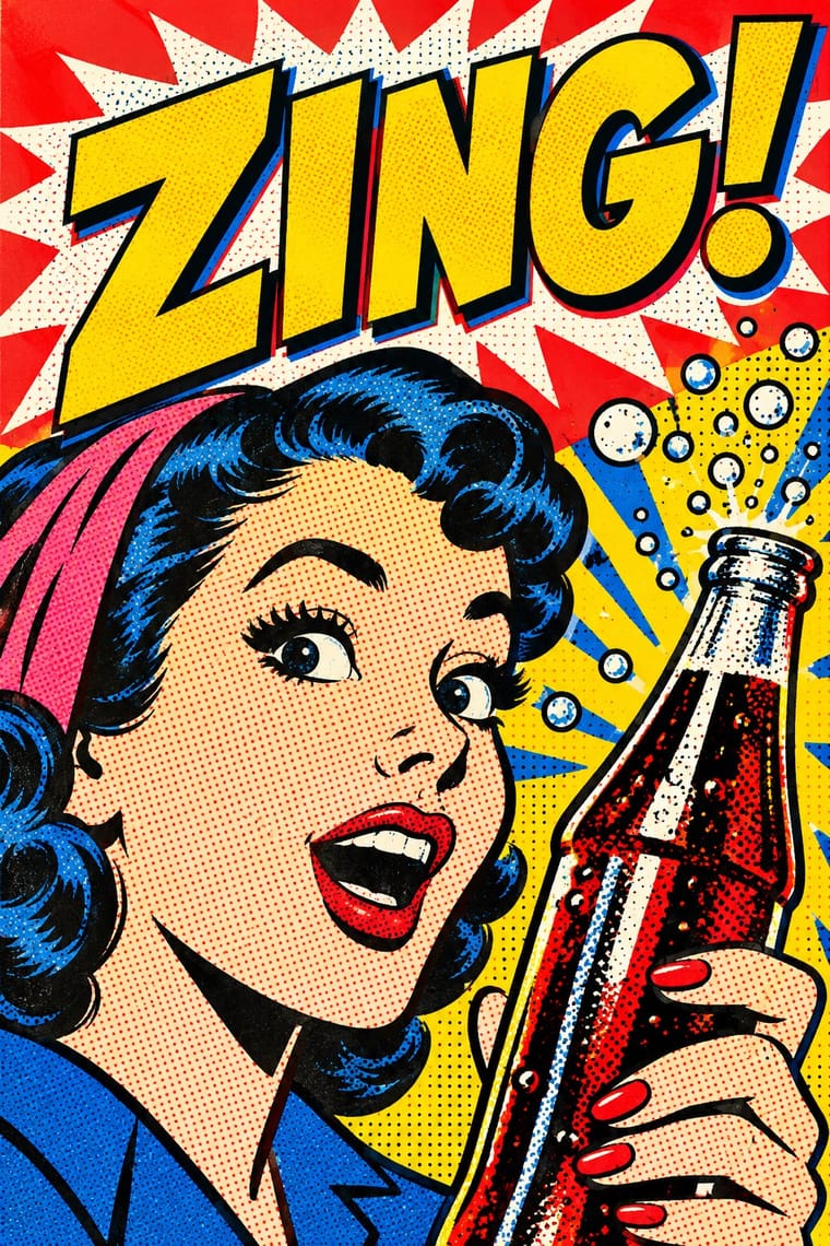
Pop turned the commercial imagery of post-war consumer culture (comics, packaging, celebrity photographs and advertising) into both its subject and its method. Images are appropriated, enlarged, flattened and repeated; colour is bright and unmodulated; and the printing process itself, from Ben-Day dots to off-register silkscreen, is left visible as a sign of mass production.
Archivo; Pop Art Graphics used Comic-book hand lettering and Franklin Gothic
03
The colours
The ground and leading colours come from Pop Art Graphics, with a counter-accent from Indian Pop-Kitsch Design. The ink reads on the ground at 4.5:1 or more.
Indian Pop-Kitsch Design (Desi Kitsch) Pop Art Graphics
-
#fbf8f0ground · 36% -
#111111ink · 14% -
#ffd400accent · 18% -
#f26522accent · 14% -
#e10600accent · 10% -
#ec1e79accent · 8%
As CSS
:root {
  --ground: #fbf8f0;
  --ink: #111111;
  --accent-1: #ffd400;
  --accent-2: #f26522;
  --accent-3: #e10600;
  --accent-4: #ec1e79;
  --font-display: "Yatra One", cursive;
  --font-text: "Archivo", sans-serif;
}
Use it with care
Indian Pop-Kitsch Design (Desi Kitsch): The style quotes living crafts and sacred images: commission, credit and pay truck, sign and hoarding painters rather than lifting their panels, and do not put deities, the Om, the Khanda or Qur'anic phrases on footwear, underwear, ashtrays or toilet jokes. Check Hindi and Punjabi puns before printing, since several hits of the trend ('KLPD', 'Bosedk') are vulgar double entendres, and keep away from divisive political figures (1469 turned down demands for Bhindranwale T-shirts). Bhagat Singh is claimed by rival political camps (the farmers' movement, Communists, Khalistanis, the AAP and other parties), so check how a portrait tee will read before printing it. Laugh with the vernacular, not at the drivers, rickshaw pullers and chai sellers whose working lives supply the icons.
04
The two styles
05
More combinations
With Indian Pop-Kitsch Design
- Hand-Painted Bollywood Poster Pairs well · Old film posters and dialogues are a staple of the style; borrow the painted star heads and drawn title logos of the hand-painted posters for a film-club or café identity, then flatten them into kitsch's vector colour for the merchandise.
- Guochao (China-Chic National Trend) Contrasts · China's guochao redraws imperial and auspicious motifs in palace red and gold with patriotic pride; desi kitsch mines the everyday street in neon pink and taxi yellow with irony, and by 2010 Open judged that 'in the race to be desi, we ended up being too desi'.
- Indian Calendar & Bazaar Art Contrasts · Its parent: Avid Learning's press release for the 2019 NGMA Mumbai panel traced Indian kitsch to 'calendars, cinema visuals and posters of gods and goddesses'. Calendar art paints deities with glowing naturalism for worship; desi kitsch redraws Hanuman, Shiva-Parvati or a lotus as flat icons that, as Open put it in 2009, 'signal novelty and coolness more than anything really religious'.
- Indian Institutional Modernism (NID) Contrasts · Happily Unmarried commissioned designers trained at NID and NIFT; set a restrained NID-style grid and sans serif against one loud kitsch icon to show the two faces of Indian design school culture.
- Newtro (Korean New-Retro) Contrasts · Korea's newtro also sells nostalgia, but heritage firms reissue their own labels and mascots; desi kitsch borrows anonymous street vernacular (trucks, rickshaws, signboards) that no brand owns, and plays it for laughs.
With Pop Art Graphics
- International Typographic Style Contrasts · Set one loud appropriated Pop image inside a strict grid with a neutral grotesque so the irony reads as deliberate rather than chaotic.
- Ma & Wabi-sabi Aesthetics Contrasts · Where Pop multiplies glossy commodities, wabi-sabi values the single worn object; use one to puncture the mood of the other.
- Guna Mola Pairs well · Guna women redraw brand logos and cartoons (RCA Victor, Bullwinkle) in reverse appliqué; let that act of translation inspire Pop work, but buy or commission molas rather than imitating them.
- Neo-Brutalism Pairs well · Lift Pop's thick black outlines and flat primaries into UI cards and buttons for a confident, comic-strip interface.
- Risograph & Indie Print Culture Pairs well · Print Ben-Day dot screens in fluorescent pink and yellow riso inks to give Pop's mass-media imagery a small-run, handmade warmth.
- Screenprinted Gig & Alt-Movie Poster Pairs well · Shepard Fairey called Kozik 'the punk rock Warhol'; take Pop's appropriated cartoons and halftones and give them a gig poster's single idea and hand-lettered title.
- Finnish Bold Print (Marimekko Modernism) Pairs well · Contemporaries in saturated flat colour at a giant scale; borrow pop's isolated, enlarged object for a poster, but drop its halftone and irony to keep Marimekko's sincerity.
- Superflat Contrasts · Both turn commodities into art; take Pop's repetition and frontal commodity but swap its halftone and off-register silkscreen for Superflat's smooth vector fills and anime characters, so the print process disappears.