Style combination · Contrasts
Corporate Memphis × GOV.UK Design
Corporate Memphis fills screens with flat cartoon people, which GOV.UK's guidance asks services to avoid; one reaches for friendliness through illustration, the other for inclusiveness through plain text.
01
What each style brings
Each part of the design comes from the style with the stronger say in it, and each style gives at least two.
Corporate Memphis GOV.UK Design (GDS Style)
- Type from GOV.UK Design
- Colour from Corporate Memphis
- Form from Corporate Memphis
- Composition from GOV.UK Design
- Surface from GOV.UK Design
02
The type
Open fonts standing in for each style’s own type, which is often hand-drawn or commercial.
Display · GOV.UK Design
Home
Inter Tight, standing in for Arial, the fallback in GOV.UK Frontend's font stack ('GDS Transport', arial, sans-serif)
Text · Corporate Memphis
The flat vector illustration style that became the default visual voice of big tech in the late 2010s: faceless, ethnically non-specific figures with elongated limbs and tiny heads, drawn in bright flat colour among blobs, leaves and confetti. Codified in Buck's Alegria system for Facebook (2017) and spread by open libraries such as unDraw and Humaaans, it was later named, half-mockingly, after the Memphis Group.
Hanken Grotesk; Corporate Memphis used Circular and Airbnb Cereal
03
The colours
The ground and leading colours come from Corporate Memphis, with a counter-accent from GOV.UK Design. The ink reads on the ground at 4.5:1 or more.
Corporate Memphis GOV.UK Design (GDS Style)
-
#ffffffground · 36% -
#2f2e41ink · 14% -
#ffc857accent · 18% -
#ffdd00accent · 14% -
#6c63ffaccent · 10% -
#1d70b8accent · 8%
As CSS
:root {
  --ground: #ffffff;
  --ink: #2f2e41;
  --accent-1: #ffc857;
  --accent-2: #ffdd00;
  --accent-3: #6c63ff;
  --accent-4: #1d70b8;
  --font-display: "Inter Tight", sans-serif;
  --font-text: "Hanken Grotesk", sans-serif;
}
Use it with care
GOV.UK Design (GDS Style): GOV.UK's branding belongs to the UK government's own services. The Design System tells services that are not part of GOV.UK to replace its branded assets, use a header without GOV.UK branding, use an alternative to the GDS Transport font and drop the GOV.UK brand blue. Borrow the approach, not the identity, and never make a page that could pass as an official government service.
04
The two styles

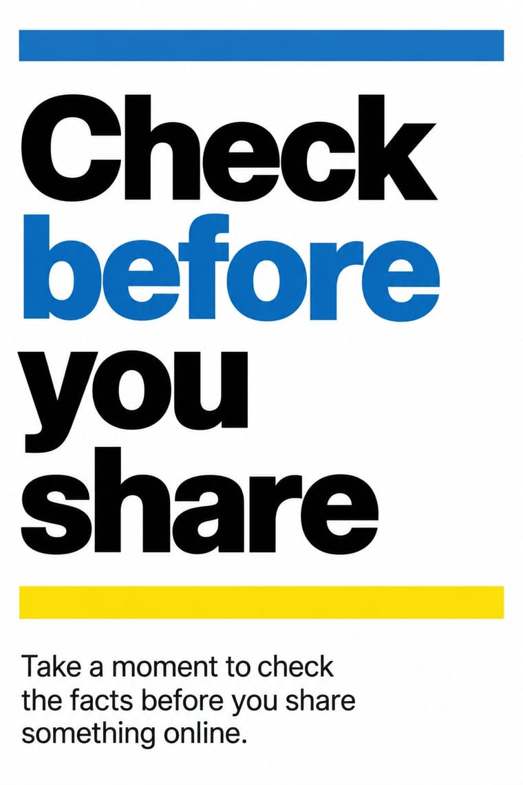
05
More combinations
With Corporate Memphis
- Polish Poster School Contrasts · Polish poster metaphor and painterly ambiguity show how much illustration can say once it stops being generic.
- Risograph & Indie Print Culture Pairs well · Add riso grain and two spot inks to the figures to escape the over-familiar SaaS sheen and give them printed warmth.
- DTC 'Blanding' / Millennial Minimalism Pairs well · Its photo-led start-up sibling: pair Corporate Memphis figures with blanding's pastel ground and geometric sans when a brand needs both people and product.
- Brutalist Web Design Contrasts · Brutalism's raw honesty is the opposite of this friendly gloss; reach for it when a brand needs credibility over cheer.
- Memphis Design Contrasts · The original's real colour clash, irony and Sottsass or Du Pasquier patterns are the foil to generic confetti blobs; borrow one genuine Memphis pattern to give the illustration an edge.
- Rubber-Hose Revival (Cartoon Mascot Graphics) Contrasts · Both draw stretched figures in flat colour, but the revival gives each brand its own outlined, nostalgic mascot where Corporate Memphis uses interchangeable faceless people.
- CalArts Style (Rounded Cartoon Character Design) Pairs well · Both use flat fills and simplified figures; borrow its pastel UI-illustration palette, but keep faces and expressions, which Corporate Memphis drops.
- Data Humanism Contrasts · Both aim to feel warm and human, but Corporate Memphis draws generic faceless figures for mood, while data humanism draws the specific data of specific people. Replace stock warmth with a drawing of real data when a brand needs sincerity.
With GOV.UK Design
- International Typographic Style Pairs well · Swiss flush-left grotesque setting and grid discipline give the same rational base; use it for printed and signage material that should read as the same voice.
- Flat Design Contrasts · Flat design leads with icons, tiles and bright colour fields; GOV.UK removes them and lets words and rules do the work. Compare both when deciding whether an icon helps or only decorates.
- London Transport Design Pairs well · Another British public system held together by fixed constants (one typeface, one emblem, a few colours); borrow its commissioned posters for campaigns that sit outside the plain service pages.
- Plain Tobacco Packaging Pairs well · Another state system of fixed constants where each colour has one job; borrow its plain wording and one-message-per-surface discipline for the leaflets and screens that sit around a health warning.
- British Road Signage (Kinneir & Calvert) Pairs well · GOV.UK sets a descendant of the same lettering, GDS Transport (reserved for its own services), flush left on white screens without the colour code or pictograms; pair the two when a public service needs signs and screens to speak in one voice.
- Penguin Paperback Design (Three Bands to the Marber Grid) Pairs well · Both are British systems that set one sans in fixed positions on white and let rules build the hierarchy; GOV.UK refuses pictures and gives each colour one job, so borrow Penguin's one colour per series when a text-led service has to sort many sections at a glance.
- Newsroom Data Graphics & Scrollytelling Pairs well · Both are plain public-information web design on a white column with colours that each have one job; set the charts inside GOV.UK-style plain-text pages for public data releases.
- Legible City Wayfinding (Heads-Up Pedestrian Maps) Pairs well · Civic, research-led and plain-spoken; pair the street maps with GOV.UK's plain screens for a public service that reads the same on the pavement and the phone.