Style combination · Pairs well
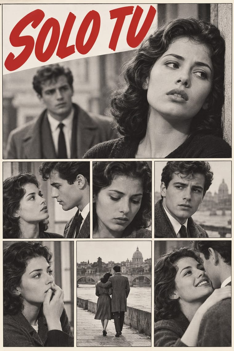
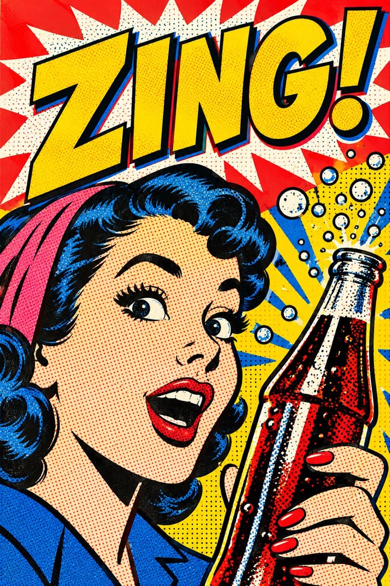
Fotoromanzo × Pop Art Graphics
Blow up a single photo-romance frame with its balloon to poster size for a Pop-style quotation of mass romance, as Lichtenstein did with drawn romance comics. Rewriting the balloons is a different precedent: Hara-Kiri's parodies and the Situationists' détournements of Nous Deux, not Pop.
01
What each style brings
Each part of the design comes from the style with the stronger say in it, and each style gives at least two.
Fotoromanzo (Italian Photo-Romance) Pop Art Graphics
- Type from Pop Art Graphics
- Colour from Pop Art Graphics
- Form from Fotoromanzo
- Composition from Fotoromanzo
- Surface from Pop Art Graphics
02
The type
Open fonts standing in for each style’s own type, which is often hand-drawn or commercial.
Display · Pop Art Graphics
Fiesta
Bangers; Pop Art Graphics used Comic-book hand lettering and Franklin Gothic
Text · Fotoromanzo
The photo-romance of the Italian women's weeklies: a melodrama told in staged photographs, first printed by Il mio sogno and Bolero Film in May 1947 and copied from France to Brazil. Actors pose on modest sets or in familiar places, and the stills sit in a plain grid of ruled frames, often two or three to a row. Dialogue in balloons and boxes, lettered by hand or typeset, is pasted over the pictures, and close-ups of faces carry the drama. The weeklies printed the stories in black and white until colour took over in the mid-1970s; covers sold each issue with a photograph of the stars.
Comic Neue; Fotoromanzo used Hand-lettered capitals for narration and balloons and Typeset sans in later work
03
The colours
The ground and leading colours come from Pop Art Graphics, with a counter-accent from Fotoromanzo. The ink reads on the ground at 4.5:1 or more.
Fotoromanzo (Italian Photo-Romance) Pop Art Graphics
-
#fbf8f0ground · 36% -
#111111ink · 14% -
#ffd400accent · 18% -
#c62a2faccent · 14% -
#e10600accent · 10% -
#2b5ba6accent · 8%
As CSS
:root {
  --ground: #fbf8f0;
  --ink: #111111;
  --accent-1: #ffd400;
  --accent-2: #c62a2f;
  --accent-3: #e10600;
  --accent-4: #2b5ba6;
  --font-display: "Bangers", sans-serif;
  --font-text: "Comic Neue", cursive;
}
Use it with care
Fotoromanzo (Italian Photo-Romance): Photo-romances starred real actors, some later famous (Gina Lollobrigida, Sophia Loren), and their photographs belong to publishers' archives such as the Fondazione Arnoldo e Alberto Mondadori: cast your own models, never ask an image model for a real star's likeness, and never present a generated still as a vintage photo-romance.
04
The two styles
05
More combinations
With Fotoromanzo
- American Four-Colour Comic Book (Golden to Bronze Age) Contrasts · Both read as ruled panels with speech balloons; choose the fotoromanzo when the cast should be real people posed in black-and-white photographs and the text may run long, and the comic book when drawn heroes, sound effects and flat colour tints should carry the action.
- Drum Magazine & Sophiatown Photojournalism Contrasts · Drum's photographs report real township life under condensed headlines; the fotoromanzo stages fiction for the camera and runs it as a grid of stills with balloons.
- Onitsha Market Pamphlets Contrasts · Both are cheap popular romance print from 1947; the Onitsha pamphlets tell their stories in letterpress text with a recycled photograph only on the cover, while the fotoromanzo tells the whole story in staged photographs with balloons.
- International Typographic Style Pairs well · Set the photo-story on an exact modular grid with a neutral grotesque in the dialogue boxes, so the melodrama sits in a clean editorial frame.
- Lianhuanhua Picture-Story Books Contrasts · Both are cheap picture stories read by millions in monochrome; lianhuanhua draws one framed picture per pocket-sized page with a caption beneath, while the fotoromanzo photographs actors and sets several frames to a magazine page with balloons.
- Situationist Détournement Graphics Pairs well · The photo-romance was a raw material René Viénet named in Internationale situationniste no. 11 (1967), calling for photo-romances to be détourned by adding or altering their speech bubbles: keep the photographed lovers and the grid of frames untouched and change only the balloons, so that the melodrama speaks against itself.
- Illustrated Rom-Com Book Cover (Cartoon Couple Cover) Contrasts · The postwar photo-romance sold love stories with photographed couples in close-up; the illustrated cover gives up the photograph so that readers can picture themselves in the role and the cover tells nothing of the heat level.
- Giallo Mondadori Covers (I Libri Gialli) Contrasts · Both sold weekly at Italian kiosks, but the photo-romance told melodrama in staged photographs and ruled grids, the giallo in one painted window; set them side by side to contrast photographic and painted suspense.
With Pop Art Graphics
- International Typographic Style Contrasts · Set one loud appropriated Pop image inside a strict grid with a neutral grotesque so the irony reads as deliberate rather than chaotic.
- Ma & Wabi-sabi Aesthetics Contrasts · Where Pop multiplies glossy commodities, wabi-sabi values the single worn object; use one to puncture the mood of the other.
- Guna Mola Pairs well · Guna women redraw brand logos and cartoons (RCA Victor, Bullwinkle) in reverse appliqué; let that act of translation inspire Pop work, but buy or commission molas rather than imitating them.
- Neo-Brutalism Pairs well · Lift Pop's thick black outlines and flat primaries into UI cards and buttons for a confident, comic-strip interface.
- Risograph & Indie Print Culture Pairs well · Print Ben-Day dot screens in fluorescent pink and yellow riso inks to give Pop's mass-media imagery a small-run, handmade warmth.
- Screenprinted Gig & Alt-Movie Poster Pairs well · Shepard Fairey called Kozik 'the punk rock Warhol'; take Pop's appropriated cartoons and halftones and give them a gig poster's single idea and hand-lettered title.
- Finnish Bold Print (Marimekko Modernism) Pairs well · Contemporaries in saturated flat colour at a giant scale; borrow pop's isolated, enlarged object for a poster, but drop its halftone and irony to keep Marimekko's sincerity.
- Superflat Contrasts · Both turn commodities into art; take Pop's repetition and frontal commodity but swap its halftone and off-register silkscreen for Superflat's smooth vector fills and anime characters, so the print process disappears.