Style combination · Contrasts
Fotoromanzo × Illustrated Rom-Com Book Cover
The postwar photo-romance sold love stories with photographed couples in close-up; the illustrated cover gives up the photograph so that readers can picture themselves in the role and the cover tells nothing of the heat level.
Mix them and make something Fotoromanzo Illustrated Rom-Com Book Cover
01
What each style brings
Each part of the design comes from the style with the stronger say in it, and each style gives at least two.
Fotoromanzo (Italian Photo-Romance) Illustrated Rom-Com Book Cover (Cartoon Couple Cover)
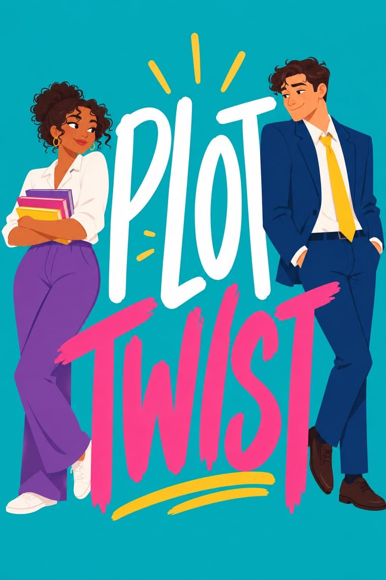
- Type from Illustrated Rom-Com Book Cover
- Colour from Illustrated Rom-Com Book Cover
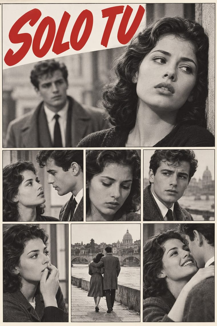
- Form from Fotoromanzo
-
Illustrated Rom-Com Book Cover avoids naturalistic depiction: this is where the two pull against each other, which is the point of the contrast.
- Composition from Fotoromanzo
- Surface from Fotoromanzo
02
The type
Open fonts standing in for each style’s own type, which is often hand-drawn or commercial.
Display · Illustrated Rom-Com Book Cover
Amour
Londrina Solid, standing in for Tall, condensed hand-drawn capitals in white, stacked in two to four lines down the cover: medium-weight on Beach Read (2020), People We Meet on Vacation (2021) and Book Lovers (2022), thin and monoline on Twice in a Blue Moon (2019) and It Happened One Summer (2021); the 'big block text' The Pudding found on the style
Text · Fotoromanzo
The photo-romance of the Italian women's weeklies: a melodrama told in staged photographs, first printed by Il mio sogno and Bolero Film in May 1947 and copied from France to Brazil. Actors pose on modest sets or in familiar places, and the stills sit in a plain grid of ruled frames, often two or three to a row. Dialogue in balloons and boxes, lettered by hand or typeset, is pasted over the pictures, and close-ups of faces carry the drama. The weeklies printed the stories in black and white until colour took over in the mid-1970s; covers sold each issue with a photograph of the stars.
Comic Neue; Fotoromanzo used Hand-lettered capitals for narration and balloons and Typeset sans in later work
03
The colours
The ground and leading colours come from Illustrated Rom-Com Book Cover, with a counter-accent from Fotoromanzo. The ink reads on the ground at 4.5:1 or more.
Fotoromanzo (Italian Photo-Romance) Illustrated Rom-Com Book Cover (Cartoon Couple Cover)
-
#024c8bground · 36% -
#ffffffink · 14% -
#fdc104accent · 18% -
#c62a2faccent · 14% -
#ef3e84accent · 10% -
#2b5ba6accent · 8%
As CSS
:root {
  --ground: #024c8b;
  --ink: #ffffff;
  --accent-1: #fdc104;
  --accent-2: #c62a2f;
  --accent-3: #ef3e84;
  --accent-4: #2b5ba6;
  --font-display: "Londrina Solid", cursive;
  --font-text: "Comic Neue", cursive;
}
Use it with care
Fotoromanzo (Italian Photo-Romance): Photo-romances starred real actors, some later famous (Gina Lollobrigida, Sophia Loren), and their photographs belong to publishers' archives such as the Fondazione Arnoldo e Alberto Mondadori: cast your own models, never ask an image model for a real star's likeness, and never present a generated still as a vintage photo-romance.
Illustrated Rom-Com Book Cover (Cartoon Couple Cover): Draw the characters as the book describes them, in skin tone, body size, age, disability and gender, and do not lighten or slim them for the market: illustration spread partly because stock photography offered too few people of colour, and Helen Hoang chose it to get past readers' bias about her Asian lead. Because a cute cartoon cover does not show how explicit a book is and can be mistaken for young-adult fiction, say clearly on the book and in its retail listing that it is an adult romance. Critics have read the uniform look as sexist, making women's adult reading look like YA (Kelly Jensen, Book Riot, 2019), so draw this book's own premise rather than the template.
04
The two styles
05
More combinations
With Fotoromanzo
- American Four-Colour Comic Book (Golden to Bronze Age) Contrasts · Both read as ruled panels with speech balloons; choose the fotoromanzo when the cast should be real people posed in black-and-white photographs and the text may run long, and the comic book when drawn heroes, sound effects and flat colour tints should carry the action.
- Drum Magazine & Sophiatown Photojournalism Contrasts · Drum's photographs report real township life under condensed headlines; the fotoromanzo stages fiction for the camera and runs it as a grid of stills with balloons.
- Pop Art Graphics Pairs well · Blow up a single photo-romance frame with its balloon to poster size for a Pop-style quotation of mass romance, as Lichtenstein did with drawn romance comics. Rewriting the balloons is a different precedent: Hara-Kiri's parodies and the Situationists' détournements of Nous Deux, not Pop.
- Onitsha Market Pamphlets Contrasts · Both are cheap popular romance print from 1947; the Onitsha pamphlets tell their stories in letterpress text with a recycled photograph only on the cover, while the fotoromanzo tells the whole story in staged photographs with balloons.
- International Typographic Style Pairs well · Set the photo-story on an exact modular grid with a neutral grotesque in the dialogue boxes, so the melodrama sits in a clean editorial frame.
- Lianhuanhua Picture-Story Books Contrasts · Both are cheap picture stories read by millions in monochrome; lianhuanhua draws one framed picture per pocket-sized page with a caption beneath, while the fotoromanzo photographs actors and sets several frames to a magazine page with balloons.
- Situationist Détournement Graphics Pairs well · The photo-romance was a raw material René Viénet named in Internationale situationniste no. 11 (1967), calling for photo-romances to be détourned by adding or altering their speech bubbles: keep the photographed lovers and the grid of frames untouched and change only the balloons, so that the melodrama speaks against itself.
- Giallo Mondadori Covers (I Libri Gialli) Contrasts · Both sold weekly at Italian kiosks, but the photo-romance told melodrama in staged photographs and ruled grids, the giallo in one painted window; set them side by side to contrast photographic and painted suspense.
With Illustrated Rom-Com Book Cover
- Modern Calligraphy and Brush Lettering Pairs well · Borrow its brush and pointed-pen scripts for the title, as The Kiss Quotient and The Wedding Date did, to tip a cover toward sweetness and the wedding plot; pair the script with block capitals to keep it readable small.
- Corporate Memphis Contrasts · Both draw flat people on bright grounds in the late 2010s, but Corporate Memphis stretches anonymous, rubber-limbed figures to sell a platform and leaves the words to a neutral sans; the rom-com cover draws two particular characters in one situation and makes the hand-lettered title the largest element.
- French Post-War Visual-Gag Poster (Savignac, Villemot, Morvan) Pairs well · Savignac's and Villemot's one-figure, one-prop sight gags on a flat ground are the model for a strong premise image; borrow the single visual pun to sharpen a cover that has drifted into two figures simply standing side by side.
- Shōjo Manga (Japanese Girls' Comics) Pairs well · When the faces have to carry more feeling, as on the later, more detailed covers, borrow shōjo manga's expressive eyes and sparkle accents while keeping the flat ground and big lettering.
- Light Novel Cover Illustration Contrasts · Both sell prose with a drawn cover, but the rom-com flattens faceless figures on a saturated ground where the light novel paints one detailed, glossy character on a pale one.
- Ornamental Romantasy Book Cover Contrasts · Both are contemporary romance covers, but the rom-com cover uses two simplified lovers on a bright flat ground; this one replaces them with a title-led emblem inside ornamental symbolism.