Style combination · Contrasts
Munich 1972 Olympic Design × HfG Ulm Systematic Design
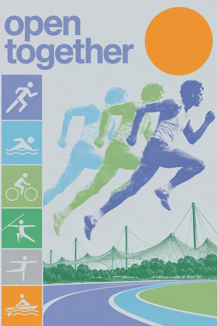
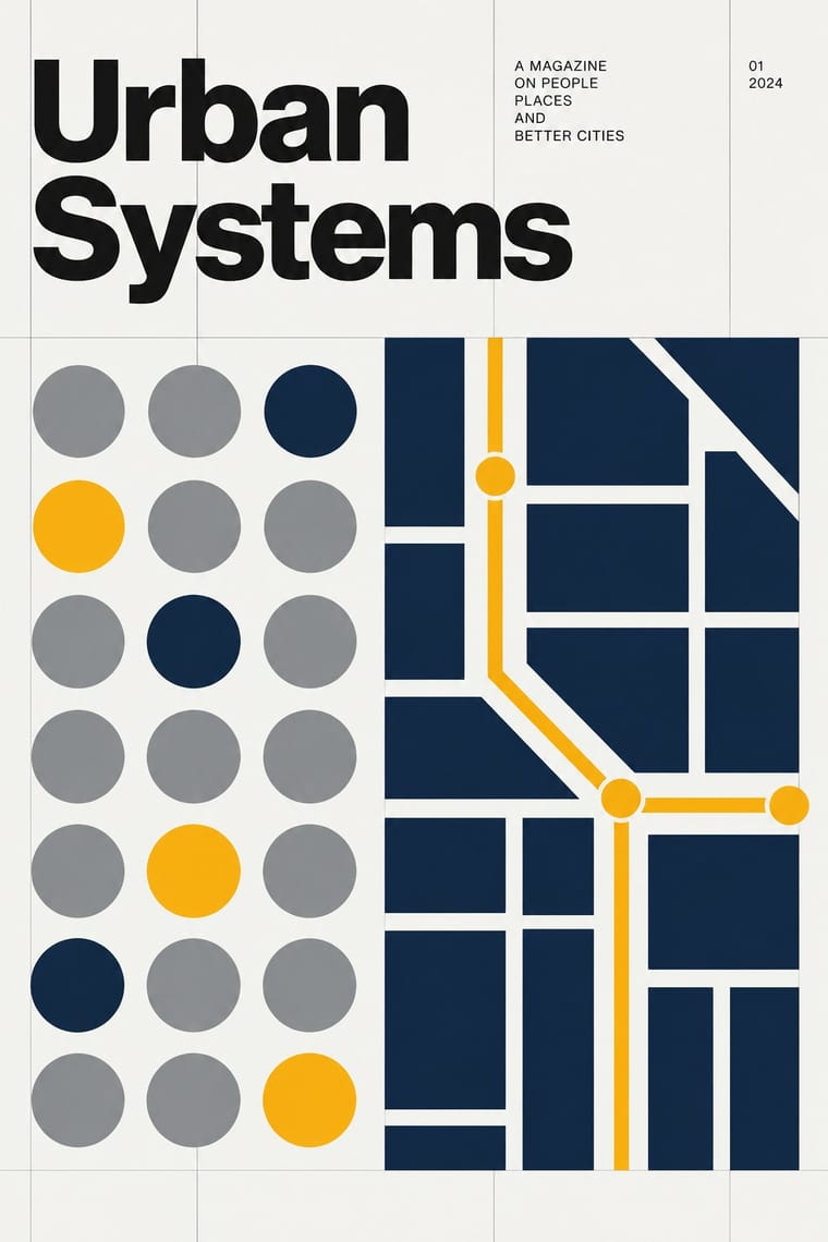
Aicher's own Ulm method (one grid, one grotesque, a manual) applied to a public festival instead of a company: Lufthansa's dark blue, yellow, black and white give way to a landscape spectrum of blues, greens, silver and oranges, pictograms and posterised photographs. Start from Ulm for a corporate system, from Munich when the system must feel friendly.
Mix them and make something Munich 1972 Olympic Design HfG Ulm Systematic Design
01
What each style brings
Each part of the design comes from the style with the stronger say in it, and each style gives at least two.
Munich 1972 Olympic Design (Otl Aicher) HfG Ulm Systematic Design
- Type from HfG Ulm Systematic Design
- Colour from Munich 1972 Olympic Design
- Form from Munich 1972 Olympic Design
- Composition from HfG Ulm Systematic Design
- Surface from Munich 1972 Olympic Design
02
The type
Open fonts standing in for each style’s own type, which is often hand-drawn or commercial.
Text · Munich 1972 Olympic Design
The visual programme Otl Aicher's department made for the 1972 Munich Olympics, the 'cheerful Games' meant to show a democratic, modest West Germany. One grid and one typeface, Univers, governed tickets, programmes, uniforms, signs and posters. The colours were the blues, greens, silver and oranges of the Bavarian landscape, with red, black and gold kept out. Sports pictograms drawn on a 45-degree grid and posters made from photographs reduced to flat bands of the official colours became a model for event and wayfinding design.
Inter; Munich 1972 Olympic Design used Univers (Adrian Frutiger, 1957), the only typeface of the Games' official communications, with Univers 55 as the house weight and The signature line of the posters
03
The colours
The ground and leading colours come from Munich 1972 Olympic Design, with a counter-accent from HfG Ulm Systematic Design. The ink reads on the ground at 4.5:1 or more.
Munich 1972 Olympic Design (Otl Aicher) HfG Ulm Systematic Design
-
#9ccf7cground · 36% -
#141414ink · 14% -
#49aa76accent · 18% -
#0b2244accent · 14% -
#8a96c4accent · 10% -
#8a8d8faccent · 8%
As CSS
:root {
  --ground: #9ccf7c;
  --ink: #141414;
  --accent-1: #49aa76;
  --accent-2: #0b2244;
  --accent-3: #8a96c4;
  --accent-4: #8a8d8f;
  --font-display: "Inter Tight", sans-serif;
  --font-text: "Inter", sans-serif;
}
Use it with care
Munich 1972 Olympic Design (Otl Aicher): The Olympic rings are a protected IOC mark and the Munich posters, emblem and pictograms are the work of named designers: borrow the method (one grid, a light landscape palette, grid-drawn figures), not the artefacts. The 'cheerful Games' are also bound up with the Munich massacre of 5–6 September 1972, when Black September gunmen killed 11 members of the Israeli team; use the identity's optimism knowingly.
04
The two styles
05
More combinations
With Munich 1972 Olympic Design
- Japanese Postwar Modernism Pairs well · Munich built its pictograms partly on Tokyo 1964's; add Kamekura's single emblem on a wide empty field to a Munich layout when one poster must carry more gravity than a series.
- Flat Design Pairs well · Flat icon families descend from these round-headed figures; borrow a single stroke width (which, as Holt shows, the 1972 figures only approximate, since a limb built from an orthogonal and a 45-degree segment cannot keep one thickness) and the 0, 45 and 90-degree rule to keep a screen icon set coherent.
- Isotype Pictorial Statistics Pairs well · Isotype's figures count, Munich's direct: combine Neurath's rows of counted signs with Aicher's grid-drawn sports figures for public information that both explains and guides.
- Wordless Flat-Pack Assembly Instructions Pairs well · Aicher's pictogram system gives the tool and warning signs a stricter grid while the drawings stay in outline.
- Cobi and Mariscal's Barcelona '92 Mascot Graphics Contrasts · The rational pictogram grid against a single drawn mascot; mixing them shows how much a hand-drawn character loosens an institutional system.
With HfG Ulm Systematic Design
- Victorian Letterpress & Wood Type Contrasts · A Victorian mixed-face handbill is the clutter Ulm's one-family rule was meant to cure; use it as a before-and-after foil.
- Dada Contrasts · Dada's chance operations expose what Ulm's method suppresses; one deliberately random element can humanise an over-engineered system.
- Isotype Pictorial Statistics Pairs well · Combine Ulm's rulebook rigour with Isotype's counted pictograms to build wayfinding and data systems that stay legible across languages.
- Generative & Dynamic Identities Pairs well · Use Ulm's parameter-driven manual as the rule set behind a generative identity, so variation stays inside a coded system.
- Plain Tobacco Packaging Contrasts · Ulm's coded colours, single type family and manual built recognition for Braun and Lufthansa; plain packaging uses the same rule-bound specification to erase it, a reminder that a design system can suppress identity as well as build it.
- Googie & Atomic Age Contrasts · Ulm's anti-styling functionalism is its sober opposite; use the contrast to calibrate how much showmanship a brand can bear.
- Neumorphism Pairs well · Model controls on Braun-style product design from the Ulm tradition: knobs, sliders and grilles that look moulded from one material.
- British Road Signage (Kinneir & Calvert) Contrasts · Both govern design by a written rule book, but Ulm ruled a company's print with a flush-left grid and one grotesque, while the Worboys kit rules roadside panels through colour, shape and pictogram codes read at speed; start from Ulm for a corporate programme and from the road signs when the reader is moving.