Style combination · Pairs well
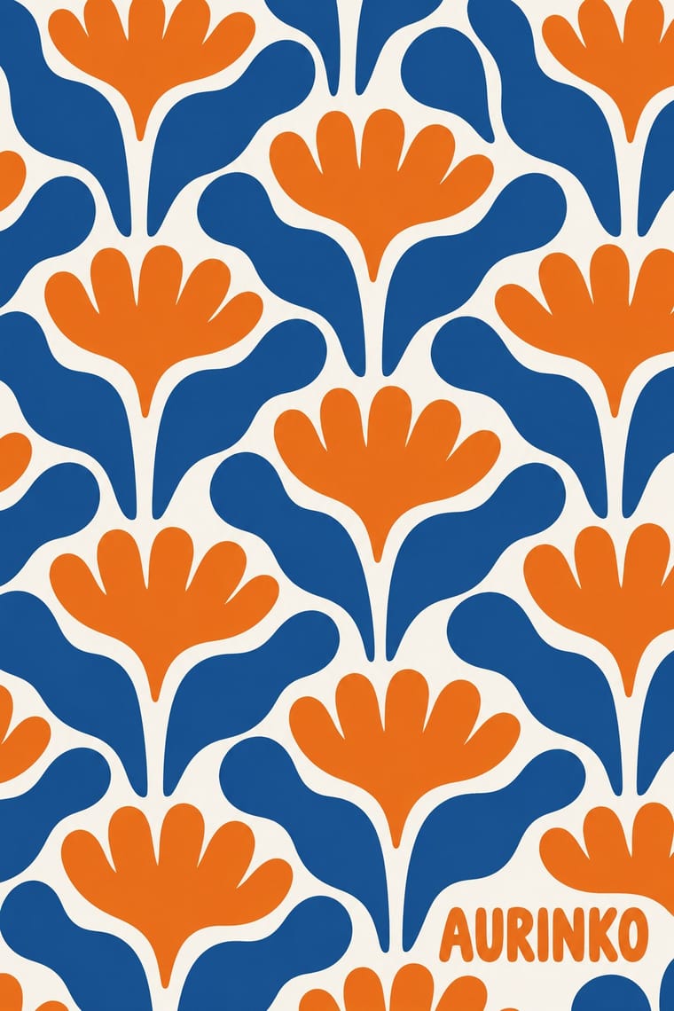
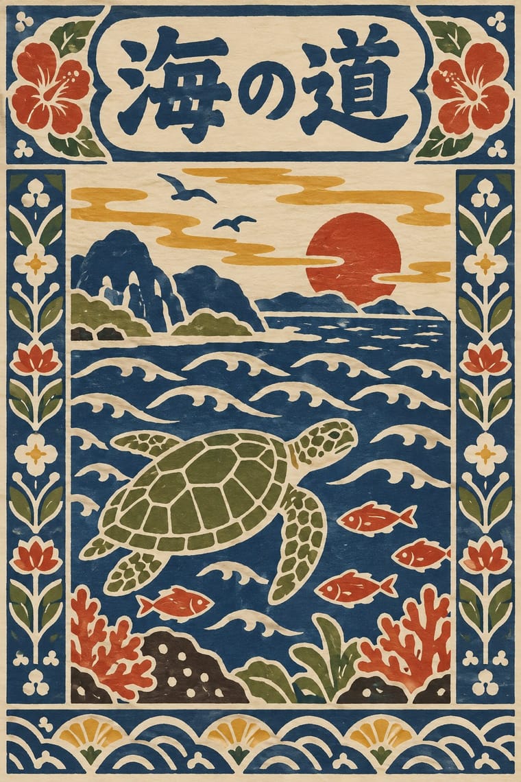
Finnish Bold Print × Serizawa Katazome and Mingei Stencil-Dye Graphics
Both make everyday design from hand-cut shapes in few flat colours; Marimekko's large abstract repeats can carry Serizawa's small figurative panels and stencil letters.
Mix them and make something Finnish Bold Print Serizawa Katazome and Mingei Stencil-Dye Graphics
01
What each style brings
Each part of the design comes from the style with the stronger say in it, and each style gives at least two.
Finnish Bold Print (Marimekko Modernism) Serizawa Katazome and Mingei Stencil-Dye Graphics
- Type from Serizawa Katazome and Mingei Stencil-Dye Graphics
- Colour from Serizawa Katazome and Mingei Stencil-Dye Graphics
- Form from Finnish Bold Print
- Composition from Finnish Bold Print
- Surface from Finnish Bold Print
-
Serizawa Katazome and Mingei Stencil-Dye Graphics avoids painterly brushwork: this is where the two pull against each other.
02
The type
Open fonts standing in for each style’s own type, which is often hand-drawn or commercial.
Display · Serizawa Katazome and Mingei Stencil-Dye Graphics
Hello
Shippori Mincho, standing in for Hand-cut stencil kana and kanji, dyed together with the picture, for calendar month names, book titles and inscriptions
Text · Finnish Bold Print
The printed-cotton modernism of Marimekko, founded in Helsinki in 1951 by Armi and Viljo Ratia out of Viljo's printing firm Printex. Its designers, chiefly Maija Isola, the first (1949-1987), with Vuokko Nurmesniemi (1953-1960) and from 1960 Annika Rimala, painted or cut one motif (stones, a poppy, waves, stripes), enlarged it to repeats often over half a metre and screen-printed it edge to edge in a few flat inks, often on white. It turns the Nordic ideal of good everyday things into one pattern for dress, curtain and home; from 1974 Fujiwo Ishimoto added brushstroke and calligraphic marks.
Inter; Finnish Bold Print used The Marimekko wordmark (in use since 1954) and Selvedge inscriptions repeated along the edge of the cloth, naming designer, pattern, maker, country and year
03
The colours
The ground and leading colours come from Serizawa Katazome and Mingei Stencil-Dye Graphics, with a counter-accent from Finnish Bold Print. The ink reads on the ground at 4.5:1 or more.
Finnish Bold Print (Marimekko Modernism) Serizawa Katazome and Mingei Stencil-Dye Graphics
-
#efe6d2ground · 36% -
#2b2622ink · 14% -
#d9a635accent · 18% -
#ef7d1aaccent · 14% -
#b5432aaccent · 10% -
#d4211caccent · 8%
As CSS
:root {
  --ground: #efe6d2;
  --ink: #2b2622;
  --accent-1: #d9a635;
  --accent-2: #ef7d1a;
  --accent-3: #b5432a;
  --accent-4: #d4211c;
  --font-display: "Shippori Mincho", serif;
  --font-text: "Inter", sans-serif;
}
Use it with care
Finnish Bold Print (Marimekko Modernism): Many of the best-known patterns, Unikko and Kivet among them, are still produced by Marimekko and remain protected designs, so work in the manner rather than copying them. Folk sources carry two further, separate risks. Anonymous folk ornament can be living devotional material: the käspaikka, the Karelian linen towel named in Isola's 1959 print, is still used to dress icons in Orthodox churches and homes, so abstract such ornament rather than quote it, and keep it out of contexts that trivialise it. A named folk artist's work is authored, not a shared tradition: in 2013 Kristina Isola admitted that her 'Metsänväki' (2007), by then painted on a Finnair aircraft, copied elements of Maria Prymachenko's 1963 painting 'Rat on a Journey'; Finnair undertook to repaint the plane and Marimekko ended its collaboration with Kristina Isola in September 2013.
Serizawa Katazome and Mingei Stencil-Dye Graphics: Katazome and Okinawan bingata are living crafts: bingata is an Okinawan (Ryukyuan) tradition, carried on by dye houses such as the Shiroma family, and is protected as an intangible cultural property, so credit Okinawa and its makers when borrowing its colours and motifs, and do not sell printed or generated imitations as hand-dyed katazome or bingata. Mainland mingei collecting of Okinawan and Korean crafts in the 1930s and 1940s is now read critically against Japan's colonial rule over Korea and its treatment of annexed Okinawa, which is one more reason to name Okinawan makers rather than present bingata as Serizawa's invention. Serizawa's and Yunoki's designs are authored works held by their museums: work in the manner rather than copying a calendar or screen. His Buddhist subjects, such as the 1939 scroll of the priest Hōnen, are devotional images, not decoration. Kana and kanji must be real, correct text checked by a fluent reader, never pseudo-script used as texture.
04
The two styles
05
More combinations
With Finnish Bold Print
- African Wax & Fancy Print Contrasts · Both are industrially printed cotton that dresses bodies and rooms, but wax print crowds the cloth with misregistered emblems that traders and wearers name after proverbs and events, while Marimekko enlarges one shape on open white under a title its designer gives; compare them when a pattern must speak or simply be bold.
- Japanese Postwar Modernism Pairs well · Japanese postwar emblematic colour fields share the reduction of nature to a few flat silhouettes, and two of Marimekko's leading designers, Katsuji Wakisaka and Fujiwo Ishimoto, came from Japan; pair one Japanese-style emblem with a Marimekko-scale repeat for a calm, nature-led identity.
- Op Art Graphics Contrasts · Both fill a field edge to edge with one repeated module in the 1960s, but op art's ruled precision makes the eye vibrate while Finnish bold print keeps hand-cut edges and calm flat shapes; choose between perceptual shock and relaxed joy.
- Scandinavian Functionalism Pairs well · The same Nordic ideal of good everyday things, turned up loud; set one Marimekko-scale print against a calm funkis layout with a light ground and a plain sans so the pattern carries all the colour.
- Pop Art Graphics Pairs well · Contemporaries in saturated flat colour at a giant scale; borrow pop's isolated, enlarged object for a poster, but drop its halftone and irony to keep Marimekko's sincerity.
- Norwegian and Finnish National Romantic Graphics (Munthe & Karelianism) Contrasts · Later Finnish flat printing abstracts into large repeat patterns what this style still draws as myth figures; put a Kalevala frieze against a bold abstract field to show the shift.
- NK Textilkammare Geometric Print (Astrid Sampe, Signerad Textil) Contrasts · Marimekko enlarges one hand-cut or brushed motif to a huge repeat with a deliberately wobbly edge; NK's geometric strand keeps small, ruled units on a black-and-white base. Set one against the other to show scale against restraint.
- Book Blob (Abstract Colour-Blob Literary Fiction Cover) Pairs well · Marimekko's big organic shapes in flat, saturated colour, printed edge to edge, are a crisp, hard-edged cousin of the blob's soft fields. Borrow their scale and confident cut edges when blurred blobs feel too vague.
With Serizawa Katazome and Mingei Stencil-Dye Graphics
- Ukiyo-e Woodblock Prints Contrasts · Ukiyo-e is carved line, urban pleasure and diagonal drama; Serizawa is a stencil edge, rural work and calm panel grids.
- Edo-moji Commercial Lettering (Kanteiryū, Yose-moji, Sumō-ji) Contrasts · Edo-moji crams heavy brush letters for the theatre and the street; Serizawa cuts open, airy letters that share the cloth with pictures.
- Kamon (Japanese Family Crests) Pairs well · Crest-like roundels sit naturally beside stencil-dyed panels; draw new crests by the tradition's rules rather than borrowing real family mon.
- Japanese Postwar Modernism Contrasts · Postwar modernism reduces to emblem and white space with set type; Serizawa fills the sheet with hand-cut figures and letters.
- Đông Hồ & Hàng Trống Folk Prints Pairs well · Another East Asian folk picture on handmade paper in earth colours; compare the woodblock's carved line with the stencil's cut field.