Style combination · Contrasts
Japanese Postwar Modernism × Serizawa Katazome and Mingei Stencil-Dye Graphics
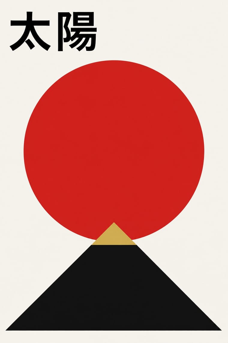
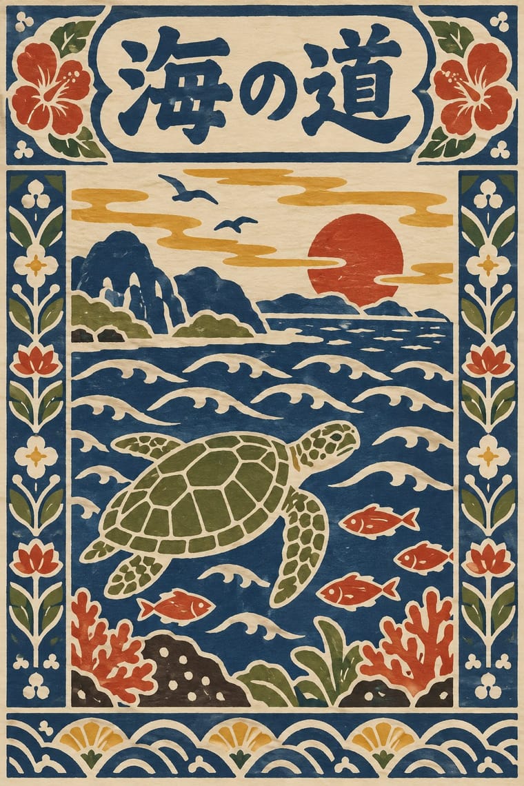
Postwar modernism reduces to emblem and white space with set type; Serizawa fills the sheet with hand-cut figures and letters.
Mix them and make something Japanese Postwar Modernism Serizawa Katazome and Mingei Stencil-Dye Graphics
01
What each style brings
Each part of the design comes from the style with the stronger say in it, and each style gives at least two.
Japanese Postwar Modernism Serizawa Katazome and Mingei Stencil-Dye Graphics
- Type from Serizawa Katazome and Mingei Stencil-Dye Graphics
-
Japanese Postwar Modernism avoids ornamented display: this is where the two pull against each other, which is the point of the contrast.
- Colour from Japanese Postwar Modernism
- Form from Japanese Postwar Modernism
- Composition from Japanese Postwar Modernism
- Surface from Serizawa Katazome and Mingei Stencil-Dye Graphics
02
The type
Open fonts standing in for each style’s own type, which is often hand-drawn or commercial.
Display · Serizawa Katazome and Mingei Stencil-Dye Graphics
Tide
Shippori Mincho, standing in for Hand-cut stencil kana and kanji, dyed together with the picture, for calendar month names, book titles and inscriptions
Text · Japanese Postwar Modernism
Building on the New Typography that Hiromu Hara and the Nippon Kobo circle had absorbed in the 1930s, Japan's postwar graphic designers fused the grid, sans-serif and objective photography of European modernism with indigenous traditions of family crests (kamon), asymmetry and charged emptiness (ma). From the Graphic '55 exhibition and the Nippon Design Center to Yusaku Kamekura's Tokyo 1964 Olympic posters, it produced bold emblematic symbols, luminous flat colour fields and photography of startling precision.
Zen Kaku Gothic New; Japanese Postwar Modernism used Gothic and Mincho
03
The colours
The ground and leading colours come from Japanese Postwar Modernism, with a counter-accent from Serizawa Katazome and Mingei Stencil-Dye Graphics. The ink reads on the ground at 4.5:1 or more.
Japanese Postwar Modernism Serizawa Katazome and Mingei Stencil-Dye Graphics
-
#f4f1eaground · 36% -
#111111ink · 14% -
#d7261eaccent · 18% -
#d9a635accent · 14% -
#1d3c78accent · 10% -
#6b7a3aaccent · 8%
As CSS
:root {
  --ground: #f4f1ea;
  --ink: #111111;
  --accent-1: #d7261e;
  --accent-2: #d9a635;
  --accent-3: #1d3c78;
  --accent-4: #6b7a3a;
  --font-display: "Shippori Mincho", serif;
  --font-text: "Zen Kaku Gothic New", sans-serif;
}
Use it with care
Serizawa Katazome and Mingei Stencil-Dye Graphics: Katazome and Okinawan bingata are living crafts: bingata is an Okinawan (Ryukyuan) tradition, carried on by dye houses such as the Shiroma family, and is protected as an intangible cultural property, so credit Okinawa and its makers when borrowing its colours and motifs, and do not sell printed or generated imitations as hand-dyed katazome or bingata. Mainland mingei collecting of Okinawan and Korean crafts in the 1930s and 1940s is now read critically against Japan's colonial rule over Korea and its treatment of annexed Okinawa, which is one more reason to name Okinawan makers rather than present bingata as Serizawa's invention. Serizawa's and Yunoki's designs are authored works held by their museums: work in the manner rather than copying a calendar or screen. His Buddhist subjects, such as the 1939 scroll of the priest Hōnen, are devotional images, not decoration. Kana and kanji must be real, correct text checked by a fluent reader, never pseudo-script used as texture.
04
The two styles
05
More combinations
With Japanese Postwar Modernism
- Angura Theatre Poster Contrasts · Tadanori Yokoo's angura theatre posters broke with this school; set one beside a Kamekura poster to calibrate restraint against overload.
- Kawaii Design Contrasts · Kawaii shows the soft, crowded face of Japanese visual culture; use the contrast to tune a brand between gravitas and charm.
- Minimalist Graphic Design Pairs well · Muji-era minimalism grew from this school; enlarge the empty field further and reduce the emblem to a whisper.
- International Typographic Style Pairs well · Graft a single emblematic disc or crest onto a Swiss grid to add focus and warmth without breaking its order.
- Hong Kong East–West Graphic Modernism Pairs well · Take its single emblem on an empty field, then add a bilingual Chinese–English lockup and one ink stroke to move the poster from Tokyo to Hong Kong.
- Finnish Bold Print (Marimekko Modernism) Pairs well · Japanese postwar emblematic colour fields share the reduction of nature to a few flat silhouettes, and two of Marimekko's leading designers, Katsuji Wakisaka and Fujiwo Ishimoto, came from Japan; pair one Japanese-style emblem with a Marimekko-scale repeat for a calm, nature-led identity.
- Yuru-chara (Japanese Local Mascot Design) Contrasts · Postwar Japanese identities give institutions abstract, grid-built marks; a yuru-chara gives a prefecture a face, a name and a body that walks into festivals and shakes hands.
- Taishō Roman & Lyrical Illustration Contrasts · Postwar modernism replaced this sentimental figure with emblems and empty fields; set one against the other to calibrate warmth against austerity.
With Serizawa Katazome and Mingei Stencil-Dye Graphics
- Ukiyo-e Woodblock Prints Contrasts · Ukiyo-e is carved line, urban pleasure and diagonal drama; Serizawa is a stencil edge, rural work and calm panel grids.
- Edo-moji Commercial Lettering (Kanteiryū, Yose-moji, Sumō-ji) Contrasts · Edo-moji crams heavy brush letters for the theatre and the street; Serizawa cuts open, airy letters that share the cloth with pictures.
- Finnish Bold Print (Marimekko Modernism) Pairs well · Both make everyday design from hand-cut shapes in few flat colours; Marimekko's large abstract repeats can carry Serizawa's small figurative panels and stencil letters.
- Kamon (Japanese Family Crests) Pairs well · Crest-like roundels sit naturally beside stencil-dyed panels; draw new crests by the tradition's rules rather than borrowing real family mon.
- Đông Hồ & Hàng Trống Folk Prints Pairs well · Another East Asian folk picture on handmade paper in earth colours; compare the woodblock's carved line with the stencil's cut field.