Style combination · Pairs well
Kamon × Serizawa Katazome and Mingei Stencil-Dye Graphics
Crest-like roundels sit naturally beside stencil-dyed panels; draw new crests by the tradition's rules rather than borrowing real family mon.
Mix them and make something Kamon Serizawa Katazome and Mingei Stencil-Dye Graphics
01
What each style brings
Each part of the design comes from the style with the stronger say in it, and each style gives at least two.
Kamon (Japanese Family Crests) Serizawa Katazome and Mingei Stencil-Dye Graphics
- Type from Serizawa Katazome and Mingei Stencil-Dye Graphics
- Colour from Kamon
- Form from Kamon
- Composition from Kamon
- Surface from Serizawa Katazome and Mingei Stencil-Dye Graphics
02
The type
Open fonts standing in for each style’s own type, which is often hand-drawn or commercial.
Display · Serizawa Katazome and Mingei Stencil-Dye Graphics
Tide
Shippori Mincho, standing in for Hand-cut stencil kana and kanji, dyed together with the picture, for calendar month names, book titles and inscriptions
Text · Serizawa Katazome and Mingei Stencil-Dye Graphics
Japanese folk-craft graphic design made by cutting paper stencils and dyeing through a rice-paste resist. Figures, tools, houses, plants and kana or kanji are cut as one stencil, so letters and pictures share the same soft, hand-cut edge and sit as flat fields of earth, indigo and bingata red on undyed cloth or washi. Serizawa used it for calendars, book covers, screens and picture books, setting small everyday scenes in grids of panels or repeating them across the cloth.
Shippori Mincho; Serizawa Katazome and Mingei Stencil-Dye Graphics used Hand-cut stencil kana and kanji, dyed together with the picture, for calendar month names, book titles and inscriptions and Moji-e (文字絵), letters built from figures and objects, collected in Serizawa Keisuke no moji-e, san
03
The colours
The ground and leading colours come from Kamon, with a counter-accent from Serizawa Katazome and Mingei Stencil-Dye Graphics. The ink reads on the ground at 4.5:1 or more.
Kamon (Japanese Family Crests) Serizawa Katazome and Mingei Stencil-Dye Graphics
-
#f3efe6ground · 36% -
#121212ink · 14% -
#b38f3daccent · 18% -
#8c2d25accent · 14% -
#1d2b47accent · 10% -
#6b7a3aaccent · 8%
As CSS
:root {
  --ground: #f3efe6;
  --ink: #121212;
  --accent-1: #b38f3d;
  --accent-2: #8c2d25;
  --accent-3: #1d2b47;
  --accent-4: #6b7a3a;
  --font-display: "Shippori Mincho", serif;
  --font-text: "Shippori Mincho", serif;
}
Use it with care
Kamon (Japanese Family Crests): Mon are inherited marks of particular families, shrines, temples and institutions. Only the imperial chrysanthemum is named in Japanese law: the Trademark Act (art. 4(1)(i)) bars registering it or anything like it. The government's paulownia, though the official emblem of the Prime Minister and Cabinet, was never given the same legal restrictions, while famous crests registered as trademarks, such as Mitsubishi's three diamonds, are protected as marks. Do not use the chrysanthemum, the government paulownia, or any identifiable family's, shrine's or temple's crest as decoration or as a brand. Imperial emblems can also recall Japan's wartime empire for audiences in Korea and China. The manji (卍), a standard crest (the Hachisuka clan; the temple crest of Sensō-ji), is read in the West as the Nazi swastika: avoid it outside a Japanese context that explains it. Draw new crests by the tradition's rules instead of borrowing real ones, and commission or credit working monsho uwaeshi, who still draw and paint crests by hand.
Serizawa Katazome and Mingei Stencil-Dye Graphics: Katazome and Okinawan bingata are living crafts: bingata is an Okinawan (Ryukyuan) tradition, carried on by dye houses such as the Shiroma family, and is protected as an intangible cultural property, so credit Okinawa and its makers when borrowing its colours and motifs, and do not sell printed or generated imitations as hand-dyed katazome or bingata. Mainland mingei collecting of Okinawan and Korean crafts in the 1930s and 1940s is now read critically against Japan's colonial rule over Korea and its treatment of annexed Okinawa, which is one more reason to name Okinawan makers rather than present bingata as Serizawa's invention. Serizawa's and Yunoki's designs are authored works held by their museums: work in the manner rather than copying a calendar or screen. His Buddhist subjects, such as the 1939 scroll of the priest Hōnen, are devotional images, not decoration. Kana and kanji must be real, correct text checked by a fluent reader, never pseudo-script used as texture.
04
The two styles
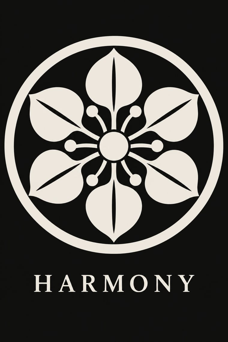
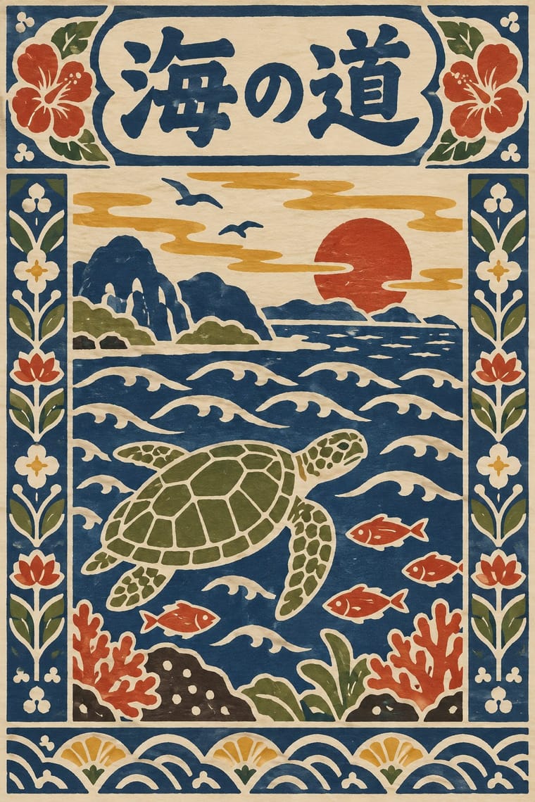
05
More combinations
With Kamon
- Ukiyo-e Woodblock Prints Pairs well · Kabuki actors had their own mon, and actor prints show them on the costume, as on the sleeve of Ichikawa Yaozō III in a print of 1796; pair a flat crest with ukiyo-e figures to identify characters without captions.
- Islamic Geometric & Calligraphic Tradition Contrasts · Both are built with compass and straight edge, but girih tiles the whole surface without end while a mon closes one motif inside a ring; borrow the tessellation for a ground and the crest for the single sign on it.
- Corporate Identity Modernism Pairs well · A mon already behaves like a corporate mark (one colour, scalable, placed in fixed positions), as Mitsubishi's three diamonds show; use crest construction rules to build a logo family with codified variants for subsidiaries.
- Ma & Wabi-sabi Aesthetics Contrasts · Both set a single sign in emptiness, but wabi-sabi wants it off-centre, irregular and brush-marked while a mon is exact, symmetric and compass-drawn; set a crest's geometry against wabi-sabi's rough, quiet grounds when packaging or interiors need that tension.
- Japanese Postwar Modernism Pairs well · Postwar Japanese designers drew on kamon for their single emblematic symbols; pair a compass-drawn crest with a grotesque or Gothic caption on an empty field for an identity that is plainly modern but rooted.
- Northwest Coast Formline Design Contrasts · Both are hereditary crest systems, but formline fills a red-and-black field with split, swelling creatures while a mon is a tiny symmetric silhouette in emptiness; compare them to decide between abundance and reduction.
- Japonisme Pairs well · Through Japonisme, mon fed late-19th-century Western pattern design, Louis Vuitton's monogram among them; borrow a crest's compass-built flat silhouette for a Western repeat or monogram, drawn new rather than copied from a real family.
- European Heraldry Contrasts · Both mark kinship with hereditary emblems varied in small codified ways, but a mon is a one-colour silhouette drawn round a centre, while a coat of arms is a shield of contrasting tinctures read by the rule of tincture.
With Serizawa Katazome and Mingei Stencil-Dye Graphics
- Ukiyo-e Woodblock Prints Contrasts · Ukiyo-e is carved line, urban pleasure and diagonal drama; Serizawa is a stencil edge, rural work and calm panel grids.
- Edo-moji Commercial Lettering (Kanteiryū, Yose-moji, Sumō-ji) Contrasts · Edo-moji crams heavy brush letters for the theatre and the street; Serizawa cuts open, airy letters that share the cloth with pictures.
- Finnish Bold Print (Marimekko Modernism) Pairs well · Both make everyday design from hand-cut shapes in few flat colours; Marimekko's large abstract repeats can carry Serizawa's small figurative panels and stencil letters.
- Japanese Postwar Modernism Contrasts · Postwar modernism reduces to emblem and white space with set type; Serizawa fills the sheet with hand-cut figures and letters.
- Đông Hồ & Hàng Trống Folk Prints Pairs well · Another East Asian folk picture on handmade paper in earth colours; compare the woodblock's carved line with the stencil's cut field.