Style combination · Pairs well
Data Humanism × Risograph
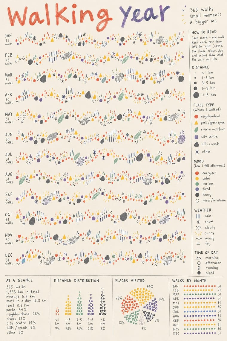
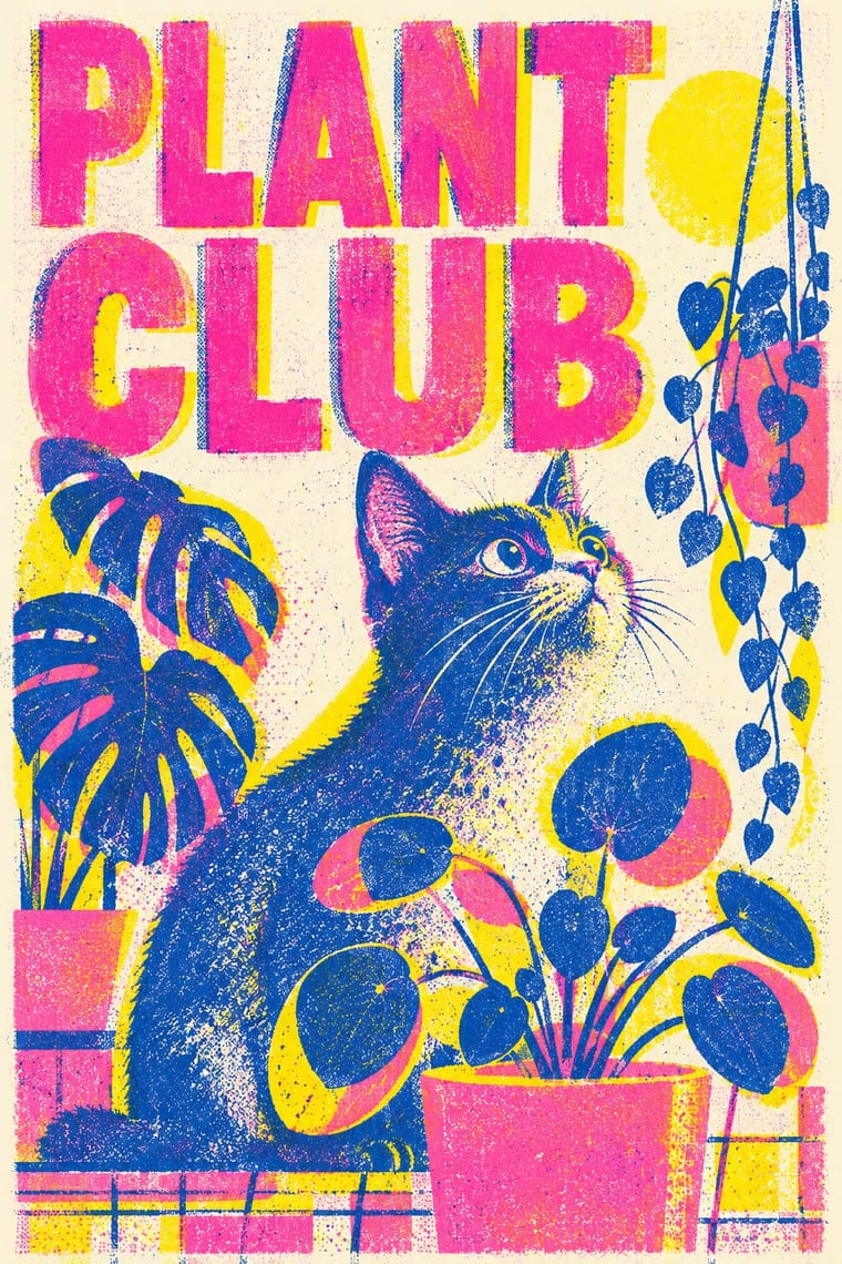
Print hand-drawn data drawings in two or three riso spot inks for zines and postcards, so each ink becomes one data category and the grain matches the hand.
01
What each style brings
Each part of the design comes from the style with the stronger say in it, and each style gives at least two.
Data Humanism Risograph & Indie Print Culture
- Type from Data Humanism
- Colour from Risograph
-
Data Humanism avoids fluorescent & neon: this is where the two pull against each other.
- Form from Data Humanism
- Composition from Data Humanism
- Surface from Risograph
02
The type
Open fonts standing in for each style’s own type, which is often hand-drawn or commercial.
Display · Data Humanism
Hello
Caveat, standing in for The designer's own handwriting in pen or pencil for titles, legends and annotations (the Dear Data postcards; the red handwritten script of Lupi's Print manifesto, 2017)
Text · Risograph
A contemporary culture of zines, art books, posters and prints made on Japanese Risograph stencil duplicators, whose soy-based spot inks (fluorescent pink, yellow, blue, teal) are laid down one drum at a time. Designers embrace the machine's limits: translucent overprints, slight misregistration, grainy coverage and coarse halftones give flat illustration and type a warm, handmade vibrancy at low cost.
Inter; Risograph used Neo-grotesques set large and Monospace and typewriter faces
03
The colours
The ground and leading colours come from Risograph, with a counter-accent from Data Humanism. The ink reads on the ground at 4.5:1 or more.
Data Humanism Risograph & Indie Print Culture
-
#f4f1eaground · 36% -
#3255a4ink · 14% -
#ff48b0accent · 18% -
#f2c14eaccent · 14% -
#f15060accent · 10% -
#00838aaccent · 8%
As CSS
:root {
  --ground: #f4f1ea;
  --ink: #3255a4;
  --accent-1: #ff48b0;
  --accent-2: #f2c14e;
  --accent-3: #f15060;
  --accent-4: #00838a;
  --font-display: "Caveat", cursive;
  --font-text: "Inter", sans-serif;
}
Use it with care
Data Humanism: Data portraits are usually drawn from real people's lives (health, moods, relationships, locations): get consent and anonymise before publishing other people's personal data. Because the custom encodings cannot be read at a glance, give a plain-text summary and the key alongside the drawing for readers who use screen readers or are in a hurry.
04
The two styles
05
More combinations
With Data Humanism
- Isotype Pictorial Statistics Contrasts · Isotype fixes one standard sign per thing and counts by repeating it so anyone can read the chart; data humanism invents a new code for each dataset and asks for slow reading. Choose Isotype for public information, data humanism for portraits of particular lives.
- Corporate Memphis Contrasts · Both aim to feel warm and human, but Corporate Memphis draws generic faceless figures for mood, while data humanism draws the specific data of specific people. Replace stock warmth with a drawing of real data when a brand needs sincerity.
- Generative & Dynamic Identities Pairs well · Let a generative system draw personal data portraits from people's own answers, as What Counts did, but give the code a hand-drawn grammar and a legend so the output reads as made by people.
- Dark Tech Minimalism Contrasts · The dark dashboard shows a few clean metrics at a glance; data humanism draws the messy, qualitative data a dashboard leaves out. Put one hand-drawn data portrait beside the KPIs to show the people behind the numbers.
- Biobrand (Organic Biotech CGI) Contrasts · Data humanism draws organic forms by hand to encode real observations; the biobrand renders them as promotional objects. Borrow its honest encoding when a render risks overclaiming.
- Sketchnoting and Graphic Recording Pairs well · Both keep the human hand visible in explanatory drawing; sketchnoting adds live speed and containers.
- Newsroom Data Graphics & Scrollytelling Contrasts · Newsroom graphics use chart types readers already know, labelled directly so they can be read at a glance; data humanism invents a new hand-drawn code for each dataset and asks for slow reading. Use the newsroom chart for the finding, a hand-drawn data portrait for the people behind it.
- Mithila (Madhubani) Painting Pairs well · Both treat hand-drawn hatching, dots and repeated small marks as content; a kachni-style legend or border can give a hand-drawn chart a South Asian line vocabulary, provided a Mithila painter is commissioned for it.
With Risograph
- Corporate Identity Modernism Contrasts · Exact Pantone-matched corporate colour is the opposite of riso's drifting inks; use the contrast to signal independence.
- Neo-Swiss Revival Pairs well · Print neo-Swiss grids in two fluorescent riso inks to soften their rigour with grain and overprint.
- Y2K Futurism Contrasts · Glossy chrome renders are everything a riso cannot print; set frictionless screen gloss against tactile grain for deliberate friction.
- WPA Silkscreen Posters Pairs well · WPA silkscreen's flat, separated colour translates directly to riso drums; borrow its layered spot-colour scenes.
- Literatura de Cordel Woodcut Pairs well · Print a cordel-style woodcut on a riso in one ink on tinted stock to keep the pocket-chapbook economy for zines and poetry pamphlets.
- Cubist Pictorial Space Pairs well · Print synthetic-Cubist planes as overlapping flat riso inks so the overprints do the faceting for you.
- Leningrad Avant-Garde Picture Book Pairs well · Today's riso picture books share the few flat inks, bare paper and speckled texture; print a Lebedev-style sequence of floating figures in two or three riso inks.
- Die Neue Typographie Pairs well · Two-colour riso printing suits its black-plus-red restraint for low-budget editorial and posters.