Style combination · Contrasts
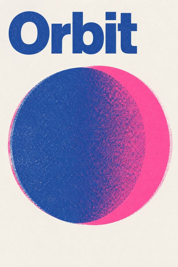
Corporate Identity Modernism × Risograph
Exact Pantone-matched corporate colour is the opposite of riso's drifting inks; use the contrast to signal independence.
Mix them and make something Corporate Identity Modernism Risograph
01
What each style brings
Each part of the design comes from the style with the stronger say in it, and each style gives at least two.
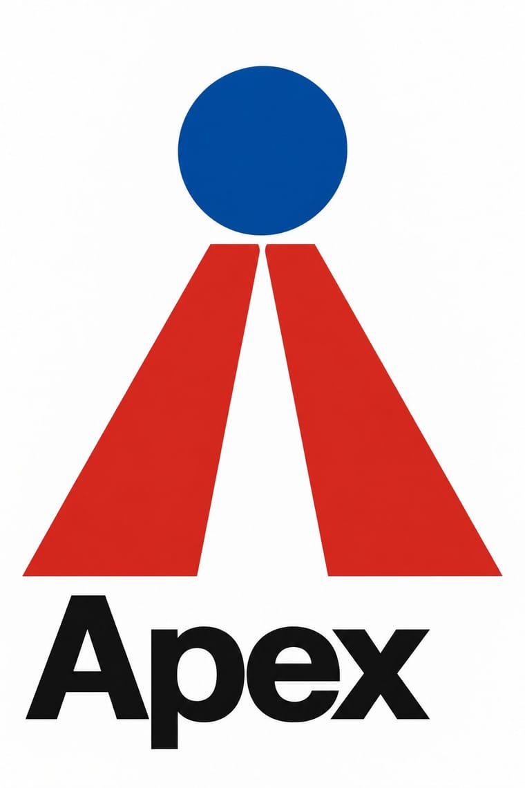
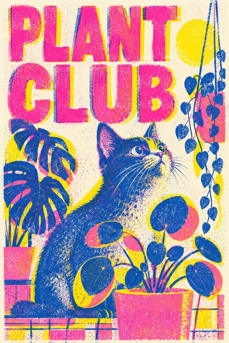
Corporate Identity Modernism Risograph & Indie Print Culture
- Type from Corporate Identity Modernism
- Colour from Risograph
- Form from Corporate Identity Modernism
- Composition from Corporate Identity Modernism
- Surface from Risograph
02
The type
Open fonts standing in for each style’s own type, which is often hand-drawn or commercial.
Text · Risograph
A contemporary culture of zines, art books, posters and prints made on Japanese Risograph stencil duplicators, whose soy-based spot inks (fluorescent pink, yellow, blue, teal) are laid down one drum at a time. Designers embrace the machine's limits: translucent overprints, slight misregistration, grainy coverage and coarse halftones give flat illustration and type a warm, handmade vibrancy at low cost.
Inter; Risograph used Neo-grotesques set large and Monospace and typewriter faces
03
The colours
The ground and leading colours come from Risograph, with a counter-accent from Corporate Identity Modernism. The ink reads on the ground at 4.5:1 or more.
Corporate Identity Modernism Risograph & Indie Print Culture
-
#f4f1eaground · 36% -
#3255a4ink · 14% -
#ff48b0accent · 18% -
#d7261eaccent · 14% -
#f15060accent · 10% -
#a4a9adaccent · 8%
As CSS
:root {
  --ground: #f4f1ea;
  --ink: #3255a4;
  --accent-1: #ff48b0;
  --accent-2: #d7261e;
  --accent-3: #f15060;
  --accent-4: #a4a9ad;
  --font-display: "Inter Tight", sans-serif;
  --font-text: "Inter", sans-serif;
}
04
The two styles
05
More combinations
With Corporate Identity Modernism
- Corporate Memphis Contrasts · Its successor trades abstract authority for rubbery friendliness; compare the two to decide how institutional or human a brand should feel.
- Generative & Dynamic Identities Pairs well · Keep the manual's mark, colour and grid as constants and let generative rules vary one parameter, so the system still reads as one company.
- Flat Design Pairs well · Flat UI inherits these reductive marks; reuse their clear-space and colour-code discipline when scaling icons across screens.
- Punk & DIY Zine Contrasts · Punk's ransom-note lettering is the anti-manual; one torn, xeroxed element against a corporate grid reads instantly as critique.
- Plakatstil / Sachplakat Pairs well · Its brand-name-plus-object formula prefigures logo-led identity; pair it with a modernist grid for confident product campaigns.
- Contemporary Arabic & Dual-Script Type Design Pairs well · Roll a matched Arabic–Latin family through a standards manual so both scripts carry the identity with equal authority.
- Milanese Industrial Modernism (Olivetti, Pirelli, Studio Boggeri) Contrasts · American corporate identity policed one mark through a manual, while Milan let artists vary the language; compare the two when deciding how strict a brand system should be.
- European Heraldry Pairs well · A coat of arms already is an identity defined by a specification rather than one drawing, applied to seals, banners, buildings and documents; Finnish municipal arms of the 1950s show how its flat two-tincture discipline reads as a modern mark, so use blazon-like rules to write a logo that can be redrawn without losing itself.
With Risograph
- Neo-Swiss Revival Pairs well · Print neo-Swiss grids in two fluorescent riso inks to soften their rigour with grain and overprint.
- Y2K Futurism Contrasts · Glossy chrome renders are everything a riso cannot print; set frictionless screen gloss against tactile grain for deliberate friction.
- WPA Silkscreen Posters Pairs well · WPA silkscreen's flat, separated colour translates directly to riso drums; borrow its layered spot-colour scenes.
- Literatura de Cordel Woodcut Pairs well · Print a cordel-style woodcut on a riso in one ink on tinted stock to keep the pocket-chapbook economy for zines and poetry pamphlets.
- Cubist Pictorial Space Pairs well · Print synthetic-Cubist planes as overlapping flat riso inks so the overprints do the faceting for you.
- Leningrad Avant-Garde Picture Book Pairs well · Today's riso picture books share the few flat inks, bare paper and speckled texture; print a Lebedev-style sequence of floating figures in two or three riso inks.
- Die Neue Typographie Pairs well · Two-colour riso printing suits its black-plus-red restraint for low-budget editorial and posters.
- Spotify Duotone Identity Pairs well · Borrow riso's overprinted two-ink grain to give the clean digital duotone a tactile, handmade edge.