Style combination · Pairs well
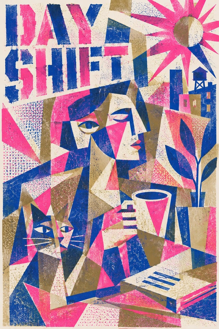
Cubist Pictorial Space × Risograph
Print synthetic-Cubist planes as overlapping flat riso inks so the overprints do the faceting for you.
Mix them and make something Cubist Pictorial Space Risograph
01
What each style brings
Each part of the design comes from the style with the stronger say in it, and each style gives at least two.
Cubist Pictorial Space Risograph & Indie Print Culture
- Colour from Risograph
-
Cubist Pictorial Space avoids fluorescent & neon: this is where the two pull against each other.
- Form from Cubist Pictorial Space
- Composition from Cubist Pictorial Space
- Surface from Risograph
02
The type
Open fonts standing in for each style’s own type, which is often hand-drawn or commercial.
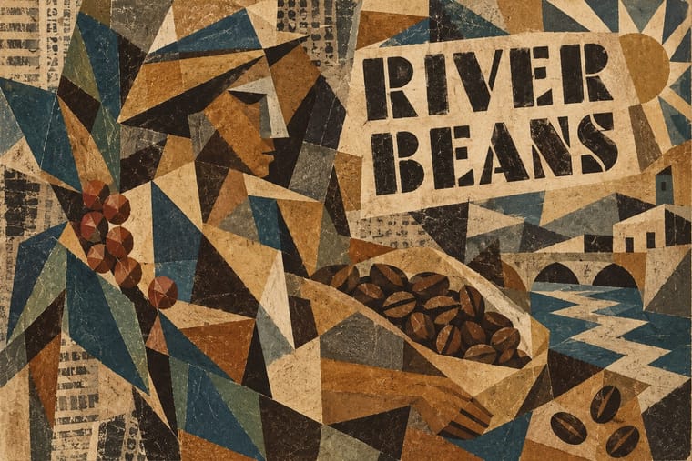
Display · Cubist Pictorial Space
Yay!
Allerta Stencil, standing in for Sign-painters' stencilled capitals (Braque, from 1911)
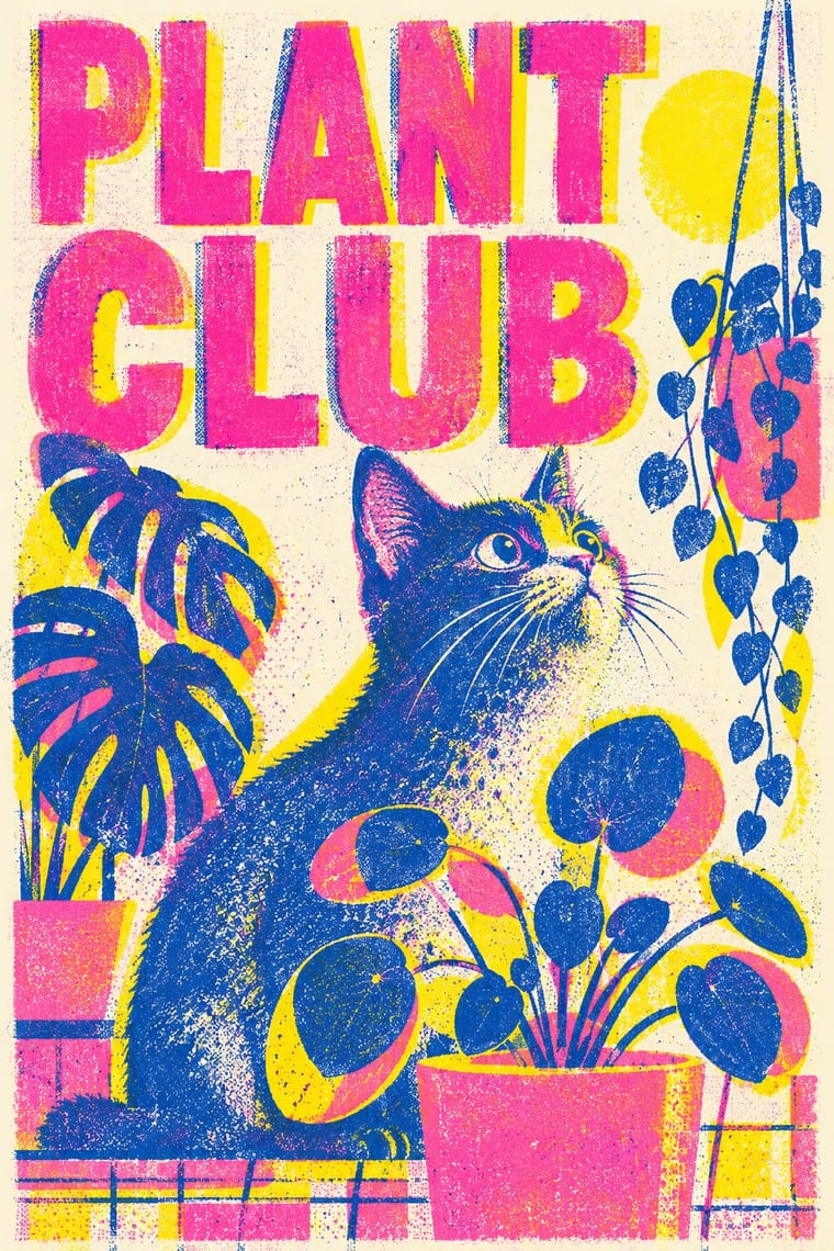
Text · Risograph
A contemporary culture of zines, art books, posters and prints made on Japanese Risograph stencil duplicators, whose soy-based spot inks (fluorescent pink, yellow, blue, teal) are laid down one drum at a time. Designers embrace the machine's limits: translucent overprints, slight misregistration, grainy coverage and coarse halftones give flat illustration and type a warm, handmade vibrancy at low cost.
Inter; Risograph used Neo-grotesques set large and Monospace and typewriter faces
03
The colours
The ground and leading colours come from Risograph, with a counter-accent from Cubist Pictorial Space. The ink reads on the ground at 4.5:1 or more.
Cubist Pictorial Space Risograph & Indie Print Culture
-
#f4f1eaground · 36% -
#3255a4ink · 14% -
#ff48b0accent · 18% -
#8b6b3eaccent · 14% -
#f15060accent · 10% -
#c9b48aaccent · 8%
As CSS
:root {
  --ground: #f4f1ea;
  --ink: #3255a4;
  --accent-1: #ff48b0;
  --accent-2: #8b6b3e;
  --accent-3: #f15060;
  --accent-4: #c9b48a;
  --font-display: "Allerta Stencil", sans-serif;
  --font-text: "Inter", sans-serif;
}
04
The two styles
05
More combinations
With Cubist Pictorial Space
- Art Deco Pairs well · Fracture a Deco poster subject into crisp Cubist planes, as Cassandre did, to add depth and movement without losing polish.
- Isotype Pictorial Statistics Contrasts · Isotype shows one thing from one view, Cubism one thing from many; choose Cubist fragmentation only when ambiguity is the point.
- Art Nouveau Contrasts · Set faceted, straight-edged planes against a single whiplash curve to dramatise the break with organic ornament.
- Woodland School (Legend Painting) Pairs well · Daphne Odjig took the overlapping planes of the Cubism she encountered in Toronto into her own curving, strongly outlined Woodland painting; when a layout wants overlapping flat planes, overlap type and colour panels around a commissioned Woodland image rather than imitating her hand.
- Chaekgeori & Minhwa Screen Painting Pairs well · Chaekgeori already shows objects from several viewpoints at once; borrow Cubist faceting to push its tilted shelves further, or cite chaekgeori as an East Asian precedent for multi-view still life.
- Low Poly Illustration Contrasts · Cubism breaks an object into planes seen from several viewpoints at once and flattens the space; low poly facets it from one consistent viewpoint and keeps the perspective. Borrow Cubist overlap only when ambiguity, not legibility, is the point.
With Risograph
- Corporate Identity Modernism Contrasts · Exact Pantone-matched corporate colour is the opposite of riso's drifting inks; use the contrast to signal independence.
- Neo-Swiss Revival Pairs well · Print neo-Swiss grids in two fluorescent riso inks to soften their rigour with grain and overprint.
- Y2K Futurism Contrasts · Glossy chrome renders are everything a riso cannot print; set frictionless screen gloss against tactile grain for deliberate friction.
- WPA Silkscreen Posters Pairs well · WPA silkscreen's flat, separated colour translates directly to riso drums; borrow its layered spot-colour scenes.
- Literatura de Cordel Woodcut Pairs well · Print a cordel-style woodcut on a riso in one ink on tinted stock to keep the pocket-chapbook economy for zines and poetry pamphlets.
- Leningrad Avant-Garde Picture Book Pairs well · Today's riso picture books share the few flat inks, bare paper and speckled texture; print a Lebedev-style sequence of floating figures in two or three riso inks.
- Die Neue Typographie Pairs well · Two-colour riso printing suits its black-plus-red restraint for low-budget editorial and posters.
- Spotify Duotone Identity Pairs well · Borrow riso's overprinted two-ink grain to give the clean digital duotone a tactile, handmade edge.