Style combination · Pairs well
Risograph × WPA Silkscreen Posters
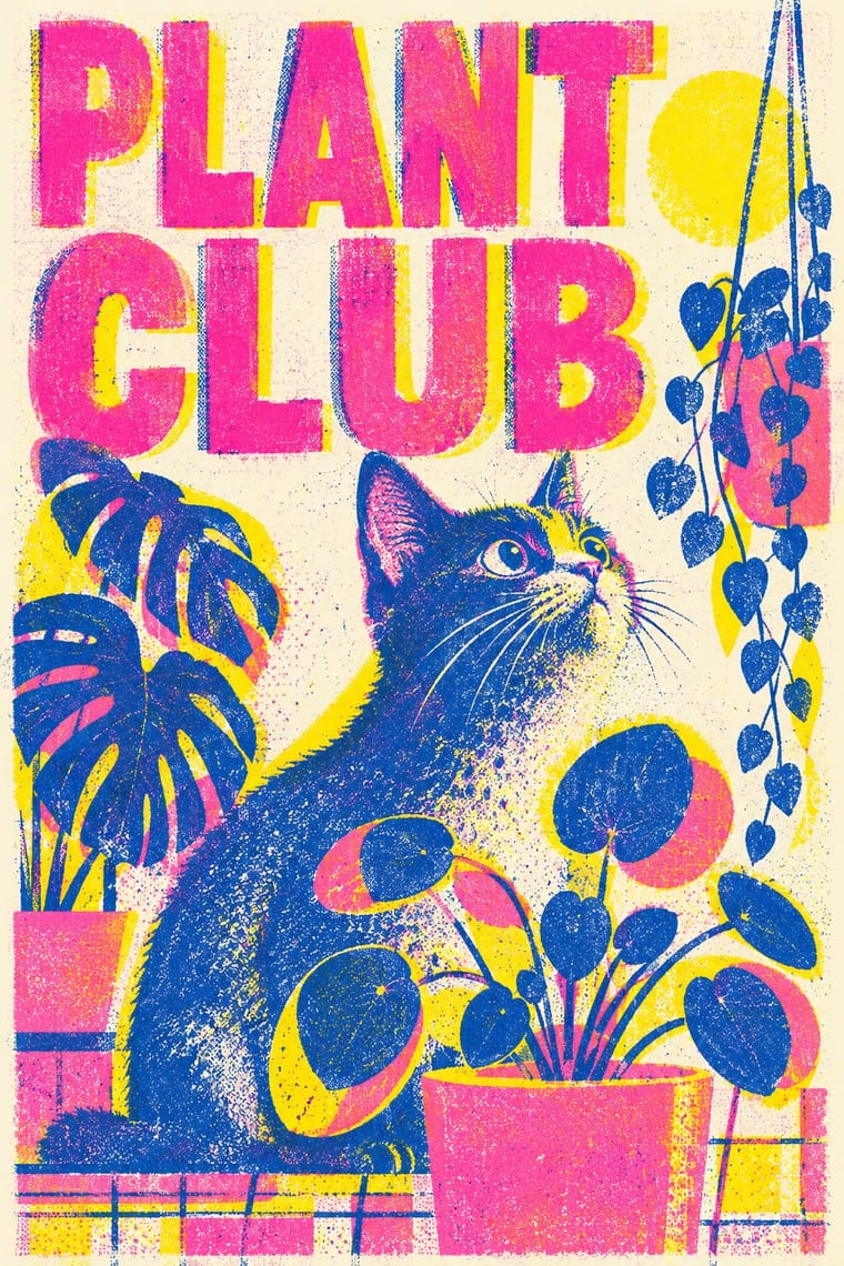
Both layer a few opaque inks; borrow WPA's stylised landscapes and plain messages for contemporary riso posters.
WPA silkscreen's flat, separated colour translates directly to riso drums; borrow its layered spot-colour scenes.
Mix them and make something Risograph WPA Silkscreen Posters
01
What each style brings
Each part of the design comes from the style with the stronger say in it, and each style gives at least two.
Risograph & Indie Print Culture WPA Silkscreen Posters
- Type from Risograph
- Colour from Risograph
- Form from WPA Silkscreen Posters
- Composition from WPA Silkscreen Posters
- Surface from Risograph
02
The type
Open fonts standing in for each style’s own type, which is often hand-drawn or commercial.
Display · Risograph
Together
Inter Tight, standing in for Neo-grotesques set large (e.g. Akzidenz-Grotesk, Helvetica)
Text · WPA Silkscreen Posters
Posters made by the Federal Art Project of the Works Progress Administration to promote health campaigns, education, theatre, travel and the national parks during the Depression. Unemployed artists adapted commercial silkscreen to print runs by hand, which gave the work its flat, opaque layered colour, simplified stylised forms and clear geometric lettering in a public-service voice.
Jost; WPA Silkscreen Posters used Hand-cut stencil lettering in geometric sans-serif capitals and Futura (Paul Renner, 1927) and similar geometric sans-serifs
03
The colours
The ground and leading colours come from Risograph, with a counter-accent from WPA Silkscreen Posters. The ink reads on the ground at 4.5:1 or more.
Risograph & Indie Print Culture WPA Silkscreen Posters
-
#f4f1eaground · 36% -
#3255a4ink · 14% -
#ff48b0accent · 18% -
#c8622daccent · 14% -
#f15060accent · 10% -
#d9a441accent · 8%
As CSS
:root {
  --ground: #f4f1ea;
  --ink: #3255a4;
  --accent-1: #ff48b0;
  --accent-2: #c8622d;
  --accent-3: #f15060;
  --accent-4: #d9a441;
  --font-display: "Inter Tight", sans-serif;
  --font-text: "Jost", sans-serif;
}
04
The two styles

05
More combinations
With Risograph
- Corporate Identity Modernism Contrasts · Exact Pantone-matched corporate colour is the opposite of riso's drifting inks; use the contrast to signal independence.
- Neo-Swiss Revival Pairs well · Print neo-Swiss grids in two fluorescent riso inks to soften their rigour with grain and overprint.
- Y2K Futurism Contrasts · Glossy chrome renders are everything a riso cannot print; set frictionless screen gloss against tactile grain for deliberate friction.
- Literatura de Cordel Woodcut Pairs well · Print a cordel-style woodcut on a riso in one ink on tinted stock to keep the pocket-chapbook economy for zines and poetry pamphlets.
- Cubist Pictorial Space Pairs well · Print synthetic-Cubist planes as overlapping flat riso inks so the overprints do the faceting for you.
- Leningrad Avant-Garde Picture Book Pairs well · Today's riso picture books share the few flat inks, bare paper and speckled texture; print a Lebedev-style sequence of floating figures in two or three riso inks.
- Die Neue Typographie Pairs well · Two-colour riso printing suits its black-plus-red restraint for low-budget editorial and posters.
- Spotify Duotone Identity Pairs well · Borrow riso's overprinted two-ink grain to give the clean digital duotone a tactile, handmade edge.
With WPA Silkscreen Posters
- Flat Design Pairs well · Its flat layered shapes translate directly to vector; use the national-park look for warm, civic flat illustration.
- Psychedelic Poster Contrasts · Calm, legible public information versus deliberate optical overload; choose WPA clarity when a message must reach everyone.
- Socialist Realist Propaganda Poster Pairs well · Both mobilised a 1930s public with state-funded posters; add socialist realism's heroic low-angle figures to WPA's flat silkscreen colour when a civic campaign needs more urgency.
- Australian Travel Poster (ANTA Era) Contrasts · The Federal Art Project also made travel and national-park posters in the 1930s, but in flat, layered screenprint for public programmes; set them side by side to choose between commercial painted lithography and a few opaque public-service inks.
- Australian Poster Collective Screenprints Pairs well · An earlier public-service silkscreen tradition; combine its calm stencil figures with the collectives' fluoro colour and puns.
- Early Turkish Republican Graphic Design Pairs well · Both are 1930s state-backed poster programmes for public institutions and tourism; combine WPA silkscreen flatness with Görey's modelled figures for civic campaigns.
- Estado Novo Folk Modernism (SPN) Pairs well · Both turned 1930s state poster programmes toward the rural and the regional; borrow WPA's flat layered landscapes and add SPN heraldry for regional tourism or heritage pieces.
- Harlem Renaissance Graphic Art Pairs well · Douglas's 1934 murals were New Deal commissions; pair his silhouettes with WPA screenprint layouts for civic, narrative posters.